


Poor.Old.Tired.Horse.
Institute of Contemporary Arts, London, UK
Institute of Contemporary Arts, London, UK

When it comes to discussing art, the adjective ‘poetic’ makes me want to run screaming from the room. This is not because I have any objection to poetry. Rather, it is because the word has come to denote, in the most lazy instances, any art work that has vaguely romantic, melancholy, imprecise, obsessive-but-futile, finding-the-marvellous-in-the-everyday, careworn or whimsical qualities. Its adjectival abuse has squeezed out of it the very qualities that actually belong to poetry: precision, rhythm, and the play of semantic content with the spoken and written word.
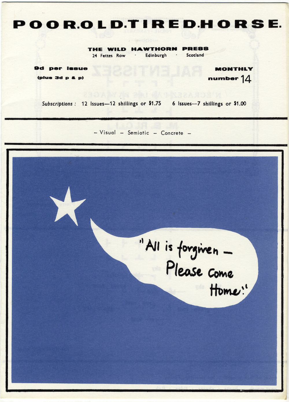
Curator Mark Sladen’s description of ‘Poor.Old.Tired.Horse.’ as ‘an exhibition of art that verges on poetry’ might therefore normally have had me quietly weeping over my collected Frank O’Hara, were it not for the fact that this really was a show that attempted to engage with poetry – albeit of a very particular kind. ‘Poor.Old.Tired.Horse.’ took its title from a periodical produced by artist, gardener and poet Ian Hamilton Finlay between 1962 and 1968, which helped introduce Concrete poetry to the UK. Loosely defined as poetry in which the typographical arrangement of words on the page is as important for the text’s meaning as the words themselves, Concrete poetry – has its roots in 1950s Brazil and Switzerland (although it was prefigured in the work of Guillaume Apollinaire at the beginning of the 20th century), before sweeping throughout Europe and the US in the ‘60s. ‘Poor.Old.Tired.Horse.’ featured a selection of works by 18 artists, either directly inspired by Concrete poetry or indirectly making use of some of its techniques. Arranged into rough chronological chunks, ‘Poor.Old.Tired.Horse.’ occasionally seemed as if it were aspiring to be a survey exhibition – there were rooms devoted to work from the 1960s, ‘70s and the present decade, but mysteriously nothing for the 1980s and ‘90s. However, this was a small but delicious taster course rather than full-blown banquet of textual Concretism.
Opening with a small room devoted to Finlay’s work and a selection of issues of Poor.Old.Tired.Horse. (which, for fans of the underground press, must have seemed exquisitely tantalizing exhibited in glass vitrines), the ICA’s ground-floor galleries focussed on work from the ‘60s. Here we had ‘typewriter poems’ by Henri Chopin, which, with their use of simple colours and optical effects – all made using typewriters – rhymed visually with artist and monk Dom Sylvester Houédard’s ‘typestracts’, three-dimensional forms rendered on the page with single keystrokes or combinations of colours. (Houédard was a prominent ecumenical theologian, and a 1966 typestract inspired by the Bhagavad Gita and exhibited in ‘Poor.Old.Tired.Horse.’ bore the brilliant title I become the moon & supply the juice to the vegetables.) Alongside these were works by Ferdinand Kriwet (aluminium ‘Text Signs’, 1968, on which texts were arranged into mandalas), and short poems by Vito Acconci and Carl Andre, which seemed extremely sober next to Christopher Knowles’ hermetically-encoded, patterned charts. The ground floor also featured the only sculpture included in the show; Liliane Lijn’s kinetic art works take the form of revolving cones, with text printed on them, the meaning of which is emphasized by the movement of the cone, such as in ABC Cone (1965) or the more complex Protons are Positive (1968) on which arrows direct the eye to-and-fro from phrase to phrase.
Both the typewriter and Letraset letter transfers (and, by extension, specific typefaces such as Courier and Helvetica) were important tools for these artists and poets, but were entirely absent upstairs in the room of drawings and prints by Alasdair Gray, Philip Guston, David Hockney and Robert Smithson. The exhibition’s shift to more gestural, hand-made work seemed abrupt, leaving unanswered questions about the relationship between print technology and the word. Works by Guston and Smithson featured feverishly scrawled figures, phrases and numbers; Guston’s including phrases from Clark Coolidge poems alongside his characteristic blocky figures and objects, and Smithson’s torrent of cosmological references and spidery figures reminiscent of William Blake. Blake’s influence is also present in Gray’s works – which here included meticulously detailed frontispieces for his epic novel Lanark (1980), along with three prints featuring poems from his cycle ‘In a Cold Room’ (1952–7). Hockney’s ‘Illustrations for Thirteen Poems from C.P. Cavafy’ (1966) were notable for an almost entire absence of text – these are elegant drawings, but their inclusion here seemed forced, and more suited to a show about book illustration.
The final room of ‘Poor.Old.Tired.Horse.’ included works by Anna Barham, Matthew Brannon, Karl Holmqvist, Janice Kerbel, Frances Stark and Sue Tompkins. Barham has a long-standing interest in systems for ordering words, although her video work Magenta, Emerald, Lapis (2009) – in which basic shapes are re-arranged in order to create simple letterforms – seemed too much like a preparatory study in comparison with Holmqvist’s sloganeering fly-posters or Kerbel’s series of bold, carnivalesque announcements (‘Remarkable’ 2007). Stark’s witty I must explain, specialize, rationalize, classify, etc. (2008) depicts a figure with a spirit-level in front of a large panel of text, as if trying to straighten the wonkily positioned sentences (which themselves describe an attempt to write a clear, orderly book preface). It seems to ask; can your thoughts be straight if your words aren’t? In Brannon’s hilarious, self-critical print Loose Change (2008), he accuses his own work of being ‘nothing more than graphic design’. Anyone who thinks graphic design is of a discipline of a low cultural rank probably needs to seriously reconsider their relationship to the written word. What ‘Poor.Old.Tired.Horse.’ tried to make clear – however idiosyncratically – was that whether you call it ‘art’, ‘design’, ‘poetry’ or ‘publishing’, our relationship to language is nothing if not physical or visual.


