Circling Back
For this regular series, artist Michaela Meise discusses her affinity to architect Ferdinand Kramer
For this regular series, artist Michaela Meise discusses her affinity to architect Ferdinand Kramer

PABLO LARIOS In front of me is an image of the Rainbelle – a disposable umbrella designed by German architect Ferdinand Kramer (1898–1985).
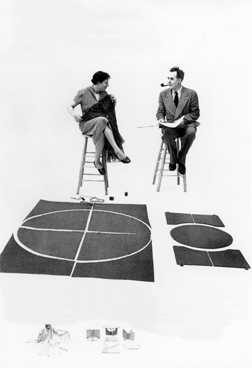
MICHAELA MEISE Kramer’s design was developed from a circle. The idea was to have an umbrella to use only once or twice, and then to throw away. It’s made of coated paper. Kramer often worked with collapsible designs, for objects as well as furniture, and often with circles.
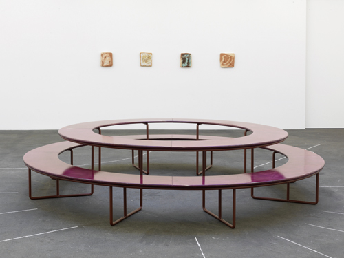
PL Your recent show at Johann König gallery in Berlin was titled Im Kreis, am Kreis (In the circle, on the circle, 2013). It was about circles, in multiple senses. You fired ceramic portraits of a circle of people – random acquaintances and friends. And in the middle of the room there was this large circular bench and table structure where visitors could sit.
MM The bench was based on one of Kramer’s designs. Kramer’s table, which was originally designed in 1928 for use in a public kindergarten in Frankfurt, has haunted me for years. I thought of it again while working on this exhibition, which was very much about individuals and their relationships to groups. I made individual portraits of people, including friends of mine. I met with them and spoke with them for hours. They had nothing in common other than sitting as portraits for the show.
PL And what is the link to the table?
MM I wanted to use the table as a symbolic meeting point, where such a group – but also visitors – might sit together. Not because they knew each other, and not because they chose to be with one another, but just because they could sit at the same table. To me, there’s a connection with the idea of a society – one where people don’t choose to be with each other, but simply happen to be with each other.
PL Where did you first come across this table?
MM Through my interest in another architect, Margarete Schütte-Lihotzky (1897–2000), who is most famous for her ‘Frankfurter Küche’ design (1926). Schütte-Lihotzky and Kramer were colleagues for two years when they were employed in the housing project for the city of Frankfurt.
PL You mean the Neues Frankfurt project (1925-1930), a Weimar-era infrastructural project for city design.
MM Yes, Schütte-Lihotzky and Kramer were developing social housing projects in parallel. Looking at images of the Neues Frankfurt project, I saw this kindergarten table that Kramer had designed. I also saw that Schütte-Lihotzky had used an almost identical design nearly 15 years later, also for a kindergarten, this time in Austria. I don’t know if during their time there was no copyright on designs, or perhaps they were friends so she was allowed to use his design. But it’s clear that this table existed twice – his version and hers. I found it sympathetic that such an aesthetically pleasing piece would be designed for children. It’s not ‘let’s give them any old crap to sit on’, but a high quality piece of furniture.
There’s also its practical implication. One of the women at this public, all-age kindergarten would sit in the middle of the circle and could thus efficiently feed the children, who were often no more than one year old. In Kramer’s version the bench had a backrest for the children. What’s also clear is the bench’s social and political implications. The children face each other; there’s no hierarchy at the table. It’s whole a pedagogical attitude.

PL Kramer twice made designs for children in Montessori schools, which is interesting because the Montessori method is all about encouraging ‘freedom’ within limits. Did you also modify this table?
MM I adapted it for adults. It’s enlarged and lacks the backrest. And I made a colour choice, finding a colour that I liked, one that would neither be too familiar nor too referential. To build it, I worked with a Berlin-based metal worker named Bernd Euler. By pure coincidence, it happened that Euler was the great-grandson of a metal worker named Emil Graf who with his son Georg produced designs for Kramer in his locksmith’s shop in Frankfurt am Main in the 1920s. Finding that out was a little moment of magic.
PL You also ‘named’ this table.
MM The table’s name is Chelsea Kramer, after Chelsea Manning, the former US intelligence analyst sentenced for providing over 700,000 government files to WikiLeaks, a transgendered individual who subsequently changed her first name, from ‘Bradley.’
PL At the time she leaked the files, Manning was working for the US government. Likewise, Kramer was once employed by the German government, but his designs were banned by the Nazi government as ‘degenerate’ in 1937, and he fled to the US. The ‘circles’ in question seem to be structures that enclose, but the same structures that exclude.
MM That’s true. The part of the exhibition title stating am Kreis, ‘at the circle’, describes exclusion. Although here it’s a soft exclusion, an inside-outside paradox: can you refer to a group when you are close to the group? And do groups necessarily entail exclusion? Something I like very much about the table is that you look at it but it also encourages you to walk around it. There’s no ‘behind’ to the sculpture. There’s some kind of movement to it as well. In general, I tend to be drawn to sitting structures, as for me they symbolize aspects of public space. Train stations, for example.
PL Train stations?
MM Yes, in German train stations, there used to be a lot of flat benches. Train stations were known for being where homeless people slept at night. I was studying in West Germany, in Kassel, in the 1990s. At that time, the West German train company, Deutsche Bahn, began to take over former East German train stations, embarking on a modernization process. They introduced a new interior design, and new rules, for example a ban on smoking. And they installed new benches. The new benches had seat dividers, so you could not lie on them anymore. I have a very strong feeling that there was a political attitude behind it.
PL Economic privatization met with physical privatization – turning public spaces into private ones.
MM Exactly. Which brought about changes in how one spent time in public space. I felt there was something programmatic about it – mean, actually.
Michaela Meise is an artist and musician who lives in Berlin. She had a recent solo show at dépendance, Brussels, and has upcoming shows at lothringer13_halle, Munich, and Künstlerhaus Bethanien, Berlin.
The Kramer Principle: Design for Variable Use was on view at the Museum for Angewandte Kunst (MAK) in Frankfurt am Main from 6 February – 7 September 2014.


