Matthew Brannon

What do ‘Coronet Brandy’ and ‘El Producto Cigar’ have in common? Certainly they’d make for a nice combination, but their logos were both created (in 1941 and 1952, respectively) by the legendary American graphic designer, Paul Rand. Beginning in the 1940s, Rand is known for having revolutionized graphic design, producing globally recognized corporate logos for the likes of IBM and UPS. The works on view in Matthew Brannon’s solo show, ‘A question answered with a quote’, appeared at first glance to be an homage to this venerable star of advertising and communication: simple images, clean lines, bright block colours depicting consumer items in cleverly stacked graphic collages. From a distance they seem to be vintage ads, something Mad Men’s Don Draper might have thought up.
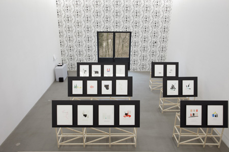
The items depicted in Brannon’s letterpress prints – exhibited here on tilted wooden stands resembling rudimentary drafting tables – are straight out of a fashion or luxury lifestyle magazine. Lobsters, wine glasses, ladies’ stockings, a Rolex watch and the inevitable array of super-sexy ‘i’s – iPod, iPad, iPhone – all look glossy, vibrant and attractive. Yet the discreet texts underneath, where one would expect a catchy slogan, turn out to be unexpectedly caustic: some imply a blackly humorous narrative while others make mordant observations on modern life.
Indeed, while most of the depicted objects are lusted-after luxury items, many are actually in a state of decay – worn, used, leftover – adding a kind of jadedness or shabbiness to the scenes. The champagne bottles and glasses, indicated by simple black profiles, are always empty and tipped on their sides (such as in Ladies Choice, 2007, or Regrets Only, 2008). The dark-red rose, which also looks like a full glass of red wine, in A Difference of Hours (2010), is past its peak, the leaves are beginning to fall and the petals will soon follow. Excerpts of text – ‘Dress Rehearsal/Closing Party’, ‘Cancelled Reservations’, ‘Who killed who the night before’ – imply shattered hope and disappointed expectations, just as the rose-as-wine-glass conjures images of the jilted, lonely drinker. These verses deny any of the relaxed sophistication one might have imagined and instead replace it with a sense of desperate striving to attain or maintain a certain social level through constant show and consumerism.
In the corner of the exhibition space, set off by Brannon’s two-tone graphic wallpaper, was a sculptural/sound piece comprising a white pedestal with black cubic speakers on either side – like a kind of sculptural Malevich – and a black record player with a white vinyl record on the turntable. A small shelf holds the white album cover with the piece’s title: Gag. Again, Brannon uses language to both emphasize and confuse: is it all a joke? Or is the gag a metaphorical restraint, or does it all make you sick?
Brannon’s barbed narrative texts are, according to the press release, meant to be a critical comment on ‘Immoderation, greed, excesses, and most gravely, indomitable hedonism.’ The artist is therefore making a criticism of the consumers’ world with the very means intended to make the punters buy. It sounds clever and subversive but somehow the visuals are simply too pretty or too catchy to really deliver a hard punch. One needs to remember that Brannon is selling something too – not only his work but also the intellectual ideas behind them, and it’s ultimately highly ironic to think of one of these prints ending up on a wealthy collector’s wall.
Rand struggled to bring elements of high art to graphic design and advertising, to lend it credibility and depth. Brannon is doing the reverse: taking the shallow language of advertising and trying to make it deeper. The show’s title ‘A question answered with a quote’ implies another kind of shallowness, an interrogative hoping for a profound response answered with a glib one-liner. Maybe, then, the best way to conclude is with one of Rand’s famous quotes: ‘Don’t try to be original; just try to be good.’


