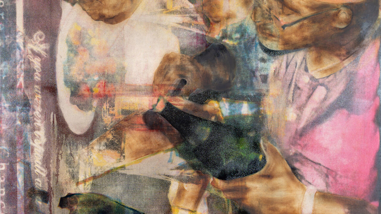


Collected Writings
Since its humble beginnings almost 200 years ago, the art magazine has reflected, in wildly divergent forms, social, technological and cultural developments. Eugenia Bell traces its evolution, and, with Emily King, presents a snapshot of some of the most important publications in its history
Since its humble beginnings almost 200 years ago, the art magazine has reflected, in wildly divergent forms, social, technological and cultural developments. Eugenia Bell traces its evolution, and, with Emily King, presents a snapshot of some of the most important publications in its history

In 1976 the art periodical experienced something of a bumper year. The ‘art press’ was fêted in an exhibition at the Victoria & Albert Museum, London, and Studio International published a special survey issue on ‘art magazines’, its cover emblazoned with a bright red, faux spray-painted question mark. Thirty years later the state of the art press may be no less in question: the art periodical has received little popular or scholarly focus; magazines are still influenced by new technology, academic whim and the fluctuating fortunes of the market; and the realm of the ‘art press’ remains a wildly varied and shambolic place.
The history of the art magazine as we know it is as inextricably linked to the history of printing as it is parallel to the evolution of criticism and the emergence of art movements. Beginning in the 19th century artists, publishers and printers – encouraged by profits from the production and sale of books and inexpensive prints to the cultivated classes – began exploring ways of broadening their reach. As early as the 18th century printers – loath to keep their presses idle and skilled manpower at a standstill – had begun printing illustrated serials and periodicals alongside books and newspapers. Papers began publishing inserts that featured prints of popular illustrations, some of which evolved into quality stand-alone supplements (Das Kunstblatt, founded in 1816, is an early example) that eventually contained commentary. But printing technology had not yet adequately resolved the issue of combining image and type, and many early art magazines carried either only illustrations or none at all. Even while techniques for engraving and integrating type advanced, reproduction quality could be so poor as to be worthless.
With vast improvements in halftone engraving towards the turn of the century art periodicals began to spread across Europe, and what we think of today as the modern art magazine, in all its variety, began to come into its own in the Victorian era. In Britain, at least, the change in economic and social conditions, the foundation of public museums and progressive education bills meant more people were reading than ever before. Shedding the cloak of the academy and moving through the scrim of journalism was crucial in bringing art into the mainstream – and criticism into its own. Magazines moved away from being the vanity projects of printers and publishers set on profiting from the middle class and into the hands of artists and enterprising editors, spawning countless titles. While the arguments about mechanical reproduction and value of art would begin soon enough, mass reproduction – in magazines, books and prints – marked the beginning of the visual dissemination of the popular arts and the democracy of taste, establishing the delicate relationship between artists, critics and the public that still exists today and preparing the ground for the virtual flood of art journals unleashed in the 20th century.
With the possible exception of the late 1960s and early ’70s (and for different reasons), the first 40 years of the 20th century was the most vital era for the art press. A distillation of everything that preceded it in terms of criticism, technology and design standards, art magazines flourished in Europe and abroad. Unique products of their time, they were as sensitive and responsive to the wars in Europe as they were to immigration (enforced and voluntary), the newly flush art market and, in the US, the collapse of the stock market. Sweeping artistic movements, and even minor ones, were dependent on ‘house organs’ to extend their lifespan; their journals functioned primarily as means for different ‘branches’ of a movement to communicate and exchange ideas. In addition, they ensured a movement’s broad dissemination across Europe and, importantly, to America. Movement-specific magazines abounded: there were countless journals devoted to Dada, Futurism and Surrealism, Vorticism and Concrete Art, and the fledgeling modes of Kinetic sculpture and Minimalism had their own organs. Needless to say, many were short-lived affairs. Under no obligation to give equal coverage to the art world at large, they often attempted to be as pure an expression of an artistic philosophy as possible, although owing to design and manufacturing limitations some would be considered fairly conventional today (oddly, Surrealist journals, in particular, were notably restrained). While, to quote a former editor of Studio International, no movement magazine was ever ‘a magazine first and an art magazine only second’, many examples probably suffered from the narrow focus. But others were just as likely to be a political organ or literary review as a conduit for disseminating the philosophical and theoretical foundations of a particular group.
A few of the countless Futurist magazines of the 1910s and 1920s, including Noi, Stile Futurista and Lacerba, were thinly veiled political screeds for the Fascist party, while still managing to fulfil some sort of artistic mission: freeing poetry from the binds of literature and creating beautifully designed publications and innovative type. The Italian Fascist government didn’t miss a beat and took over the perfectly respectable (state-sponsored) Bolletino d’Arte and transformed it into Le Arti – fervently nationalistic pages defending a ‘Fascist art history’. Not surprisingly, similar publications emerged from Austria and Germany during the 1930s. And View, the American Surrealist magazine, was probably better known for its literary legacy (indeed it was subtitled ‘Through the Eyes of Poets’) than for being the magazine that bolstered Marcel Duchamp’s reputation in the US or for commissioning artists from Wilfredo Lam to Isamu Noguchi to design their covers. George Bataille’s Documents of the 1930s (the spiritual and decidedly less glossy heir to Minotaure) brought together artists, writers and ethnologists to explore its founder’s greater sociological cause. As with Futurism, text was all-important to Dada, Merz and the Situationists, and their magazines seemed to proliferate at an alarming rate: Merz, Z, La Révolutione Surréaliste, 391 and L’Enciclopedia, a rare example of Italian Dada.
Integral to – and arguably the most vital by-product of – these titles was design. Along with the replacement of hand-set type by machine composition and advancements in offset lithography, conditions in the early part of the century meant that the intersection of political activity, cultural activity, scholarship and increasingly urgent international communication allowed tremendous strides to be made in the development of type and layout, and with them new ways to present content that challenged tradition and, in some cases, competed with the art being presented. In Dada magazines text appeared sideways, in different type sizes and, while not unusual or particularly radical to readers today, nothing from the past was safe from re-interpretation. Futurist magazines filtered their design through the new machine-age aesthetic, and new typefaces were developed by the leading journal designers, notably Enrico Prampolini of Noi and, most significantly, Herbert Bayer of the Bauhaus, whose Universal typeface was used throughout the school’s publications. The Dutch magazine i10 covered the synthesis of art, architecture and design and boasted sparse interiors by László Moholy-Nagy and cover designs based on an architectural grid. Wyndham Lewis’ Vorticist Blast was so complex that it was impossible to find a printer equipped to handle it. At the Bauhaus communication design was an element of every student’s education, and the journals (including Bauhaus and Offset Buch- und Werbekunst) and the Bauhausbücher series speak of a commitment to innovation and the importance of mass communication of ideals.
Art magazines have, of course, always been dependent on advertising revenue. In the period of independent movement magazines advertising was often limited to paid ads from competing publications, for lack of contacts in the industry or at galleries. Publishers have been oft-criticized rather unfairly for being open to the influence of advertisers – usually galleries – but advertising revenue contributes to the literary and design quality of a magazine while keeping subscription rates affordable. In the 1976 Studio International magazine survey – most certainly, and at times entertainingly, a product of its time – out of 68 magazines contacted (a handful of them state-, gallery- or art association-sponsored) around a dozen explicitly stated that they didn’t take advertising – almost 18 per cent – an unthinkable proportion today.
Censorship and advertising have intersected publicly on more than one occasion, but perhaps most famously in 1974 at Artforum, with the infamous Lynda Benglis episode. When the editors decided not to illustrate an essay on Benglis (by Robert Pincus-Witten) with the controversial image of the artist naked and sporting a dildo, she decided instead to take out an advert featuring the photograph, which was accepted by the magazine’s advertising staff. The ensuing schism among the editorial staff resulted in a heated exchange, in which Rosalind Krauss was prominent, about the ad’s inclusion and the mockery it made of women’s liberation. Krauss and her supporters (who included Lawrence Alloway, Max Kozloff and Annette Michelson, with whom she subsequently left the magazine to set up the anti-Artforum journal October) called its inclusion a stab at ‘self-promotion … in the most debased sense of the term’ and accused others at the magazine of ‘complicity’ with the market-place. The extant editors were cowed into a printed apology. Robert Rosenblum, quite funnily, called for the exposure of the ‘Sons and Daughters of the Founding Fathers of the Artforum Committee of Public Decency and Ladies’ Etiquette’.
In the late 1970s photographer Jacqueline Livingston (a Cornell University art professor at the time) exhibited a number of nude photographs of her family, including a photograph of her husband’s erect penis and of her son, according to the artist, ‘in a moment of natural, child-like self-exploration’. She was summarily slapped on the wrists by Cornell (where she later lost her job) and investigated by New York State’s social services department for child abuse; needless to say, they were without a case and charges were dropped. In an effort to save the photos from further denigration Livingston self-published and sold a poster-size edition of some of the images. She attempted to advertise the edition in Art News and Art in America, who refused to take it because it showed male genitalia (for what it’s worth, Ms and Playgirl also refused to run the ad).
The older, more august magazines were not themselves free from the hand of the censor. The December 1943 issue of View was banned by the US post office because it featured Leon Kelley nudes and reproduced Pablo Picasso’s Le Minotaure. Racy stuff, indeed. But the event was indicative of a larger cultural pall at the time. In March 1946 Surrealist poet Philip Lamantia (who at only 16 had been published in the influential San Francisco journal Circle and was a contributing editor to View) asked for his name to be removed from the masthead, claiming View represented the ‘perverted sensibility of our time’ and that the openly gay editor of the magazine, Charles Henri Ford, was responsible ‘ for the basic corruption of this generation’. Well, perhaps such censoriousness was not universal. One of the more ambitious magazines ever to emerge from the 1960s’ renaissance, Aspen, lasted ten issues – remarkable given its unorthodox advertising guidelines and its atypical format, the postage costs for which would sound its death-knell.
Studio International’s survey, which covered only magazines in print at the time, revealed a spirit in independent arts publishing that seems to have resurfaced only in the last six to ten years. Reading it, one gets a sense that the editors, while necessarily hopeful – they were, after all in charge of a highly influential, successful journal that could boast about its longevity – also despaired at the state of criticism, the real or perceived self-censorship among the larger titles, and the challenge presented to magazines by the rise of arts coverage on television and radio. Today, as arts readership, gallery attendance and general interest in art soar, those very mainstream media outlets – the sources of most people’s information – have drastically cut or diluted their arts coverage in favour of page-turning, subscription-selling ‘entertainment’ reporting. Art magazines are perhaps more essential than ever, in order to keep criticism critical – of itself as much as of what it covers – and to keep art publications the vital, changing forms they need to be.

The Yellow Book
Country UK
Founded and folded 1894–7
Key contributors Aubrey Beardsley, Max Beerbohm, Henry James, Walter Sickert, William Butler Yeats
The Yellow Book – founded in 1894 – steadfastly rejected many of the technological advances that marked the rise of the art and literary review in the 19th century. By remaining text-heavy and including only sketches throughout (most of which were by the magazine’s art editor, Aubrey Beardsley, whose work also graced each cover), The Yellow Book at once reflected the modest origins of the Bodley Head as an antiquarian book business and, later, especially after the partners (John Lane, a relative of Allen Lane, who would later establish Penguin Books, and Charles Elkin Matthews) parted ways, an avant-garde assortment of Feminism, naturalist fiction and illustration. Lane said that his model reader was a ‘lady of means who has the freedom to read what she chooses’. Indeed, the magazine opened up its pages, unprecedentedly early, to women writers.
In the mid- to late 1890s the magazine was upset by accusations that Lane is reported to have said ‘nearly killed The Yellow Book and […] me’. Lane had published Oscar Wilde’s Salomé and a reprint edition of Wilde’s poems to modest sales. However, between an open feud over design with Beardsley (who made it a condition of his employment that nothing by Wilde be published in the magazine), an incident between the writer and one of the Bodley Head’s office boys and a general sense of anomie between Lane and Wilde, the arrest of the author in 1895 became the flashpoint in the magazine’s history. Beardsley resigned, the offices were vandalized because of the indirect connection with Wilde and the magazine was fiercely satirized in the pages of its biggest rival, Savoy. It’s hard to underestimate the impact of The Yellow Book in its early years: its unusual aesthetic qualities and Beardsley’s drawing style (not to mention its outré content) ‘made the magazine’, Lane would later say, and when Beardsley left it became ‘just another good magazine’. EB

Wendingen
Country The Netherlands
Founded and folded 1918–31
Key contributors M. de Klerk, Frits Lensvelt, El Lissitzky, Hendricus Theodorus Wijdeveld
Inspired by the intersection of architecture and typography and propelled by the need for a publication that engaged all the arts, self-taught Dutch architect Hendricus Theodorus Wijdeveld launched Wendingen with the support of the Dutch arts society Architectura et Amicitia (Architecture and Friendship). The name Wendingen loosely translates as ‘upheavals’ or ‘turnings’.
Published from 1918 until 1931, some of the most artistically vibrant years of the 20th century in Europe, Wendingen rose from the ashes of Architectura magazine. While still primarily devoted to architecture, design and the work that motivated the loose group of typographers and book designers who called themselves ‘The Directors’, Wendingen evolved into a printed manifestation of a synthesis of the arts of the time. As well as covering the progression of the avant-garde into the sweeping Modernism that was engulfing Europe, it also enthusiastically covered dance, painting, applied arts and the crafts.
Edited by Wijdeveld until 1925, a different cover was commissioned for each themed issue, with a view to it being a unique work of art. The cover designer was often charged with producing his or her own woodcut of the design or commissioned to draw the design straight on to a lithographic stone. Strict monitoring by the editors ensured quality and meant that covers by even notable artists were not guaranteed acceptance. Designs provided by Eileen Gray and Frank Lloyd Wright, for issues dedicated to them, were soundly rejected for their poor quality. El Lissitzky, H. P. Berlage and W. M. Dudok (who was also responsible for some of the most innovative typographic treatments of the era) were some of the more famous names whose work graced the covers. But some of the most outstanding work on the covers came from relative unknowns: for example, designer M. de Klerk, whose cover on a special issue about public housing featured a dramatic beehive and bird’s nest motif, or took the form of inventive typographic work by Frits Lensvelt and Wijdeveld himself, or sublime, wildly varying designs by Arthur Staal, Henrik Wouda, Vimos Huszar and Margaret Kropholler. EB

View
Country USA
Founded and folded 1940–7
Key contributors Marcel Duchamp, Charles Henri Ford, Parker Tyler
While poet, editor, filmmaker, photographer and artist Charles Henri Ford’s View is seen as one of the premier avant-garde magazines of its time, and viewed as a Surrealist organ, it is probably too eclectic for that label alone. Prior to its publication, American art readers had been exposed to movement magazines only in the form of a few issues of Minotaure, whose influence Ford had hoped to usurp.
Ford’s first foray into publishing was the short-lived magazine Blues (1929–30), which was critical in launching the careers of Djuna Barnes, HD and Kenneth Rexroth and produced while Ford was practically a teenager. When it folded, Ford moved to Paris, and in September 1940 the first issue of View appeared. Although only six pages long, within 18 months it was clocking in at 40 pages, each issue typically devoted to a single theme or artist. It was published at least quarterly, sustained by advertising and a ‘commercial’ format beginning with the April 1943 issue. While it was eventually distributed internationally, circulation never exceeded 3,000 copies. Its achievement rested on the lavish, artist-designed cover and Parker Tyler’s distinctive design and typography. As a result of World War II, artists and writers who had fled Paris for New York made the magazine the rich depository of Surrealist art and literature.
View’s crowning achievement was its Marcel Duchamp number: a folded and perforated cover that could be assembled following the enclosed instructions, to behold ‘a vision of The Bride Stripped Bare’. It was the first American periodical to recognize Duchamp. Some of the most revealing things about this extraordinary magazine, though, can be found in its letters section. In September 1942 Randall Jarrell wrote to Ford: ‘View is, really, almost the weirdest magazine I’ve ever seen – a tribute that ought to touch its contributors […] Do you think many of your contributors are consciously Dada? Are they “breaking down the morale of the bourgeoisie”? Or are they sincere as doves?’ Earlier the same year William Carlos Williams wrote: ‘By your persistence you are beginning to prove something. AND you’re creating the impossible magazine of the arts no one could have dreamed [of].’ EB

Spirale
Country Switzerland
Founded and folded 1953–64
Key contributors Eugen Gomringer, Dieter Roth, Arcel Wyss
Probably the most significant document recording Swiss art – especially abstract and Concrete art – in the 1950s and early ’60s, Spirale was the handiwork of Dieter Roth and edited by him with artist Marcel Wyss and Concrete poet Eugen Gomringer (who became recognized for his ‘constellations’ and one-word poems). Their objective recalled the best intentions of magazines from 20 and 30 years earlier to publish a magazine that would ‘embrace poetry, the plastic arts, graphics, architecture and industrial design’. Conceived in 1951, the magazine did not start publishing until 1953. At the same time, and over the course of the life of the magazine, Roth was involved in up to six other independent publishing projects. Although the design and illustrations for the magazine indicate Roth’s committed Constructivist phase, when it folded after nine issues in 1964, he shifted gears from the ‘universal aesthetic language’ to the more ephemeral, personal works for which he may be best known, but Spirale set in motion his obsession with self-publishing, which was a source of the enormously popular trend for photocopied books and early ’zines in the 1970s. Roth’s contributions to the ‘conventions of the page [as] subject-matter [where] a turning page becomes a physical, sculptural element rather than an incidental activity’, set the precedent for future experiments in art magazine publishing that questioned and deconstructed the form of the ‘book’ and presaged a great era in self-publishing. EB
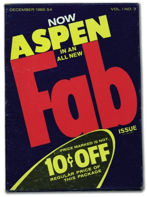
Aspen
Country USA
Founded and folded 1965–71
Key contributors Quentin Fiore, Phyllis Johnson, Marshall McLuhan, Brian O’Doherty, Andy Warhol
Aspen didn’t really come into its own until its third issue, the Andy Warhol-edited, Pop art issue that put the magazine on the art world radar. But the magazine was, from the start, highly unusual. Established and published by former Women’s Wear Daily and Advertising Age editor Phyllis Johnson in 1965, the ‘multimedia magazine in a box’ shrugged off all notions of format and custom. In content it may have appeared to be little more than a lifestyle rag for the ski set: the pleasures of cross-country skiing, reports from the Aspen Film Festival and an article on white-tailed ptarmigan sightings, albeit set alongside an interview with the Maysles Brothers and visits to architecturally significant homes in the area. Johnson’s editorial for issue 1 stated: ‘The articles will be as surprising as the format, ranging from beautiful picture stories on nature and sports to the more esoteric subjects of art, humanistic studies, design, underground movies, music (always with a record), poetry, dance, architecture, gourmet dining. In other words, all the civilized pleasures of modern living […] as exemplified by what goes on in Aspen, Colorado.’
Esoteric or not in 1966 Aspen became an art magazine. The box format remained unchanged; advertising was still composed of loose sheets kept distinct from the editorial, banging around at the bottom of the box; and the editor changed with each issue. But gone was the genteel nature of the chalet and the slopes. Dalton’s first issue was number 3 (though each issue also had a guest editor) – all cult cinema flipbooks, Velvet Underground and multiple opinions on LSD. Marshall McLuhan and Quentin Fiore took over for issue 4, and Brian O’Doherty’s issue 5/6 – the famous minimal white box ‘for Stéphane Mallarmé’ – appeared next: Susan Sontag, Roland Barthes, flexi-disk recordings by Morton Feldman and William Burroughs, 8mm films by Laszlo Moholy-Nagy and Robert Rauschenberg and a Tony Smith sculpture, to be assembled by the reader. Recalling Mallarmé and writing as ‘Sigmund Bode’, O’Doherty wrote in his introduction to the issue: ‘It is, of course, also possible to consider how placement is concealed, how the objectified unit (a person, a concept, a period) can conceivably occur without dimensions, in no place and in no time, and thus approach the condition of art.’
It survived only ten issues, but Aspen’s influence is still felt even without exact dimensions, and without time. EB

Interfunktionen
Country Germany
Founded and folded 1968–75
Key contributors Marcel Broodthaers, Benjamin Buchloh, Fritz Heubach, Jörg Immendorf, Sigmar Polke, Wolf Vostell
Twelve issues over seven years may not appear to be a particularly impressive output, but it is difficult to overemphasize the influence and significance of Interfunktionen’s brief existence. Dissenting from the new art-as-commodity attitude expressed at Arnold Bode’s documenta 4, the magazine, edited by Fritz Heubach in Cologne, was an interdisciplinary effort among activist artists to promote European art and ideas without bowing to the era’s increasingly commercial trends.
Inextricably linked with the Joseph Beuys-era Kunstakademie Düsseldorf and the LIDL Akademie, Interfunktionen boasted contributions and support from Jörg Immendorff, Sigmar Polke and Wolf Vostell. It published theory, criticism and artists’ projects, and facilitated a brand of European-American relations in art that had not quite existed or been explored before.
Interfunktionen’s first issue was originally published in – by today’s standards – an impossibly small edition of 120 (later issues averaged a circulation of about a thousand). Its main function was to articulate its reaction to documenta 4: the record of a performance action staged by a loose group of Interfunktionen members and supporters at the press conference and the reproduction of pieces banned at the exhibition. That first issue was under 80 pages, and in the spirit of experiment that Heubach was afraid of losing touch with, consisted of a motley assortment of paper cheaply bound, but with random loose bits and gatefolds; many of the ‘articles’ were handwritten.
Interfunktionen became mired in scandal under its second editor, Benjamin Buchloh, in 1975. In what would be its final issue (and only his second) Buchloh published Anselm Kiefer’s controversial Occupations, wherein the artist is photographed giving the Nazi salute in front of monuments throughout Europe. Marcel Broodthaers, once a keen supporter and contributor to the magazine, led the charge (which included Fritz Heubach) that caused an almost total withdrawal of funding from the review. A leading outlet for European art not seen elsewhere, Interfunktionen was ambitious beyond compare in scope and non-design. EB

October
Country USA
Founded and folded 1974–ongoing
Key contributors Yve-Alain Bois, Benjamin Buchloh, Hal Foster, Jeremy Gilbert-Rolfe, Rosalind Krauss, Annette Michelson, Mignon Nixon
On the heels of the 1974 furore over Lynda Benglis’ provocative advertisement in Artforum, editors Rosalind Krauss and Annette Michelson resigned to establish their own magazine, in partnership with Jeremy Gilbert-Rolfe.
October – named after Oktybar, Sergei Eisenstein’s film commemorating the tenth anniversary of the Bolshvik Revolution in 1917 – was established in 1976 as an antidote to the market-driven advertising-filled art glossies. In the early days it looked at Minimalism through the prism of French Structuralism; later Yve-Alain Bois joined the journal, whose work fused Structuralism and Greenbergian formalism. As post-Structuralism evolved, the editors began catalysing criticism through Michel Foucault, Jacques Derrida and especially, Jacques Lacan; Hal Foster and Mignon Nixon meanwhile brought their psychoanalytical scholarship to the fold. Put another way, October has always examined art in ‘its social and critical contexts’.
The October group has certainly shaped Postmodern theory, and if the ghost of Clement Greenberg lingers less often around the October office than it used to, the writing in October today does display a subtle shift away from issues of authorship, which have been side-stepped by a less authoritarian critical method. The old guard, and the ambitious younger generation of critics and historians the journal supports, is still firmly rooted in the academic realm. Indeed, many are now on the top university faculties and increasingly considered the new modern art history establishment. EB

Avalanche
Country USA
Founded and folded 1970–6
Key contributors Vito Acconci, Liza Bear, Chris Burden, Bas Jan Ader, Bruce McLean, Bruce Nauman, Willoughby Sharp, William Wegman
Almost every issue of Avalanche has a full-bleed artist’s portrait on its cover – the only the exception being a William Wegman photograph of his celebrated dog Man Ray. All are studies in brooding intensity, and some of them – notably Gianfranco Gorgoni’s portrait of Bruce Nauman – are extraordinarily beautiful. The art critic Peter Schjeldahl, himself a member of the Avalanche milieu, has argued that the magazine pioneered an unconventional model of glamour. If that is the case, then it was overwhelmingly successful: Nauman’s heavy-lashed eyes and well-defined jaw look handsome by anyone’s standards.
First published in 1970, Avalanche was the product of a meeting between the critic Liza Bear and the artist and writer Willoughby Sharp. It was founded on sweat equity in a Gramercy Park office a few blocks from Warhol’s Factory, where Interview was being launched at about the same time. Avalanche’s mission was to chart the anti-materialistic aspects of new art, and its circle was tightly knit but international, including Nauman, Wegman, Vito Acconci, Chris Burden, Bas Jan Ader and Bruce McLean. Apart from a news section at the front, it consisted solely of documentation of works and artist interviews. Apparently unedited transcriptions, these rambling conversations were a reaction to prevailing models of criticism, which were viewed by Bear and Willoughby as complicit in marketing and spectacularization. The magazine achieved its zenith in the autumn of 1972, with an issue devoted to the work of Vito Acconci.
Staple-bound, approximately 25 cm square and with a consistent three-column grid, the format of Avalanche is a straightforward affair. The most striking element of the magazine are the photographs, both grainy documentary pictures and artist-at-work portraits, which the designer Boris Wall Gruphy set out in a dynamic, cinematic fashion reminiscent of Alexey Brodovitch’s art direction of Harper’s Bazaar two decades earlier. In the spring of 1974, after eight issues as a magazine, Avalanche responded to rising paper costs by becoming a newspaper. Five issues later, in the summer of 1976, it folded altogether. The magazine doesn’t give reasons for its imminent demise, but the red masthead – the first time colour had ever been used – and the cover image of a balance sheet offer hard-to-miss hints. EK

The Fox
Country USA
Founded and folded 1975–6
Key contributors Sarah Charlesworth, Michael Corris, Preston Heller, Joseph Kosuth, Andrew Menard, Mel Ramsden
The Fox magazine was born out of conflict, lived on a diet of rancour and bitterness, and was finally snuffed out by a surfeit of animosity. Its three issues, published between 1975 and 1976, contain some of the sharpest art writing of the period. Notable Fox scalps include the Whitney Museum of Art’s exhibition ‘Three Centuries of American Art’, which was attacked for its blatant support of existing power élites. However, over time the editorial veered toward attacking its own rather than its enemies. Instead of feasting on sacred cows, The Fox appeared to prefer gnawing at its own tail.
The first issue was edited by Sarah Charlesworth, Joseph Kosuth, Michael Corris, Andrew Menard, Preston Heller and Mel Ramsden – all members of the New York wing of the art collective Art and Language, which at the time was breaking away from the UK branch in a viciously public fashion. The argument ostensibly concerned the scope of their concerns, but rumour has it that it was more personal than political. The publication opened with an invitation: ‘Those who are interested, curious, or have something to add (be it pro or con) to the editorial thrust […] the revaluation of ideology […] of this first issue are encouraged, even urged, to contribute to following issues.’
Although commendable, The Fox’s willingness to acknowledge the ‘con’ was to prove fatal. When the artist–activist Karl Beveridge wrote a piece for issue 2 accusing Donald Judd of perpetuating ‘the Big Cultural Lie’, he was actually making a veiled attack on Judd acolyte and Fox mainstay Kosuth. The publication could not survive the fall-out. In an article written for the final issue, titled ‘Lumpen Headache’, Peter Benchley characterized the situation as ‘relentless psycho-drama’. The Fox does not carry a design credit, but it is usually assumed to be the work of Kosuth. With its cardboard covers and newsprint interior the magazine makes a feature of its economy, but its typography, although simple, is extremely elegant. The covers display the issue number and the title, set diagonally in Copperplate Gothic. The same typeface is used in the interior of the magazine for headlines, and text is set in a straightforward two-column grid. Illustrations are used sparingly – there are no reproductions of art works – but to great effect. The Fox may have been a savage beast, but it was ever so sleek. EK

Charley
Country USA/Greece
Founded and folded 2001–ongoing
Key contributors Maurizio Cattelan, Massimiliano Gioni, Conny Purtill, Ali Subotnick
Charley is reliably irregular and unclassifiable. Does it cover emerging artists, or is it a paean to the 1980s? Would it be unfair to call Charley a send-up of art world current affairs? Is it a magazine or an artists’ project? In the same way that the editors’ Wrong Gallery defies characterization, Charley successfully and humorously appears to be all of the above and, at the same time, none of them at all.
Founded and edited by Maurizio Cattelan, Massimiliano Gioni and Ali Subotnick, it is financially supported by the Athens-based Deste Foundation. Describing itself as ‘a machine for distribution, a mechanism for spreading and exploiting information, rumours and communication’ and as ‘fixated on assimilation and consumption’, the four-issue young Charley (designed by former Walker Art Center designer Conny Purtill) takes a different form each issue. The second number was a box of picture postcards depicting New York’s 2001–2 art ‘season’, and issue 3 was accompanied by two exhibitions, a homage to peripheral artists of the 1980s. That issue of the magazine itself comprised coverage of the artists from other magazines published in the 1980s but provided no revision on their careers today. The fourth issue comments on some of today’s most important museum collections and their legacy of defining modern tastes. Charley’s practised nonchalance, enterprising presentation and informality somehow manage not to undermine the critical content. By slightly altering the method of reading and assimilating information, the magazine succeeds in combining design, near-voiceless criticism and legitimate topics in an impossible package.