


Constantina Zavitsanos Looks Beyond the Colour Spectrum
On the occasion of the artist’s show at Artists Space, New York, they speak about accessibility in the built environment and the ‘extra-visual’
On the occasion of the artist’s show at Artists Space, New York, they speak about accessibility in the built environment and the ‘extra-visual’

Constantina Zavitsanos’s forthcoming solo exhibition ‘fwiw’ opens in September at Artists Space in New York City. In this conversation Zavitsanos discusses their work, through which they explore the extra-visual, text, architecture and the built environment.
Sadia Shirazi You’ve been playing with text a lot in your recent work, from overlapping open captions or crossing texts, to drawing your titles from song lyrics. Can you talk about how you’re using text, captions and infrasonic sound in the new sculptural works There’s something happening here [2024] and Wishing Well [2024] for your upcoming show at Artists Space? I know the title, ‘fwiw’, as an acronym that people use with each other in text messages.
Constantina Zavitsanos ‘For what it’s worth’ is a phrase people use in many ways. At times it can mean something akin to ‘here are my two cents worth’, signalling a personal take on a matter, especially when the unsolicited offering is tangential or apparently inconsequential. At other times it’s used as a rejoinder that implies something is missing from the first statement, like ‘you must consider this’. Here, the addition is not insignificant but paramount. I love its colloquial ambiguity; it can elaborate, argue or function as an aside. Or it can be made outside of any interpellation altogether, unasked. I’m personally drawn to the ‘two cents’ usage - both for its conversational feel, and for its latent call to ‘worth’ itself. It’s an offering that can be both inconsequential and invaluable. So often these are posited as ‘either/or’.
In my upcoming show I’m thinking through matters like, how wishes are invaluable despite the value of the coins you make them on; how images can be what I call ‘extra-visual’; how image can be fleeting not just fixed; and how imaging systems may blur sculpture and performance.
Right now, I’m working with the Buffalo Springfield song, ‘For What It’s Worth’ [1966] and several of its interpolations, especially the Public Enemy song, ‘He Got Game’ [1998], which features Stephen Stills of the former band. By layering renditions, especially those with differing tempos and lyrics, I’m also thinking through how to caption overlapping sound, both temporally and spatially.

Captions need to fit the sound they transcribe or describe. We think we look to song lyrics for meaning, but they’re usually a bit ambiguous. The songs that we cherish most are saying something that feels clear to us, but they are also open to many readings. The lyrics to ‘For What It’s Worth’ literally state that ‘there’s something happening here’ but ‘what it is ain’t exactly clear’. There’s more clarity in the open affective power of being unclear.
Captioning has historically focused on notions of clarity but – among other issues of what clarity even means – this often doesn’t convey the aesthetic feel of sound. My work considers the one- and two-line traditional form of captions as line breaks. I add a bit of sound description too. There’s a lot of fitting involved, and a lot to capture. Typically, I slow the sound to meet the captions in order to privilege reading, but in this case, I’m thinking about how the speed of some lyrics can be rendered as a flash, in a way to privilege their rhythm, such that you can only read a fragment of text but you experience the time and flow of the song more acutely. Luckily, pop songs are short, and their samples are even shorter; these will be looped, so if anyone wants full lyrics, they can catch them in the repetition on the next round. This show problematizes notions of capture.
There are inaudible frequencies in There’s something happening here [2024] and both audible and inaudible ones in Wishing Well [2024], that will be felt as vibration – similar to my works Call to Post [2019] and All the Time [2019]. The captions for There’s something happening here and Wishing Well are on separate walls but meet at a corner, such that at times the text from one will bleed into the other.

SS I recall the red colour that permeated your exhibition ‘L&D Motel’ at Participant Inc. and the purple from Call to Post [Violet] [2019], which was in this year’s Whitney Biennial. You’re also thinking about colour in relation to both blind and sighted people. What will be the dominant colour in your show at Artist Space? And why?
CZ Red is a material situation. It’s a specific frequency range at one end of the visible light spectrum. Infrared is what is just below red on the larger electromagnetic spectrum, falling outside of the visible light spectrum portion. We feel it as heat, and it’s not called a colour because sighted people can’t see it. At the other end of the visible light spectrum are the blue frequencies. Sighted people can see violet, but not ultraviolet, which is beyond violet. For me, colour – and frequencies deemed beyond colour – are very material, even if that material is ephemeral, invisible or imaged outside of current notions of sight.
At Participant, I chose red because it is at one end of the threshold of visible light, and I also welcomed the association with the lights of clubs and motels. But the material concept was about the threshold for vision. For the Biennial, I went to the other end of the spectrum with violet because the other piece, Box Bet [2019], wasn’t there, which had had a red laser that lit the entire show. I love purple because it doesn’t have a frequency on the spectrum – unless you call it ‘violet’ of course, which is technically a blue. Purple is an experience. It’s an experience – of perceiving red and blue simultaneously – but there’s no spectral purple halfway between red and blue on the visible light spectrum. It’s green there. I wonder if the linear light spectrum has a back. I like to think that if it did, it’d be purple.

SS Purple like our astrological brother Prince! Your work also engages with architecture and the built environment in interesting ways. It seems to me to do the opposite of an architecture that disables. You’re both challenging debates around art, architecture and sculpture and modernist architecture’s functionalist relationship with ornament. The relationships you create between infrastructure and support seem to manifest as forms of radical accessibility that never centre one figure or figuration. Could you talk a little bit more about these concepts in relation to ‘fwiw’?
CZ Artists Space’s main entrance on Cortland Alley has internal stairs, but there’s a separate freight elevator entrance there for loading, and a lift for the stairs at the White Street entrance. Looking through old Google Maps images of the space from 2014, before Artists Space moved in, I noticed that the steps on White Street weren’t there, only a loading dock. At some point, between 2014 and 2017, the building owner added stairs. I know part of this is an access need for ambulatory people to be able to more easily enter spaces and to do so in the smallest footprint possible, but I think it’s also an aesthetic choice.
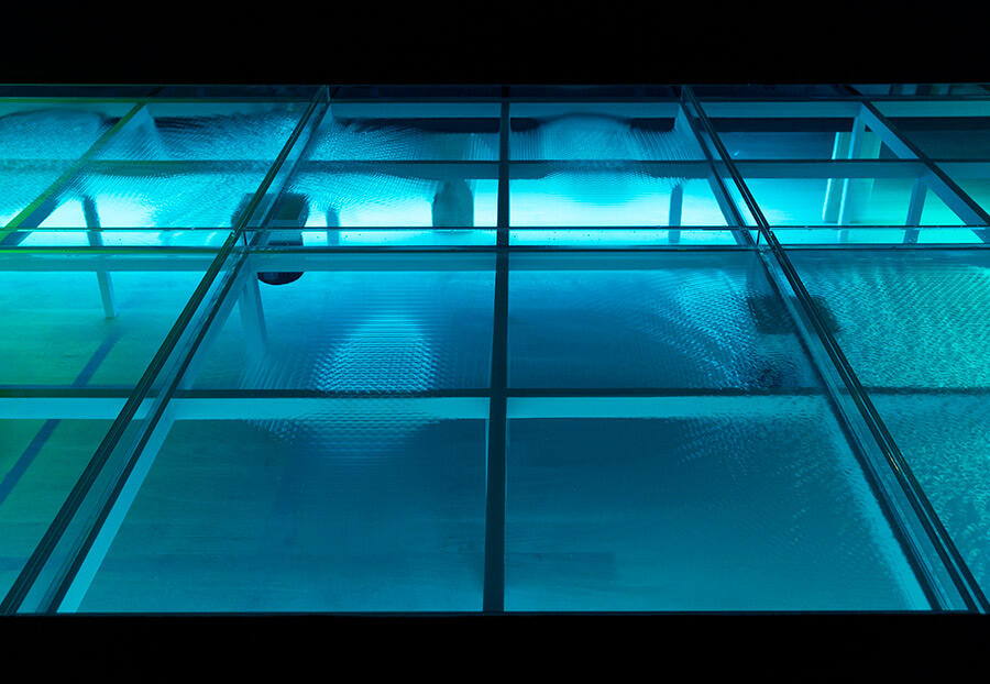
The extant neo-Greco columns of the building seem to be functional in terms of support, but they are certainly an aesthetic choice too given their elaborate capitals. I’m thinking about how function is aesthetic. For the exhibition, I designed and 3D-drew a platform build in order to install an artwork in the floor of the gallery rather than on it, thinking through the figuration and horizontality of a floor on a floor, and how big a sculptural installation can be while going largely unseen because it is perceived as architectural and infrastructural, rather than sculptural. Alongside this massive volume that isn’t so figured, I’m considering sound-image in and beyond the visible, and its spatial capacity. And of course, this platform will be ramped, as ramps work for more people than stairs do. They take up more horizontal space, but there’s room for that. So often we must live in a world built against us; it’s nice to get to make a little space with others, I’m starting with the ground.
Constantina Zavitsanos’s ‘fwiw’ is on view at Artists Space, New York, until 9 November
Main Image: Constantina Zavitsanos, Wishing Well (Korpí) [detail], 2023/24, open water (Korpí natural mineral spring water, distilled water and sourced mineral specimens), stereo sound and infrasonics, sine wave generator, speakers, transducers, acrylic, wood, LEDs, 424.2 × 210.8 × 48.3 cm. Courtesy: Artists Space, New York, and the artist; photograph: Carter Seddon.
Image description: In the dark, a modular structure set in the floor hosts open water that shows several distinct ripple patterns in motion on its surface.


