Experimental Jetset
Experimental Jetset play it straight. In staging their retrospective ’10 Years of Posters’ the Dutch graphic design group (Erwin Brinkers, Marieke Stolk and Danny van Dungen) adhered scrupulously to the unwritten code dictating how graphics should be shown in galleries. Their exhibition consists of 79 posters hung over three densely packed walls. Binder-clipped at the corners and hooked over transparent-topped drawing pins, they appear fresh-faced and informal. This mode of presentation allows them to teeter between the categories of useful object and discreet, contemplative image. It is an unassuming display in that it makes no great claims for the value of the posters in either sense.
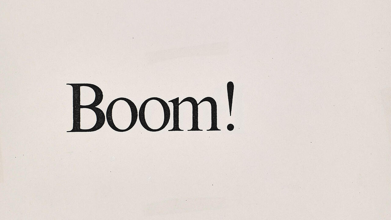
Not only do they play their exhibitions straight; Experimental Jetset also produce design that conforms to the most stringent of graphic diktats. Using the typeface Helvetica (varied with the odd sprinkling of Univers), keeping to standard formats such as the A4 paper size and tucking their type and image into well-constructed grids, they create graphic compositions that would have satisfied the strictest of 1960s’ corporate Modernists. In the post-desktop publishing environment, where the rules of graphic design have been kicked around by professional and amateur alike, Experimental Jetset’s conformity has become a quirk. It is a trait that many fellow designers interpret as ironic – a cynical take on a more optimistic era.
But of course none of this – neither the direct style of display nor the Modernist graphic foibles – is as straight as it appears. On the most basic level Experimental Jetset does not have a decade of work behind it. The group formed in Amsterdam in 1997 and they have fudged the dates by including some of their 1996 student projects from the Rietveld Academy. In a similar vein, they are not poster designers as such. Unlike the masters of the art, designers from early 20th-century France or mid-century Eastern Europe, they do not consider the design of posters to be a freestanding public art. Rather, these designs are part of larger graphic systems: on the exhibition press release they are described as ‘by-products’.
More significantly, Experimental Jetset’s conformity to Modernist strictures is neither wholly in earnest nor a mockery; it is a considered acceptance. Modernist graphic designers failed in their own terms – however clean and well made a graphic form may be, it can never float free of cultural, social and economic associations – but they succeeded in founding a potent graphic tradition, particularly in northern Europe. Experimental Jetset choose to stick with this tradition, justifying their use of Helvetica with the claim that ‘late Modernism is the folk art of the Netherlands’. Of course, tradition is exactly what Experimental Jetset’s role models despised, and the group’s regard for their work may be an unwanted consolation prize, but that does not alter the sincerity of their admiration.
For anyone outside the graphic design community these arguments probably read like tortured formulations around a simple exhibition of good-looking, intelligent graphics. They would have a point. Experimental Jetset’s posters are so clever and formally resolved, who cares what the Helvetica-haters think (a surprisingly vehement breed, mostly consisting of American designers who believed they had slain the typeface once and for all two decades ago)? I particularly like a set of three posters designed for the Terminal Five show – the 2005 New York exhibition held in the Saarinen-designed TWA terminal at JFK airport, which is largely remembered for its runway-storming private view. Matching sweeping statements from Filippo Marinetti, Laszlo Moholy-Nagy and Theo van Doesburg with grainy, beautifully cropped photographs of aircraft, they manage the seemingly impossible combination of being both exhilarating and anachronistic. Originally posted on the streets of New York, they were intended to look like adverts for a non-existent airline. Once in the gallery, their typographic rhythm appears less corporate than elegiac. Other notable projects include the extended identity for the Stedelijk Museum’s temporary premises in a former mail-sorting office near Central Station – a playful meeting between the graphics of the museum and those of the Post Office – and their map-shaped Rorschach ink-blots designed for the 2004 Dutch entry to the Venice Biennale, ‘We Are the World’.
Standing within the graphic-lined walls of Experimental Jetset’s exhibition, although struck by the elegance of their output, I began to question just how minimal their visual vocabulary need be. Not only do they regulate their typefaces and their formats, but even their colours are limited almost exclusively to black, white, blue and red. Their asceticism seems to have increased with the passing years, with the odd splash of orange or turquoise that may have appeared in the late 1990s being expunged by the turn of the millennium. As their work stands, they run the risk of making Wim Crouwel – the most hardline late Modernist of them all – look like M/M, the French design team fêted for its flourishes. If this kind of self-restriction has an end-point, what is it? And if it doesn’t, where does it lead? These questions aren’t meant as criticisms: I am genuinely curious. What happens next?


