


Francis Baudevin
Art:Concept, Paris, France
Art:Concept, Paris, France
For about 15 years Francis Baudevin has been making paintings that faithfully replicate abstract geometric motifs culled from industrial packaging. After all the text has been removed, these patterns are blown up on to canvases and walls to either 10 or 20 times the size of the original. At a time when anything goes, why would any artist decide to stick to such a strict, self-imposed working method? The fact that for many years Baudevin has limited his choice of motifs almost exclusively to pharmaceutical goods would seem to reduce even further the scope of his endeavour.
It is almost commonplace to note the influence of Constructivism on Swiss graphic design, with artists such as Richard Paul Lohse and Max Bill having worked in both fields since the early 1940s. In a simple gesture Baudevin refers these motifs back to their original form, which generates play between the indexical value of the object and its status as a work of art.
Of course, the relation between specialized, avant-garde art and popular, industrial culture has already come full circle many times. In spite of its successive attempts to define itself as a rarefied, homogeneous field, abstract painting has always been open to other disciplines. The first generation of artists to tackle the adulterated nature of abstraction dealt with generic forms - from John Armleder's neo-Suprematist compositions to Sherrie Levine's grid and stripe paintings. Baudevin's work, however, resonates with a specific, albeit discreet, vernacular culture. Unlike other European countries, Switzerland remains curiously iconophobic. Crisp, hard-edged geometric design makes up most of the everyday visual landscape. Cute animals or cartoon characters are only very rarely used to advertise retail chains or even, for that matter, corner shops. The country that spawned Helvetica has stuck to a grass-roots Modernist ethos. In a sense, while Baudevin's work highlights the relation between pharmaceutical packaging and Modernist painting, it also strives to investigate the process by which these forms become naturalized. This has led some commentators to see a Photorealist streak in his pictures - which, for an artist who spends days searching the exact translation in acrylic paint of offset printing colour values, makes a strange kind of technical sense.
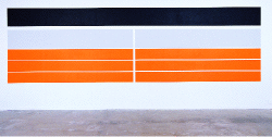
Why is it that when seen together, these paintings, which stem from an approach that has remained largely unchanged for over a decade, made for one of the most satisfying exhibitions I have seen in a while? Baudevin's work never registers as dry, Conceptual academism. On the main wall he painted large, horizontal orange rectangles - Untitled (Orange) (2003) - that, in high Minimal fashion, seemed to alter our perception of the whole gallery space - a kind of light-absorbent, ultra-matte flip-side to John McCracken's shiny, reflective finishes. Opposite it stood a typical 1950s Concrete composition (Colophos, 2002), but its deep purple colour seemed to throw it into a stylistic hysteria. Sitting at the front of the gallery, a small pastel canvas - Untitled (Viva la Rock'n'Roll) (2002) - drifted between mute introspection and remote Pop-cultural implication (it kind of looked like a flag). Meanwhile, a projected black and white image of the Tupperware logo (Tupperware, 2003) hovered across the gallery space (thanks to a night-club mirror), and gave the exhibition an icy sci-fi kick.
One of the most striking things about Baudevin is the way he manages to refigure art-historical models to create something new. Of course, this has always been the strength of good graphic design - and something the artist himself has never been afraid to do. In fact, he actually trained as a graphic designer, and his own particular brand of appropriation owes as much to the designer's working process as to a clear post-Conceptual lineage.
At this juncture Baudevin's obstinacy looks more and more like a ploy, a way of resisting the ideological rationalization that has accompanied the many 'returns' and consecutive disappearances of painting that have occurred since he started working. The artist seems to be reminding us that today there aren't that many ways available to make a good painting. Maybe this acknowledgement can spare us from the drudgery of repetition.


