Fuzzy Logic
The winner of the 2016 Turner Prize responds to Laura Owens's painterly nets and fences
The winner of the 2016 Turner Prize responds to Laura Owens's painterly nets and fences

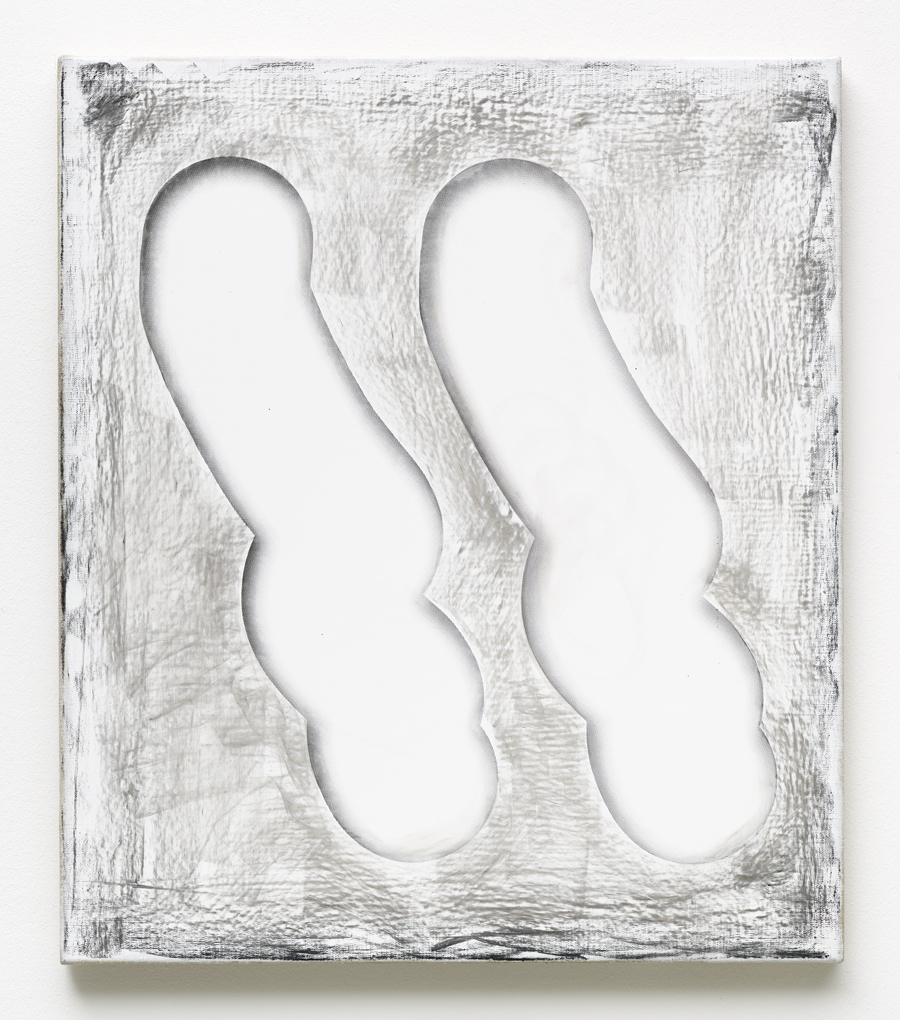
Two hypothetical bodily abstracts
Painterly scenario number 1: Spooning out your orbitals with a palette knife and slathering the provoked blackness of unseeing onto canvas; realizing panicked a desperate authorial need to sign or encrypt the work but suffering under this crippling new condition of blindness, being competent only to form a few gasping shitty smears, black on black. Caught in the smear, leftover optic nerves scatter micro traces of white, a deadpan but burning puncture of otherwise monochromatic tension that reinvents the attempted signatory strands as extinguishing fireworks in a sweet night sky. The metaphor is of dust on the lens. And in lieu of retinal clarity – of visual solids – we are in turn presented with an image of ideas, of memory or dreamscape information: tadpoles floppy and wet; guffawing miasmic spirits as medieval folklore might depict them (crudely figurative in lunatic silhouette); finger traces on a habitual device; slowly dying sperm in a yeasty boil of spunk; pregnant flies smashed at speed into a windshield. All the scatological basics, really. And the impulses here are as light and time-sensitive as a Polaroid. You can see crusts of red and purple at the edges where whatever speedy paintover-job worked to disguise the underlying tones is still just visible in the sense of an implied lamination. The condition is one of temporality, but one that has been fixed just for a moment. Paint hasn’t extended to the edges of the canvas, and in its brushy insistency on a visible edge is the implication of another scene change, another attempt at authoring a new vision from inside the scruffy rectangle.
Painterly scenario number 2: Unstoppable Epitaxis – a colossal nosebleed. The body’s gravitational litmus of excess, pressure, attention; you could call the nosebleed geographically signatory, a ruddy river of human typography. Wipe your nose with an already sullied tissue and unfold it to behold an Expressionist pastiche. There is a libidinal plasticity to blood and paint alike. Philospher Richard Wollstein’s 'two-foldedness' describes an eternal condition of humour (ie. not pure abstraction), which allows us always to see beyond the surface of the painting itself – a narrative plane where even the simplest blob or vector squiggle becomes a contaminated thing, a vehicle of metaphor, a description, a body, a conversation. Image making is the making invisible of the formal descriptive language that we give to marks: there are no more edges or wiggly lines. In these paintings we understand there is a subject and a predicate and words are spun into nets of visual and graphic action with all the expediency of a linguistic spider. As viewers with experience of the immense physicality of a world around us, implications of material transformation are readily legible: tides ebb, liquids flow, steam expands, carbon burns, iron melts, powder explodes, leaves tremble, worms crawl, hares lope1.
Ghost markers
Light falling through the suspended gridded ceiling in Monet’s La Gare Saint-Lazare (1877), creates a trapezoid wedge of skewed squares at the bottom of the painting’s frame. The implication is of one of pure physics, a quality of light, refraction and perspective that gracefully mutates an economically naked structure into a fleshy and neatly patchworked yellow grid. Through greasy, chubby smoke the implication is of a condition of order that is native rather than applied. Even buildings in the background appear as though built from this smoke’s emotional wispiness, the violet grey of architecture and smoke alike a kind of evanescent revenge on entropy. And outside the image frame, no brick building fully gains expression until the rungs of its masonry are neatly hauled into place: this is their graphic facade and it’s a continually renewing paradox. Chaos is on the surface; their bones are the beauty2.
This making-flesh of the transformative mutations of light and time is a painterly tactic riddled with wonderfully exponential corruptions. Fuzzy Logic is an approach to computing and analytics, which describes degrees of truth rather than the conventional binaries of true or false. To some extent, the paintings here might be seen to be bending to a similar set of algorithmic properties. Painting as an action is given visibly worded instruction: blur and original. Between these two states of being is a grand phenomenological crisis, an ironic dissolve of authorship in the sense of relinquishing optical legibility to technological adaptation. Paint as a literal substance – as a medium – is aroused through deliberate 'misuse', through corruption of our initial visual interpretation of it. We see daubs, drips, rasters, patchwork, smears, scratches, viscosity, gloop, liquidity, tears and pixels. But the causality of paint on canvas is made treacherous by instances of deliberate digital remove. Flatness is the topography of choice where we are visually duped to read contour and 3-dimensionality; drop shadows propose a weird empathy suggestive of the painter’s desperate default position of trying to capture authorial indelibility. Laura Owens’ brushstrokes are mobilizing units, isolated cartoons of painterly action - economical cels – which might serve to scaffold further painterly propositions. They illustrate a softly empty space, their perfect roundness generated algorithmically by a computer program whose only impulse is to ensure an ecstasy of baby softness. Angles of distortion, opacity and gradient are logged and charted in neat graphic columns in bottom left hand corners; yet the physical ingredients (volume, weight, materiality) are visibly undefined.
There are so many foils and false abstractions in these works it is possible to see them as an index or set of appendixes for other works, as though you could ink-dropper an infinite fill from these soft bodies to erase or reposition content elsewhere. These marks are perhaps in essence the most virtuous or elemental because they enable a kind of pre-authored ventriloquism that dissolves responsibility to jargonized (male!) histories. Sardonically analogous with the figurative centre of Pollock’s Cut Out, these quivering marks are facialized in the sense of becoming anthropomorphic approximations: like Caspar the friendly ghost, we know the vanilla mash of flesh is immaterial, dead even, yet it wields spectacular personality. As micro-zoom isolations, these brushstrokes mark premonition of a forthcoming wild and painterly landscape, but in their near slapstick stance against ejaculatory splat they silently repurpose and recharge a new Feminist rhetoric. They are preliminary thermometers. To proffer the idea of extreme minimalism being simply a fur coat turned inside out might allow these digitized forms to be seen as a Benedictine attempt at denying or reframing the decorative nature of any works to come. Masterful and initiated, this vacancy is no doubt specifically duplicitous. The canvases of these works are silent to the extent of being visually empty but the implication of swollen surface skin proposes a stalling or buying of time before the point at which a more legible (or congested) pictorial set of problems might emerge.
Oil properties; values fixed
Simple vector proposition is also the logic of the child’s colouring book. The vector is expedient, but caught in a state of contingency too: it is an aggregate of consistency in the sense of desiring to align many hidden mathematical points as a reductively regulated and well-behaved form. The place just before a curve happens in 3D computer software (a pre-render curved line only exists as tiny joined sections of straight edges) is oddly liminal. In a strange sense, it is the place at which information is, for a few split seconds, truly honest: the geometry is exposed, all the intention, the struggles, the carefully plotted points. In working the lines or vectors of a shape – a teapot, for example – you are playing with the tessellated edge of volumes before they become softly animated shapes. A hand can’t draw a curve anywhere near as fast or as perfectly as a computer. A digital drawing package strips out the anxiety of wonkiness, there is no chance of a breath disrupting the flow of the hand, none of the snaking fever of a body’s pulse, no pencil marks, no erasure. The computer vector provides a border or an edge though which ideas and pictorial marks must pass (or be contained). Crests of paint can lap over these edges and still feel definitive.
The paradox of the vector line in painting is the intermingling and degradation of its timescale within a lexicon of other more sporadic or painterly gestures. The vector in graphic or public-realm usage is often a single bold colour; it is frequently black, solid and unwavering. In Laura Owens, the implied violent blackness of ink toner sits edges away from the grating roughness of speedily applied graphite. Here is a deliberate erasure of emotional temperature, but the line is just as easily subject to minute breaks and recalibrations of colour, line length and density. Paint renders it intuitive. Just as trees morph from blushing Autumnal heads to writing their strange calligraphy against the whiteness of a winter sky, so too does the vector line perform in a kind of seasonally fluctuating manner. Quick un-laboured brushwork with the touch of a caricaturist can divert visually solid lines to a more stumbling legibility of skittering dots and dashes. Murky white shadows or fleshy pastiches of junk emphasise unseen structures of Cubism, with overlapping forms, negative space, collages and cutouts biting afresh to forge new 3-dimensional forms. Paint has a strangely uncomfortable relationship to external geologic reasoning: it is elastic in some instances, sticky, slippy, scratchable, parched, granular, cracked. Its essence is unruly, but this is not a flippant teenage obstinacy, more an ancient set of productive problems: sometimes it flows and pours, and at other times it must be cajoled and forced unwillingly into application. Materially, it seems perfectly erudite and respectable to think that oil paint will move nowhere when mixed with water. Nylon paint - more chemically unhinged and often put to work in screen printing - is possessed with all the elastic springiness and potential energy of a rubber ball.
Visual matter here is continually tangled between the two- and three-dimensional. It is possible to read flatness in both a hard outlined graphic, but also in something material and lumpy that is unthinkingly reverted back into planar space because we are habitual creatures of the screen. It is impossible not to think about technology’s impulse to sanitise the bristling bloodiness of painting, to subject every moment of viewing and digesting information to a malaise of optical impatience. This treachery of timescale is particular to the process of screen printing and is determined by the order in which visual information is delivered: how image, materiality, exposure, size, flatness and imperfection all run off at different speeds towards a punchline of legibility. Common visual intuition is not what it seems: Which layers come first? How does a more transparent ink change on top of white versus cantaloupe orange? If you make a printing screen with dispersion dots to connote the perfect evanescence of smoke, will its sensual arabesque quality be fully conveyed? As a process, screen-printing is impossibly full of allegory and shorthand. Any solid vector colour needs its own screen, so the necessity of determining a hierarchy is implicit from the beginning. It might even be possible to think of screen-printing as a metaphysical start where infinity, or perhaps more cosily, a state-of-finish does not exist. Screens can be used exhaustively; they must be repetitively cleaned, dried and taken care of; the emanating smell of inks, cleaning fluid, thinners and catalysts is positively hallucinatory. Screens can be wiped and re-exposed in the swiftest of moments. The labour involved is vast, but spookily eliminated from the final flatnesses which emerge. As a process it is both autotelic and possessed of multiple invisibly implied conceptual laminations. The idea that you are forcing ink onto a substrate through a mesh screen is also a beautiful paradox of authorship: the thought that instead of catching information, it is being physically pushed out, only to find itself freshly receptive amidst a jungle of other marks.
Even weave
And this jungle, although at times ripe and rakish, is often mapped against a formally demarcated space. In Laura Owens, there are grids, chequers, graph lines, pixels, nets, fences, weaves and skeuomorphs of all of the above. To further galvanise the thick tautological accretions: images of gorgeously embroidered samplers swell from raggedy sets of pixels, screen-printed via mesh onto canvases with visibly pronounced and geometrically visible grains. Squares of all kinds - apertures, colour-fills, panels, exits, quantifiers - breathe and collapse in exponential sequences of compression and spillage. Within a single canvas alone there are windows which open onto schematic cutaways of a domestic home: there are motor cars, cats and curtains. This home is bordered by brick cornices, ornamental fences, a sprawling tree and shrubbery of alarmingly diverse taxonomy. Marks are schematised but enormously generous. The optical effect is dizzying - paint as literal rhizome - shooting stems and leaves out onto the topmost surface of the painting. This hyper magnified and associative foliage is in turn supported in a backwardly-visible manner by trellises in waxy environmental lime, forest greens and tropical minty teals. The pictorial depth of field and contextual size relationships are masterfully corrupted, impossible even. It is almost as though chloroplast cells are bursting against a lens and we are watching an osmotic dance of juicy green matter move in differently swelling seas of concentration. This is not paint applied to the silent vacuum of plastic or metal, but performing a more audible kind of visibility: a smooth surface assumes heterogeneity, but here all about is the rub and vibration of multiple grains, an open weave scramble!
With grain or ragged edges there is implicit information and muddling - imagine the dirt caught in the seams, the dust gathering on the steppes of those edges. The grid is a motif of mapping and order, but in Laura Owens rhythms of structure and visual turbulence are in constant flux. Cross-stitch presents a mirage of information: from the front, it is pictorially rigorous, deploying many neatly focused X’s of colour, but the reverse side is often a sea of knotted and trailing chaos. Embroidery of any kind is a decidedly analogue practice: it is slow and humble, Quaker in its self-effacing chasteness. Although cross-stitch shares in theory the same image generating logic as the JPEG, it is not possessed with the same sense of poverty, the same rough crassness of decay3. Cross-stitch feels majestic because its actions towards economy are deliberate and carefully plotted. The pixel in contrast exists in instances of content degradation, the visual exemplar of digital failure. Pixels are a well-meaning surrogate, a speedy filler, but can be represented at best as only three or four component intensities: they are a simulacra of content, a rainbow Tetris of RGB and CMYK piled with philosophical wizardry one block on top of one another. The pixel is described as the smallest addressable element of a digital image, a visual illustration of the empirical problem of focus: how far we can go to describe what we cannot clearly see? The pixel is perhaps even exemplary of the habit of outsourcing our brains to other mechanical devices, a simulation of our desire to continually refresh, supply and substitute cognitive threads. Even the name is a squashed linguistic portmanteau - picture and element rammed together like an atomic orgy gone awry. The geometric colour field, which represents many hundreds of pixels is possessed by an eerily vibrating force. But where painting dissolves, is transient and sometimes fleeting, the pixel, like the cartoon, exposes itself dumbly to receive animation. It is objectified, and at times empty or silent. It can be both artificial and resisting movement, yet also active or infected. In painted form, (or photographically reproduced) pixels represent an image like holding your breath, where the impulse to inhale and the choice to continue without oxygen are unspecified and incomparable variables. Imagine a rolling sea, a volcanic eruption, wind in the sails, a lighthouse, a sunset all described in paint via a mosaic of little squares. Up close visual promiscuity is no more articulate than a dumb bitmap grid, but with distance a shimmering landscape emerges. This deliberate dragging of the gaze through multiple surfaces of image clarity is an act of painterly subterfuge, a deploying of colour-as-camouflage. Even in the real, organic forms seen at micro scale are composed of many hard, angular surfaces: look at a snowflake under an electron microscope and any initial impressions of ephemerality are reversed by the vision of many hundreds of gorgeously interlocking Brutalist forms. There is great pleasure in this distortion, in forcing nano-scale to the fore like a permanently magnified facade or prophylactic against the inevitable moment when information is emptied out and exhausted.
Nets and fences
In a tennis-themed painting from 2016, a cartoonishly inflated figure serves a flat yellow disc of paint into space. The ball and figure alike are without shadows and similar to the brushy washes of paper-green glued into place, these forms feel like volumetrically flattened appliqués. All components of the image hang upside down in defiance of gravity, with the whole canvas framed by a frieze border, graphically overlapped like the embroidered straps of a backpack or haberdashery trim. The strings of the racquet are so deeply pixelated as to suggest a spongey fuzz of softness. Instead of the accelerated swoop of a neatly curving power serve, the tennis ball is spooned out into space, a dribbled action riddled with comic corruption. Even the ball itself is missing several crescents of definition, whilst a parasitic doubled version in washed out pixel-display sits behind like a lousy pale lemon shadow. The content of the whole work is subject to a continuous tragicomic meltdown of information: the skin of the face and torso is partially vacant, with the knees and feet represented by a schizophrenic chaos of multi-zoom, dissolve and erasure. Nets are composed high above eye level, with painted, screen-printed and physical instances of netted forms collaged relentlessly atop of one another. The whole painting is like a taxonomical scour of the quality of net-i-ness! How one material representation might outdo, recompress or outsource its own data to another realm of informational dispersion. And against this morphing sea of squares, the thread count of the canvas itself is visible, as though its basic and discrete voice might be extending a quiet parable of the exponential powers of the universe to shrink and expand before us.
In Infinite Jest, an ambiguously authored monologue declares, 'Nets and fences can be mirrors. And between nets and fences, opponents are also mirrors'. The reference is to the obsessive tennis and logic games played throughout, but it parallels as well the continuous self-reflexivity of painting’s position as a possible refractor of social and philosophical phenomenons. Painting has spooky temporal diagnostics: its default expectation is to riff on the past yet not disappoint the future. There is so much meta-meaning, all those surface distractions, distortions, projections, nonsense and dead ends. What about the conjuring of light, or the deliberate swallowing of it? Or painting for pleasure’s sake, for mood, intuition, respite, delay or arousal. Or for the routine bounce-hit logic of striking a conversational rally. In process, the anxiety of an imposed blockade or reflection might be a strange catalyst for inventiveness - for the productive thinking in meshwork (in nets that extend to other nets) that happens tangled in an upside-down tennis swerve. This is a beautiful comic book visualisation of idea exchange: a scrambling of intensities or burning migration of data, pounded laterally back and forth above a physical barrier before eventually snagging in a pre-constructed mesh. This of course is a wild extrapolation of purpose, but in the warp and weft of all language and visual fibres is the potential for fruitful distortion. These are mutant abstract lines that are both separate and inconsequential to the real world around us, yet equally essential and toxically fresh. Even the band-aided knee and quiet pharmacy cross in the painting’s top corner attest to the discriminate language of painting as a prophylactic, a sermon, a comic enabler: this is a constant adjusting of impurities and the possibilities are chemically delirious.
1) Reed and Kellogg; Diagramming sentences, 1877
2) Phillip Guston: The Studio (AFTERALL); Craig Burnett; MIT Press
2) Hito Styerl; In Defense of the Poor Image http://www.e-flux.com/journal/10/61362/in-defense-of-the-poor-image/


