Louise Lawler
In older novels, especially in older French novels, place names are often signified by a long dash: 'We were on our way to -- when our carriage was stopped by a stranger'. This dash has always intrigued me. Was it rude to be too particular, too specific about places? Might a definite location improperly divulge the true identities of the tale's participants? Or was it assumed that the 'where' of something that happened simply didn't matter? I've always suspected that it must be a combination of the two, but I still feel slightly miffed at not being in the know, a little petulant in the face of an unknown triviality. Venturing toward Chelsea, New York's new artistic neighbourhood, I had an experience of that dash: 'we went off to -- in order to take in the new pictures'.
It turns out that Chelsea is quite different from SoHo. The galleries are much larger, industrial in scale. Although SoHo began as lofts in a run-down manufacturing neighbourhood, the scale of those spaces has become familiar over the years. It is not too much of an exaggeration to say that SoHo's spaces now feel domesticated in comparison to the vastness of the new Chelsea galleries. After all, people live in lofts similar and adjacent to the ones colonised by the SoHo galleries.
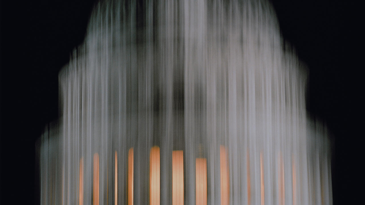
The effect of this change of venues is quite striking, and Louise Lawler, ever the uncanny photographer of context, is, in her inimitably quiet and cunning way, once again deftly up-to-speed on the transformation. Her recent exhibition contained several new sumptuous colour photographs, shown in conjunction with an installation of her older photographs of art in private homes. The new works are documentary-style photographs of the renovation of Metro Pictures' new Chelsea space. Lawler found passages of the gutted building where squares of densely coloured painted brick walls (lapis lazuli, blood red) were trimmed by one or another architectural element in the process of being dismantled. Every photograph was so saturated with deep primary colours that when the gallery press release evoked colour-field painting one actually nodded in agreement. The photographs were large in scale and shiny. The net effect was that one's reflection uncannily followed one around the room. Here, true to Lacanian form, we were in the picture.
These oblique installation shots turned on a sixpence, however, as one moved into the back gallery where Lawler's now familiar older work was installed a paperweight, images of art in living rooms, dingbats made in collaboration with Allan McCollum. Discreetly silk-screened on the wall was a quote from Lynne Tillman: '...but does anyone really know anything other than by comparison?' This simple question got to the heart of the complicated problem of taste, that slippery terrain of preference and class. The exhibition suggested that what we know about art we know through the differences between the contexts in which we encounter it. The appearance, much less the meaning, of an art object, is always contingent upon the vagaries of place, and every place is saturated with the markers of taste. Lawler has always been funny on this score (paperweights, indeed). Her work has often pulled at the loose threads of tension and ambivalence inherent in art practice and aesthetic enjoyment. Here that pull threatened an unravelling, opening up a question which seemed if not sufficiently theorised then at least old hat: why are galleries white cubes?
In Chelsea one is struck by how similar the new galleries look: analogous sky lights; equivalent enormous storefront windows; identical poured concrete floors; the same tasteful brushed aluminium; similarly 'decorative' exposed architectural elements a little rough brick here, a rusted pipe there. Galleries were the same in SoHo, yes, but from the deep colours and textures in Lawler's renovation photographs, there emerges a nagging question. Why has the model been repeated here? Why now, at the oft-mentioned end of the millennium, has the white cube model been reproduced with such rigidity? The humour of Lawler's photographs of art objects in domestic spaces aka collectors' homes came from the compare and contrast model that is constitutive of both art history and taste. Now her photographs seem to ask, if all the galleries look alike (and, significantly, look like up-market fashion boutiques), how can we compare them? How can we be sure that industrial white cubes are the spaces we prefer? What version of taste does their resolute whiteness embody?
The spaces in Chelsea are beautiful. I quite liked them, but I was reminded that, in the realm of taste and preference, the generic is almost always translated into the specific. Oddly enough, however, Lawler skewed that trajectory: the specificity of one gallery's renovation exposed the desire for an experience of taste or aesthetics to appear generic. For although the gallery's dramatic representation of the white cube still pretends to neutrality, the overwhelming similarities between them exposed their taste after all. 'We had been to -- and seen the new pictures'.


