A New Brand Identity for Frieze
Luke Powell, Partner at Pentagram Design, talks about Frieze's rebrand
Luke Powell, Partner at Pentagram Design, talks about Frieze's rebrand

Unveiled earlier this year to coincide with Frieze’s 30th anniversary, the new logo and branding were designed by leading studio Pentagram Design. We spoke with Luke Powell, Partner at Pentagram Design to learn more about Frieze’s new brand identity.
What are the ideas behind the brand design that Pentagram has created for Frieze?
It all really started with what Frieze wanted, the central and most important thing was the unification of the brand. Over the years, due to the way Frieze has grown, different identities were born as new projects launched and consistency needed to be created to bring these different elements together. That was our starting point and we looked at different ways that we could create uniformity across the brand.

How did you design the new logos? There’s a lot of cultural heritage behind the frieze magazine masthead (created by Tom Gidley and later redesigned by Paul Barnes) and the stencilled logo Graphic Thought Facility designed for the art fairs. Was it challenging to create something new that also honoured this heritage?
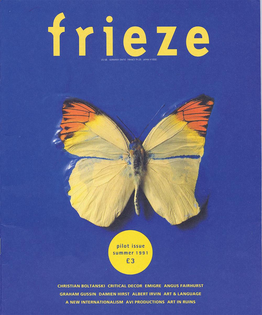
We looked at where all these separate identities sat within the architecture of the brand and where we needed to create difference, and if this was valuable or wasn’t. We also looked at ways to retain the stencil feature of the GTF logo and the typographic details of the magazine masthead, but it quickly became apparent that this was not going to work and it would do a disservice to the beauty of those previous identities and wordmarks.
The Tom Gidley’s masthead represented the birth of Frieze, the moment when Frieze became recognized because of the critical content of the magazine and its approach to art writing. The soul and the DNA of Frieze was really bound to that masthead; that’s actually where the reputation of the brand stems from. This 5-letter wordmark became our starting point and where we could keep the heritage of the brand.

Frieze Fairs have been known to use bold colours to distinguish between each art fair. What made you choose black and white as the colour palette for the new branding?
This was fairly simple decision, we wanted to bring Frieze back to be all about the art. Brands can get incredibly confused when you are forced to add multiple colours. Frieze has access to amazingly visual content and we felt it made more sense for the brand to be content-led rather than being colour-led. The campaigns and the artists that Frieze works with can make the fairs unique and recognisable – you don’t need colour for this.

What’s the new branding going to bring to the magazine’s look and feel?
The change is so minimal that I don’t think most people will notice that the magazine’s masthead has changed, and it’s not a bad thing; it wasn’t our aim to make a difference there. How people respond to Frieze as a whole, and how they see the whole brand will change, because all of a sudden people will notice that everything is part of the same thing.

What do you want Frieze’s audiences to think and feel when they see the new brand identity?
I hope that the relationship between all the different parts of Frieze, the magazine, the fairs and all other initiatives is now being made clear. We hope the new design has made Frieze more accessible, the new branding is refined and minimal, but it’s open and democratic enough as a design that it appeals to everybody. It was really important to us that it felt like an identity that works for everybody. Art can sometimes feel elitist and if the identity we created makes more people think that art is accessible to them, that would be a massive win for us.
What do you love about your work?
It’s graphic design, what’s not to love?! You sit around having ideas, making them real and they are all visual and creative. The reason why I decided to get into graphic design it’s because I love helping people communicating their ideas and realize their dreams and aspirations. That’s a fantastic thing that graphic design can do. I love the idea of accessibility to information. So many people can’t get access to some information and if there’s anything that graphic design can do is help to get this information out to more people.


