New Identity
How do you rebrand a museum?
How do you rebrand a museum?

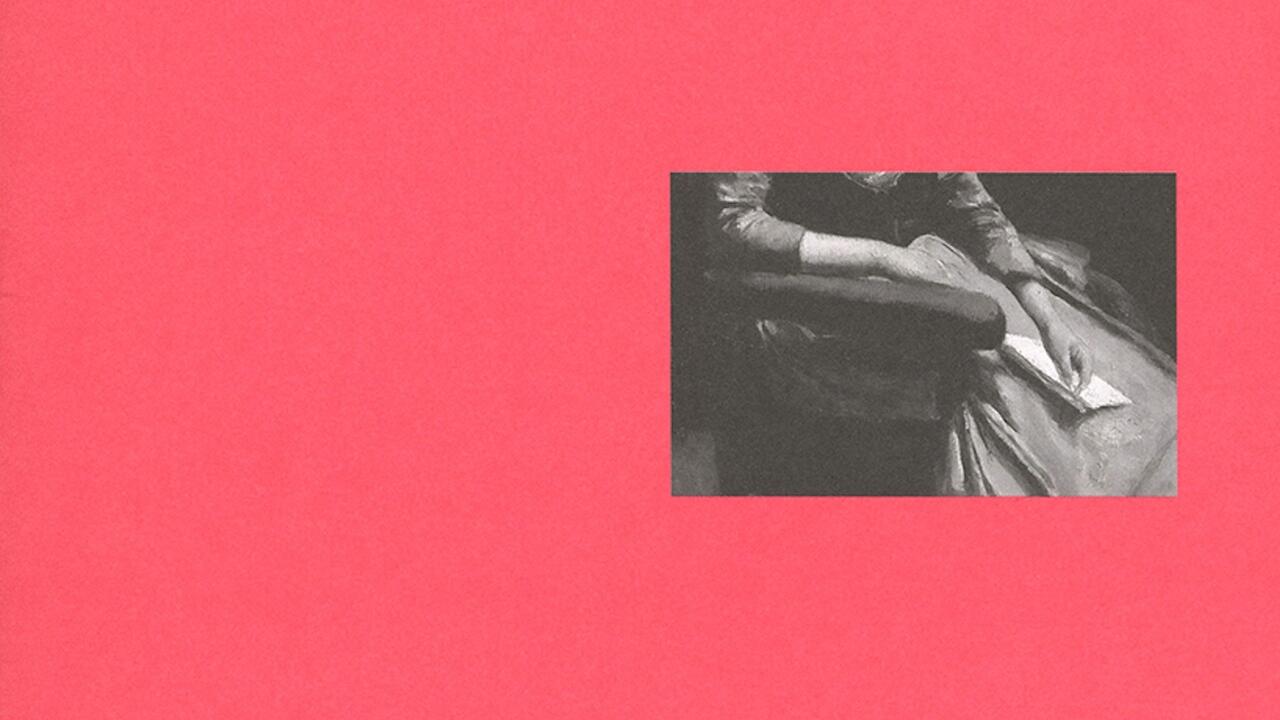
Het Nieuwe Instituut (The New Institute) was founded in Rotterdam on 1 January 2013, the result of a merger between the Netherlands Architecture Institute (NAI), the Dutch design foundation Premsela, and the Virtueel Platform, a government sponsored organization for digital culture. Spun by the then State Culture Secretary, Halbe Zijlstra, as a response to the convergence of disciplines, it was generally thought to have more to do with the cutting of funds. In the dying months of the old bodies, the new organization’s director, Guus Beumer, commissioned a temporary graphic identity that was surprisingly explicit about the institutional wrangling. It was the creation of Karel Martens, a veteran Dutch graphic designer who is known for his sustained experiments in printing and over-printing, and comprised redundant stationery and marketing materials from nai, Premsela and Virtueel Platform over-printed to obscure all previous information save what can be glimpsed through three symbolic dots. The outcome is quite brutal, yet it is mitigated by the odd stripe of beauty that comes from mixing inks in unlikely ways – metaphoric rays of hope. The online identity operates in a similar way, with a grey veil falling over the former websites through which it is possible to access the still-relevant information. From outside the Netherlands, it is quite hard to decipher, but that doesn’t detract from the power of the strategy. Whatever Het Nieuwe Instituut’s ambition, the politics of its transition are a national matter.
Martens’s design is rare in making a feature of such machinations; yet ask basic questions about the recent crop of new identity designs for comparable institutions in Europe and the United States and you will arrive at related issues. Times are changing for culture in the public sphere and this is reflected in its graphic self-expression. In the Netherlands, the recent big identity stories in the cultural sector are the designs for the Rijksmuseum and the Stedelijk, both institutions that recently reopened after much-delayed renovations. In the case of the Irma Boom-designed Rijksmuseum identity, the controversy around the ten-year refurbishment is counteracted with a hard-to-dislike sans serif. The logo has two small quirks: an ‘I’ and ‘J’ digraph, which is in keeping with Dutch typographic tradition; and a small gap between ‘Rijks’ and ‘museum’, which perhaps renders the name slightly clearer to non-Dutch speakers. The final score is a neutral draw: locals 1 – tourists 1. The identity’s fullest expression is on the museum’s website, the most noteworthy element of which is Rijksstudio, a feature that allows the public to download images from the museum’s collection to use as they wish. In many ways, it is a natural development – if these pictures are part of a national collection then they should be available for public use – yet no other museum has done anything like it. It is a radical act of conciliation.
By comparison, the house style for the Stedelijk is a prickly affair. It was born out of conflict when the incoming American director, Ann Goldstein, sacked the French designer Pierre di Sciullo – who was already quite far along with his design for the new identity – and replaced him with the Dutch team Mevis & Van Deursen. Since its launch, the identity has continued to provoke. The new centrepiece is a logo in which the museum’s name is spelled out in sans serif capitals arranged in the shape of an ‘S’. The designers’ references are to type in art, particularly concrete poetry, and the typography resists finesse in a fashion that has riled many of their colleagues. Rather than trying to look right, it simply follows its own logic. I think the potential applications look promising, but what I appreciate most of all is that the Stedelijk house style might help stretch the limits of what is considered possible in the field. Over time, the logo will begin to appear normal, at which point it could become a base on which other designers can build. The combination of insecurity about public funding and the need to attract private wealth is likely to promote conservatism in those commissioning graphic design for galleries in Europe. Anything that counteracts those forces is welcome. This assumes that the identity will be granted the time it takes to become familiar. Goldstein left her post at the Stedelijk at the end of 2013 and her replacement will be announced soon. As graphic designers well know, freshly appointed museum directors tend to want to express their ambitions through newly designed identities.
The most prominent recent museum identity project in New York – for the Whitney Museum of American Art – was also the work of a team from the Netherlands, Experimental Jetset. Launched in spring 2013, the redesign was prompted by the institution’s move, scheduled for 2015, to a new Renzo Piano-designed building at the southern end of the High Line. It’s unusual for a house style to be commissioned so far in advance, but in this case it was done so that signage being installed in the new museum would be in keeping. Whatever your feelings about the Whitney leaving the Marcel Breuer-designed structure at Madison and 75th, you can be comforted that the details of the project are being thought through. More than two years before the opening of the new Whitney, Experimental Jetset’s work was done. In print, the execution of the scheme is now in the hands of the museum’s internal design team, while online it is the responsibility of Linked by Air; the signage in the building is being realized by Entro. The most noticeable feature of the Whitney’s new house style is a hairline sans serif capital ‘W’ of unfixed form. Depending on how it interacts with the images around it, in some cases it is obviously the initial, in others it is more of a crooked line. Experimental Jetset named this ‘the responsive W’; they see it as a metaphor for the indirect path of art history, the heartbeat of the city and the institution, and the dialectical pull between the past and the present. They also point to formal echoes of the ziggurat-like shapes of both the new and old Whitney buildings, the waves of the Hudson River and New York graffiti. The analogies strike me as those of tourists, not residents – a comment I don’t intend as pejorative. Identity design can get bogged down in issues of, well, identity. Apart from the ‘W’, Experimental Jetset specified the use of a recently redrawn Neue Haas Grotesk printed black on white. In all, the house style is an unusual mix between strict typography and a playful logo, which makes it a particularly brave choice on the part of the museum. Usually entirely privately funded, American cultural institutions tend to be highly competitive. Perhaps the Whitney house style reflects the bullishness of those responsible for the museum’s move, with its director Adam Weinberg making noisy claims for the features, such as the ‘largest column-free spaces to show art in New York’.

While the Netherlands is exporting designers to the us, the us is exporting billionaire trustees to Britain. Since stepping down as mayor of New York City at the end of 2013, Michael Bloomberg has taken up the post of chair of the trustees at the Serpentine Gallery in London, which has also recently commissioned a new graphic identity, although in this case it was launched at the same time rather than in advance of the opening of its new Zaha Hadid-designed Sackler Gallery. It’s the work of Brian Boylan and Marina Willer, who were responsible for the branding of Tate in 2000, and the letterforms of the logo bear an immediate, if superficial, similarity to Tate’s custom face – although rather than being all curves like Tate, they do have the odd right angle. The type is described by the designers as ‘challenging and approachable’ while also conveying the Serpentine’s ‘democratic spirit’. Presumably, rounded ends equal approachability, while points equal challenge.
Shapes of letter ends aside, the most significant element of the logo is an aperture that can be placed at different points within the word ‘Serpentine’ and filled with an appropriate image. So far it’s been rendered on banners at the gallery as a block, in a leaflet filled with promotional images of Hadid’s building, and in various other self-promotional manifestations showing generic park pictures or digitally generated imagery. According to Willer, it’s intended to reflect the fact that the Serpentine is ‘totally open’ in that entrance is free and the work it shows is interdisciplinary. In 2010, the New York-based design team Project Projects evoked a similar metaphor in their design for the identity of the Istanbul cultural institution salt. Creating a typeface called Kraliçe, in which the letters of the institution’s name remain incomplete, they invited various designers to fill in the gaps. There have been six versions so far, each one serving as the identity for four to six months. While the opening of the Serpentine’s new identity (a few weeks old at the time of writing) remains blank, salt is gathering a collection of typographic proposals that could have a life beyond the institution.
Although open to the public, salt is funded by the Turkish bank Garanti and thus is not publicly accountable. As such, comparing its identity to that of a European public institution, with its delicately balanced mesh of government, corporate and private funding, is not entirely fair. British public galleries have so many boxes to check that they tend to use graphic design as a means of dealing with those they fear have been forgotten. Tate Modern, for example, is a potentially scary structure – it looks like somewhere you might be processed – and at the outset its graphic identity appeared to be an attempt to give it a friendlier mien. That said, although disappointed by the scheme on its launch, over the years I have been impressed by the way individual designers have adapted it to fit different situations. Also – it’s almost too obvious to say – while a great gallery can mitigate a poor identity, a subtle and intelligent scheme can do nothing for a failing institution.


