Pae White
If Pae White's work is about anything it is about seduction: how a successful picture or object gets your attention by first offering what you want only to twist that into what it thinks you need. Through her use of rich colours, sumptuous materials, voluptuous shapes and leggy type, White is capable of weaving some rather captivating webs of her own, successfully pushing our pleasure buttons while teasing our deciphering gene. Equally impressive has been the confusion of her intent: as a 'designer' White might do something primarily for herself and as an 'artist' she might respond to client command. Neither activity supersedes the other, and of course it works the other way round too. That's the point.
Of all the artist/designers today White is one of the few brave enough to surrender the distinction and admit that the two jobs are virtually interchangeable, as are the distinctions between private and public work. To White's credit, she just works, engendering as much enthusiasm for other people's projects as she does for her own, because whatever form an idea might initially take - book, poster, picture, object - the culture-at-large will be responsible for sorting it out. Either everything or nothing that Pae White makes is art, and you get the feeling that that's fine with her.
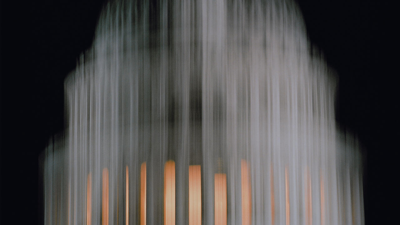
Nonetheless, her skilful obfuscation didn't save this from being a lacklustre show. There was little of note in the eight images leaning against the gallery's far wall except for a vague, mid-80s feeling of various media merged into slab-like picture/objects: cibachromes mounted on plywood. Aside from the cover art for the exhibition, a digitally-generated, 'family-of-man' montage overlaid by the phrase 'animal flood', the remaining seven panels could have been categorised under the heading of 'water themes'. Indeed, on closer view they dissolved rather than focused, the literal depiction of amorphous bodies in water giving way to the more imaginary flux of digital processing. Three shiny pills the size of hockey pucks lay on the floor in front of one of the panels, their surfaces reflecting and further distorting the image. The panels were titled with black graphic silhouettes of animals, both exotic and common: a squirrel, an alligator, a goat, a monkey...
All I could think was: I hope to God this isn't about the fluidity of electronic media and the random categorisation and dispersal of images made possible by the internet. Unfortunately, it was, and the calculated 'betweenness' of the picture/objects was a way of accounting for their status as art, a flat acquiescence that was neither ingratiating nor mischievous. Better were White's 'Ponygirl Editions': found images of women done up in bridles and boots overlaid with 'graphic identities' for Tokyo, Munich and Silverlake, CA. Whether real or contrived, the extreme precision of the fetish and the diversity of the locales alluded to how, at this point in time, any one thing can be cross-referenced with any other thing to create an instantaneous, arbitrary kind of 'information'; information that someone, somewhere probably already has a use for.
On the gallery's front desk were copies of a book that White had designed to accompany her show, including reproductions of some of the works in the exhibition and pieces of fiction by Lisa Anne Auerbach, Max Lark and Meg Bradbury. Immediately I was pleased, because I could tell that this was what White really wanted to do: make something more subtle (but no less tangible), something more modest (but no less profound), something more capable of evincing motion and mutability (but no less believable as a work of art).
Which would suggest that, as an artist, it can be interesting (brave even) to do whatever you want and worry about an audience for it later (if at all). And while that approach to making things has no bearing on White's abilities it certainly puts a lot of pressure on her persuasiveness, which was what her gallery exhibition lacked. For, in art as in design, a 'good solution' has as much to do with peddling one's own pleasure as it does with meeting the prospective client's needs. In this case, either Pae White was not a very inspired artist or 1-20 Gallery was not one of her better clients.


