


Piazza del Pop! Did Italian Pop Art Actually Exist?
Flavia Frigeri discusses a very Roman take on modernism
Flavia Frigeri discusses a very Roman take on modernism

In the world of Pop Art, 1964 is widely regarded as the year in which the movement achieved international recognition. Robert Rauschenberg winning the Grand Prize for Painting at that year’s Venice Biennale contributed to the transition from the gestural aesthetics of Abstract Expressionism (which had dominated the 1950s) to the figurative and boldly coloured style commonly associated with Pop. Reactions were mixed. Enthusiasts celebrated the way Pop had reconnected with the everyday through its appropriation of existing images and references to consumer culture. By contrast, detractors were shocked, deeming advertisements, film stars and packaged foods unsuitable subjects for art. Whether in favour or against, however, no one could escape this momentous shift and, within a short time, the trends inspired by Pop moved from the localized field of art into the broader cultural arena.
In Italy, following the debates prompted by the 1964 Venice Biennale, everything was suddenly measured against Pop; fashion, film and design were all under its spell. Often criticized as an American by-product, Pop nonetheless made headlines. As the journalist Ruggero Orlando put it in 1965: ‘Art or not, Pop is fashion.’1 Italian artists working in a Pop style were less overtly critical but equally sceptical of what they perceived as a quintessentially American import. Like many other Pop-isms found around the world, Italian Pop maintained an ambivalent relationship towards contemporary American iconography and often turned well-known symbols – such as the eagle found on one-dollar coins or the red and white Coca-Cola logo – into agents of political subversion. Italian Pop also turned its attention to well-known masterpieces from the country’s rich art-historical past, as well as taking an interest in the urban landscape and mass culture more generally. Italian Pop, like all other Pop-isms, was interested in capturing and commenting on everyday life through bold colours and flashy imagery.
What, then, were the unique qualities of Italian Pop? Rather surprisingly, perhaps, the answer is that there never was a fully fledged Italian Pop Art movement. In fact, the generation of Italian artists coming of age in the early 1960s, who returned to a figurative lexicon in the wake of Art Informel’s abstract demise, were variously labelled as post-Informel, New Dada, new figuration or, more commonly, La Scuola di Piazza del Popolo (School of Piazza del Popolo). As the artist Fabio Mauri once noted: ‘Piazza del Popolo continued to generate painters, but not painting. Just painters in movement, not a movement of painters,’ pointing to the fact that this was a school in name only.2 Despite these artists’ common inclination towards a Pop vocabulary, it was, in fact, a physical location – Piazza del Popolo, one of Rome’s most iconic squares – rather than a cohesive style that dictated the parameters of this loosely affiliated set, which encompassed, amongst others, Franco Angeli, Umberto Bignardi, Mario Ceroli, Tano Festa, Giosetta Fioroni, Jannis Kounellis, Sergio Lombardo, Eliseo Mattiacci, Pino Pascali, Mario Schifano and Cesare Tacchi. The inclusion of many of these artists in the 1964 Venice Biennale played a critical role in turning this nebulous grouping into an Italian off-shoot of Pop. In fact, readily associating these artists’ work with mass culture, critics saw the 1964 Biennale as proof of their alignment with Pop and, from that point on, those identified as being part of La Scuola di Piazza del Popolo could never quite rid themselves of the label.
The following selection of works exemplifies the range of themes and styles that have come to be associated with Italian Pop – assuming, of course, we can concede such a movement ever really existed.

Tano Festa, The Creation of Man (in Black and White), 1964
‘In 1964, I did a series of paintings on Michelangelo […] When I did these Michelangelos, moreover, I never went to see the Sistine Chapel. They were things deeply bound up with Rome, with a kind of image that is consumed here. Remember my argument, then: an American paints Coca-Cola as a value and, for me, painting Michelangelo is the same thing, in the sense that we are in a country where, instead of consuming canned food, we consume the Mona Lisa on chocolates.’3
Consumption was at the heart of Festa’s – and his peers’ – rapacious hunger for iconic imagery. No longer an extraordinary work of art, Michelangelo’s masterpiece was an image like any other, to be devoured. In 1964, Festa made two works – The Creation of Man (in Colour) and The Creation of Man (in Black and White) – both based on Michelangelo’s The Creation of Adam (c.1512). First-hand knowledge of Michelangelo’s fresco was, as Festa observes, irrelevant to his paintings; in keeping with Pop, these works were entirely based on reproductions found in books or on postcards of the Vatican’s renowned Sistine Chapel. By a similar token, his understanding of Leonardo da Vinci’s legendary Mona Lisa (1503) was informed by a reproduction on a chocolate box and not by the painting hanging in the Louvre in Paris. On the one hand, in choosing images that were so ‘deeply bound up’ with Italy’s art-historical past, Festa was seeking to distance himself from his American peers. On the other, by appropriating The Creation of Adam, he was endowing the masterpiece with a new mythological charge tied to the contemporary moment, reinvigorating and updating Michelangelo’s historic imagery.

Mario Schifano, To Sign Painters, 1964
Speaking of his beginnings as an artist, Schifano stated: ‘You either went to galleries to see Informel paintings, or you went on the streets to see advertisement billboards. I chose the streets.’4 An earnest appreciation of the urban landscape – its pedestrian crossings and commercial hoardings – fuelled Schifano’s early paintings. In To Sign Painters (1964), he juxtaposes the painter’s brushstrokes, represented by coloured swirls, with the standardized advertising typography emblematized by the repeated outlines of the Coca-Cola logo. Unlike Festa, Schifano saw in Coca-Cola a fitting subject for his paintings, returning to it in a number of works. Widely appropriated by Pop artists internationally, Coca-Cola was associated with American imperialism – an issue Schifano likewise addresses through his redeployment of the famous sign.

Mario Ceroli, Goldfinger/Miss, 1965
In Goldfinger/Miss (1965), Ceroli transposes Sandro Botticelli’s iconic Birth of Venus (c.1485) from a flat, two-dimensional canvas to a three-dimensional, self-supporting wooden structure. The string of Venuses that results from Ceroli’s superimposition of multiple silhouettes sits in stark contrast to the uniqueness of the mythical goddess of beauty depicted by Botticelli. Although Venus still strikes her familiar pose, Ceroli’s work removes the goddess from the realm of reverence and, by rendering her a featureless repeated silhouette, affiliates her image with contemporary advertising strategies. The end result is a new form of icon, selling ‘the past to the future’.5
By opting for the double title Goldfinger/Miss, Ceroli seeks direct comparisons for his work with both the Miss Italia national beauty pageant and the James Bond film Goldfinger (1964). Released in Italy in 1965, the movie featured Shirley Eaton as Jill Masterson, one of Bond’s infinite succession of female aides and lovers. Masterson dies covered in gold paint, which Ceroli mimics with his gold-tinted wooden silhouettes. Ultimately, the artist undermines the iconicity of Botticelli’s Venus by drawing an analogy with her contemporary nemeses, Miss Italia and the latest Bond girl, whose annual replacement embodies the transitory nature of modern-day mythology.
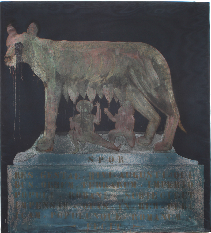
Franco Angeli, She-Wolf, 1964
For this work, Angeli took inspiration from the Capitoline She-Wolf (variously dated as either 5th century BCE or Middle Ages), an iconic bronze sculpture representing the legend of the founding of Rome. Traditionally considered to be the rescuer of Romulus and Remus, the she-wolf cared for the twins after they had been cast in the Tiber River by their grandfather’s brother in his attempt to seize the throne. Angeli’s She-Wolf (1964) reads as a faded tribute to the original legend: the gilded creature is only faintly visible against the black background; Latin calligraphy renders yet more archaic the already muted scene; the suckling twins are reduced to little more than simple props. Adding to this sense of waning decadence is a nylon-stocking veil, which shields the painting from full view. Reminiscing on the origins of his interest in iconic symbols, Angeli explained: ‘The eagles, the she-wolves, the ruins, the plaques of my childhood were part of my visual memory, of my culture past and present.’6 The she-wolf, as Angeli makes clear, was not something he chose or looked for: it was inescapable, embedded in Rome’s urban landscape. Like Festa, whose blunt appropriation of Michelangelo’s The Creation of Adam had underscored its popular expendability, Angeli’s She-Wolf sought to emphasize how the quintessential symbol of Rome had been reduced to a stereotype.
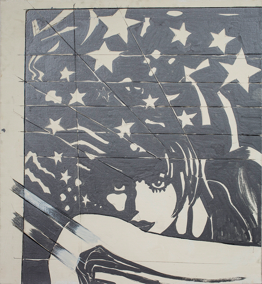
Giosetta Fioroni, Ritorno Liberty, 1968
Ritorno Liberty (1968) belongs to Fioroni’s early series of portraits of beautiful women lifted from newspapers and women’s magazines. Infused with a mixture of curiosity and criticism regarding the representation of women in popular literature and television, Ritorno Liberty considers the constituents of beauty as well as its relativity. Enhanced by Fioroni’s trademark silver aluminium-based industrial paint, the woman depicted is simultaneously unspecific and stereotypical. As Fioroni explained: ‘The basic criterion on which I selected the photos was connected with the possibility of capturing some particular element such as femininity, elegance, astonishment, expectation. Or the horror of the stereotype, predominant seriality, consumption, etc.’7 Her images of gorgeous girls with languid eyes and vaporous hair highlight the clichéd nature of perceptions of female beauty. Reflective, shiny and desirable, Fioroni’s silver girls symbolize the mythical deities of the television era.

Pino Pascali, Dove of Peace, 1965
There is a photograph showing Pascali taking off on his homemade missile, Dove of Peace (1965). It belongs to a set of images staged by the artist that same year in his studio in Rome. The target of this attack remains unknown to the viewer: all we can see is Pascali’s artist-as-cowboy machismo. Dove of Peace is, of course, a scam: a pastiche of random found objects – pots, tires, tubes and other discarded materials – form the weapon’s skeleton, while a dark-green, military-style coating hides its humble origins. The deliberately ironic title nods to Pablo Picasso’s famous peace doves, symbols of postwar reconciliation.
Triggering associations with children’s toys rather than with menacing weapons, the absurdity of Pascali’s Dove of Peace is exaggerated to the point of caricature in this staged encounter with the artist. The reference to the iconic final scene of Stanley Kubrick’s Cold War political satire Dr Strangelove or: How I Learned to Stop Worrying and Love the Bomb (1964) is clear and deliberate. By mimicking the character of Major T.J. ‘King’ Kong as he bull rides the H-Bomb to detonation, Pascali aligned and infused his work with the characteristic black humour of Kubrick’s film about the threat of nuclear war.
This article first appeared in Frieze Masters issue 8 with the headline ‘Piazza del Pop’
1 Ruggero Orlando quoted in Laura Iamurri, ‘Il pennello nell’occhio. La Pop Art sui rotocalchi, prima e dopo la Biennale del 1964’, Studi di Memofonte,
issue 11, 2013, p. 125
2 Fabio Mauri, ‘The Fifties Were Ten Years Old in 1960’, Flash Art, March 1983
3 Tano Festa interviewed by Giorgio de Marchis, in Tano Festa, exh. cat., April 1967, Galleria La Salita, Rome
4 Mario Schifano quoted in Achille Bonito Oliva ed., Schifano 1934–1998, 2008, Galleria nazionale d’arte moderna, Rome, p. 222
5 One of John Berger’s contentions in Ways of Seeing is that publicity is essentially nostalgic. To validate contemporary products, advertising relies on well-established tropes and images from the past. John Berger, Ways of Seeing, 1972, Penguin, London, p. 139
6 Franco Angeli, ‘Untitled’, Franco Angeli Archive, n.p.
7 Giosetta Fioroni, ‘Dialogo con Alberto Boatto’, in Giosetta Fioroni, ed. Germano Celant, 2009, Skira, Milan/Geneva, p. 13