


Rates of exchange
Mark Grotjahn
Mark Grotjahn

He lives in Las Vegas, after all, the equal opportunity Mecca (or Gomorrah) of Middle-American get-rich-quick dreams, consensual bluff and 'honest fakery'. In Air Guitar (1997) Hickey recalls how, flying home after four gruelling days sequestered in Washington DC as a member of an NEA grant panel wading through torrents of artists' slides in a winnowing process of aesthetic judgement, he made a beeline for the uncomplicated embrace of Vegas airport's video poker machines. Before he knew it, Hickey found himself re-enacting a nearly identical selection procedure - 'interpreting finite permutations of a limited iconography', fixing values to images, trying to identify winners and back them up with cold hard cash. Unlike in DC, however, the gaming machine was up front about the slim chances for success and 'cheat[ed] you fair.' 1
It's an equivalence that I think the Los Angeles-based artist Mark Grotjahn might appreciate. Grotjahn, by all accounts an avid and adept poker player who's been known to spend hours at a time at casino gaming tables, makes paintings the way some people deal cards: working his way methodically around the surface with
a practised generosity, enjoying the feel of the process without once forgetting to recalculate the shifting odds or ever tipping his hand. This overlay of the business of living and the practice of art has a traceable history in Grotjahn's work. In the mid-1990s he was busy making exacting copies of gruff, semi-literate signage that caught his eye at neighbourhood bodegas, newsagents and five-and-dime stores, handmade placards of the 'you break it you bought it' or 'no shirt, no shoes, no service' variety. Getting one up on Andy Warhol, he exchanged his newly completed, studio-produced knock-offs with bemused storekeepers for their grimy shop-soiled originals, which he then hung on gallery walls. A neat little trade-off: one in which everybody walked away sure they'd got the better end of the deal.
Recently Grotjahn has taken to turning out the contents of his pockets in search of objets trouvés made closer to home, specifically the dog-eared matchbooks palmed during casino poker games, scribbled over in ballpoint pen with self-directed advice, admonitions and strategic mantras for winning and not losing his head. 'Be cool ... wait for good cards', 'remember smart position', 'only 300 - that's it', 'play strong, think pussy, make money', 'take breaks ... call Mom'. Following his own invented rules, controlling outward appearances, patiently waiting for profitable patterns to coalesce and things to fall into place - these are good guidelines not only for keeping your shirt at a table of high-rollers, but for making worthy and viable paintings as well.
Which is why his abstractly perspectival 'butterfly' paintings, which at first appear to depart from the mainline Marcel Duchamp/Andy Warhol/Jim Shaw trajectory, can be read as equally encoded with Grotjahn's quick-witted, strategic frame of mind. Looking at his paintings, you get the sense that he is working all the angles, probing for weaknesses or strengths while setting up visual scenarios that may or may not pay off.
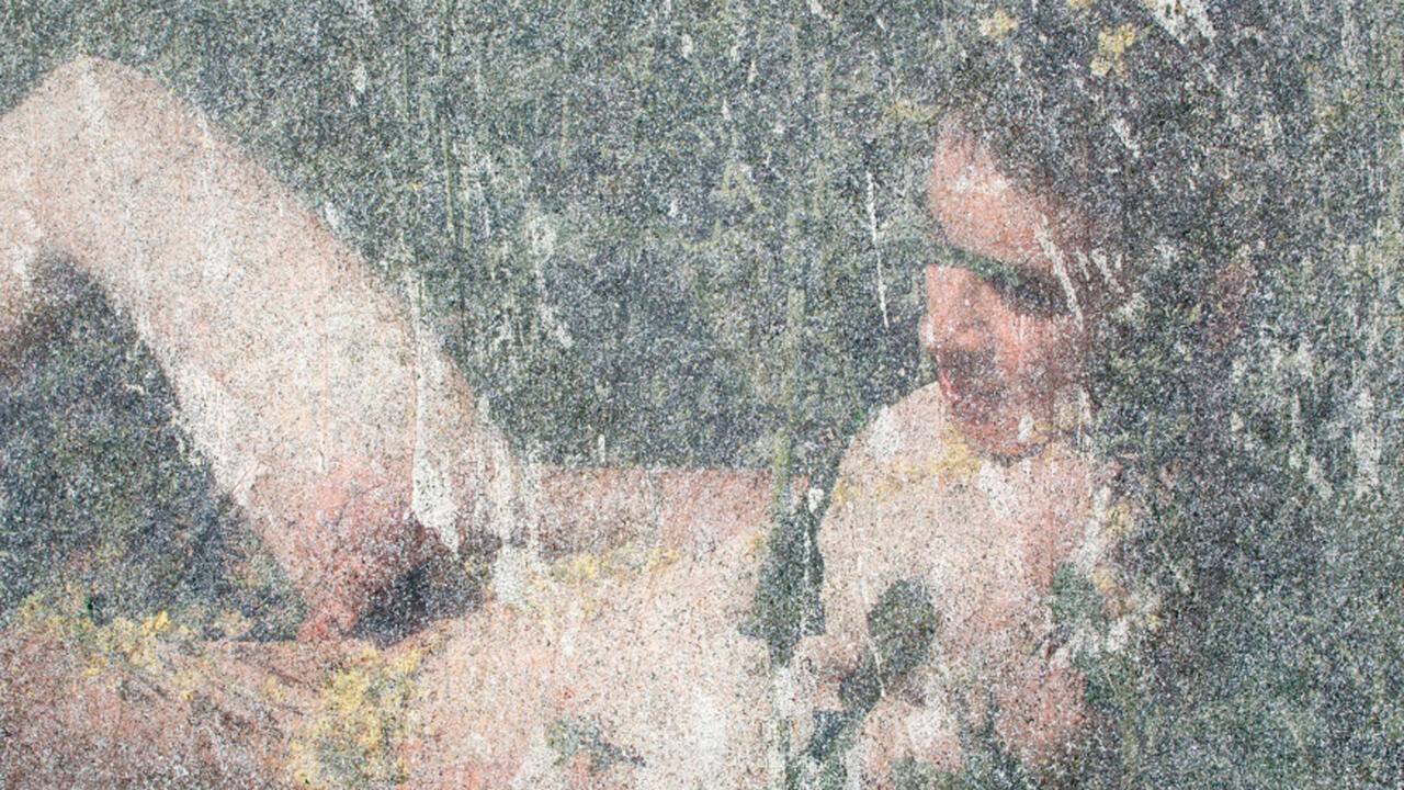
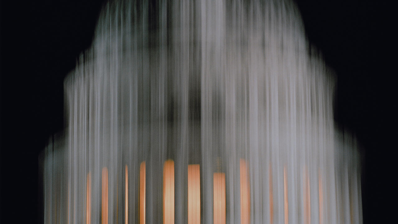
Pinwheeling fans of candy-coloured rays are splayed out like cards in the hand, and in stacked compositions such as Untitled (Three-Tiered Perspective) (2000) each window plays like another set of reshuffled and dealt-out possibilities framed within finite variations and combinations of colour. While to claim his work as concretely illustrative of game-playing (or landscape or illusionistic space for that matter) would be off the mark, as home-made objects they do bear the imprint of a certain calculating disposition of thought - a natural inclination to reorder sequential values and tweak variables mutually advantageous to both his day job and his moonlighting activities.
Grotjahn's split-screen lepidopterous abstractions have the pithy surface dazzle of stripped-down California fruit crate labels tipped on end or tiered on top of one another - one-point perspective views of furrowed fields slotted back to back with the rays of a rising sun. Although geography isn't supposed to matter any more, these paintings couldn't be more Southern Californian, and it's hard to imagine them being made anywhere else. Their solid, saturated brightnesses are neighbours of those once discovered by Ed Ruscha on the surfaces of petrol station forecourts and superfluous neon- and day-lit stucco. But Grotjahn's simple radiating geometries don't add up the way you might expect them to. Like the plush felt zones of some obscure gaming table, they're precise, seductive and undecipherable by the uninitiated.
His abutting symmetries are less fearful than they are skewed, the off-kilter quality demonstrating what could be just poor graphic planning or (more likely) obedience to a separate internal logic, an obscure set of algorithms. Framing bars of colour discomfortingly widen, slant or otherwise diverge from the perpendicular; perspectival vanishing-points come teasingly close to one kind of alignment or another, remaining just off enough for you to wonder if you're possibly being set up; one prismatic composition may be very nearly duplicated in other canvases with all the ebullient chroma bled away, leaving only the subtlest variant hues of pale gypsum yellows or gravelly greys. With all these probings, feints and doublings back, exactly what is at stake stays unclear. Perhaps, for the viewer, it is simply the diminishing practicability of assuming that you have been here before, in front of precisely this kind of object, and that you therefore know where you are and how to respond. Automatic, complacent looking is among the first casualties of such an enterprise. After all, mere assumptions, as someone once said, 'never win the pony'.
But consider the odds in favour of failure: how would paintings that on their face look so much like high Modernist formal abstractions stand a chance? When I first saw a few of Grotjahn's paintings it was close on the heels of last year's major Barnett Newman retrospective in Philadelphia. What most struck me about paintings such as Untitled (Red Butterfly) (2002) and others was how Grotjahn had commandeered Newman's totemic and cabbalistic 'zips' - those declarative vertical stripes judiciously deployed to rend and reconcile oppositional forces on the picture plane Old Testament-style - and so handily retro-fitted them with the lollipop palette of Kenneth Noland, the geometrically compartmentalized painterliness of Alfred Jensen and the segmented cartwheeling compositions of early 1960s Frank Stella.
However, just when you start wondering if the glistening, thickly worked-up surfaces, delicately slathered with a confectioner's finesse, are simply an exercise in latter-day Op art or Colour Field refinement, one telling detail - such as the contours of the artist's initials excised from the bottom corners of the paintings to expose a chaotic slice of expressionistic underpainting - hints that the canvases are as resolutely poker-faced as the artist. Once you know that beneath the deliberate and restrained façade lies a garishly emotive substratum - which, in some cases, might remind you of the desperation of Jackson Pollock's so-called psychoanalytic drawings - it is hard to un-know it. That this hemispheric slippage between two different temperaments pivots around the emblem of the artist's initials (the monogram being not an addition to the canvas but a negative, a subtraction) is a tip-off worth consideration as well.
One suspects that Grotjahn would reject, with Hickey, the false idea of art 'as a low-cost, risk-free spectator sport when in fact it is a betting sport'. 2 There are no sure-fire guarantees of a successful outcome. As in any other risky social endeavour, with painting you bring a set of skills and hunches to the table, you play them the best you can and remain willing to shift strategies mid-course. If your fakery is honest enough to create an illusion with legs, with a bit of luck you may just pull it off. Or as one state lottery slogan puts it, 'Hey, you never know ...'.
1. Dave Hickey, 'A Home in the Neon', in Air Guitar: Essays on Art and Democracy, Art Issues Press, Los Angeles, 1997, p. 24.
2. Dave Hickey, 'Frivolity and Unction', ibid, p.208.
1. Dave Hickey, 'A Home in the Neon', in Air Guitar: Essays on Art and Democracy, Art Issues Press, Los Angeles, 1997, p. 24. 2. Dave Hickey, 'Frivolity and Unction', ibid, p.208.


