The Time of the Signs
An interview with Margaret Calvert
An interview with Margaret Calvert
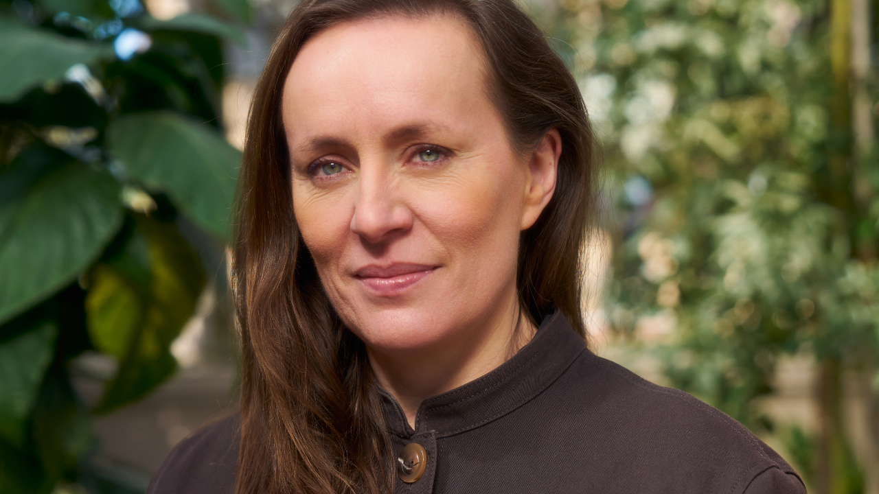
Margaret Calvert is one of the designers responsible for producing signing programmes for, among other things, the British motorways and all-purpose roads, British Rail, the British Airports Authority and the Tyne & Wear Metro. Between 1961 and 2001 she also taught part-time at the Royal College of Art.
Phil Baines You studied illustration at Chelsea in the 1950s. What was it like?
Margaret Calvert I was quite a young student, just 17. I found Chelsea fantastic because it took art seriously. The course was four years. After the two year intermediate course I was told I was a born illustrator, but I did not enjoy illustration as such and just yearned to do something with, I suppose, 'design'. It hadn't got a label then because graphic design hadn't happened.
Illustrators were also taught 'commercial art' by practising designers such as Milner Gray and Hans Schleger. If we were given a poster brief we were told to concentrate on just the idea not to incorporate the typography or lettering. At one session Schleger said, 'You' - meaning the whole group - 'are too old to learn typography'. Well I hadn't even taken the word on board then.
After Schleger left, Jock Kinneir came in. There was something about his attitude which I liked and I started coming in very regularly. He came in one day and said, 'I've got this big job' - he'd just left the Design Research Unit to start up on his own having worked on the Festival of Britain - 'to do the signs at Gatwick Airport'. Jock got that job almost by chance. He had a neighbour called David Alford from Yorke, Rosenberg & Mardall, and they were designing Gatwick. It was a big prestige project as you can imagine. They were in the same queue waiting to get the Green Line bus to Hyde Park Corner, and David said, 'We've got this job, and we need someone to do signs, are you interested?', so Jock said 'Of course', although he knew very little, if anything about signing large buildings. I had just taken my final exams when he invited me to work for him.
PB Leaving college to work for Kinneir must have been tremendously exciting.
MC It was, but it was also so different. When I asked him what I would be doing, he replied 'Well ... design, which is nothing like you're doing here!'. I had to do everything. I learnt to type, I made the coffee, I walked through the park to the photographic studio. It was terrific really, absolutely learning from the ground up. I was still living at home and I felt I was continuing my education.
When I started, Jock was establishing the starting point by writing the report (the first part of any signing job). I was a real assistant. I lost about a stone through sheer nervousness.
I even took work home in the evenings and weekends to make it happen, I was so keen to get it right. It was only later when I started having my own point of view that real debate and discussion started ...
PB Gatwick was all learning?
MC Gatwick was learning for both of us. It was at that point that we established getting the right weight of letter and all that kind of thing ...
PB Was Gatwick tested in situ?
MC Some of it was. I remember going into snow-filled buildings and up and down stairs ... The initial execution of the job at Gatwick was appallingly done, because the sign manufacturer worked from the report and just enlarged the visuals. They all had to be re-made.
PB What were the signs made of?
MC I can't remember exactly except that they were front illuminated. Later, in 1966, all the national airports were grouped under the British Airports Authority, and we re-did Heathrow which had been designed by Colin Forbes.
Working on the signs I remember thinking, 'This isn't right, there's no logic to the layout here. You can't design each sign as a one-off, you need a structure'. So we began to break it all down to box dimensions, illumination, all that, and incorporating the graphic information. No expense was spared, we did a lot of research, particularly on colours - all the signs were internally illuminated. They wanted everything colour coded, but after testing various combinations, we found that black letters on yellow was the most effective. Only the colours and the grammar of the layout are still in use ...
PB And after Gatwick you worked on motorway signs in 1958.
MC It's all connected, like a detective story. Colin Anderson, Chairman of P&O-Orient Line, saw Gatwick and got onto Jock to design a luggage label system for illiterate porters. He then became chairman of the committee looking at the motorway signs.
PB Did the motorway signing seem that big a deal at the time?
MC It was, yes, and we never really thought it would eventually be applied throughout the whole country. The committee was the first of such a stature to employ a designer as consultant. We had to re-think and re-do work continually. Sir Hugh Casson a was key figure on the Anderson committee, and T. G. Usborne of the Ministry of Transport, who was on both the Anderson and Worboys committees, was absolutely crucial in getting the whole job done. He saw the whole thing as a two stage job, stage one for motorways and stage two for all the roads.
PB David Jones who worked with you at the time of the Worboys report described Kinneir as being the ideal person to deal with the committees.
MC Jock was amazingly articulate in presentation situations, no erring or rambling. Although he could be prickly, he would argue the case for what we thought was the right solution.
PB Did you ever attend the meetings?
MC Only one, I was in my early 20s, shy, a woman and perceived as only Jock's assistant. Unfortunately on one occasion, he was ill and, because the committee was made up of so many important people from various institutions including the police the meeting couldn't be postponed. The meeting went on all day and included many safety issues, not just the design of signs. Many of the pictogram signs were presented at that particular meeting, you can imagine their comments.
PB At that time Britain had started to consider joining the Common Market, so the pictogram signs were designed to adhere to the 1949 Geneva Protocol, is that right?
MC Yes, but the protocol only defines content and colour, so we were given total freedom over how all elements were drawn. I now regret that I didn't put a corner of a spade on the 'men at work' sign, it would have stopped all the jokes about a man struggling to put up an umbrella!
PB One of the nice things about travelling around most of Europe is that, while we understand the signs, they are all drawn differently.
MC I too enjoy the differences, I'm very fond of the Greek schoolchildren with plaits. The later British signs (not designed by us) like the 'elderly people' or 'pedestrians in road' are neither diagrammatic, nor are they good as representations ...
PB ... no, they look like aliens. Most people don't realize these things are 'designed' by any particular person at all ...
MC ... and for some designers that is a convenient journalistic pose, like Alan Fletcher in his book The Art of Looking Sideways (2001). And as they are 'public property' they also get appropriated, like the Gay Dad logo by Peter Saville.
PB There are other symbols from that period that have also lasted and become part of the public's consciousness, such as the British Standards 'kitemark' and the MoT vehicle testing station mark.
MC I don't know who designed the kitemark. Jock designed the MoT symbol and the three triangles reflect the three parts of the test as it was then carried out.
PB Another key 1960s job was the Rail Alphabet, which was part of the British Rail corporate identity.
MC Yes, we were consultants on the signs and had done a pilot scheme at London Liverpool Street, and DRU were working on the corporate identity. Jock had wanted to use the Transport alphabet but I felt that its characters and spacing were specifically designed for fast moving traffic and therefore inappropriate in a pedestrian context.
When working on the sign lettering - we never called it a typeface - I solved the problem of the relationship of dark letters on a light background and vice versa. The letters were produced on spacing tiles, and the same letter of each alphabet occupies a tile of identical width. The black letters are fractionally heavier and larger than their white counterparts.
PB So if both alphabets are superimposed it looks as though the master drawing was an outline letter?
MC Exactly, and you see that there is no common baseline. Which I thought was so simple. Some of the old ones are still in existence.
PB Did books such as Derek Birdsall's 17 Graphic Designers London (1963), reflect a coherent scene at that time?
MC Well ... there was something in the air, Typographica [New series, no. 7 'Typography in Britain'] appeared about the same time and the D&AD [Designers & Art Directors] was also formed. Everyone in 17 Graphic Designers London except us came from the Central School of Arts & Crafts, as it was called until 1966, or the Royal College of Art; we were included because of the prominence of the road signs. The book wanted to reflect the Swiss and American influence on design and how that was given an English twist. All of us were based in London because you couldn't do anything unless you were.
PB The Tyne & Wear Metro (1980) was one of your last jobs with Kinneir, with a much more prominent use of typography, particularly at platform level in the city centre stations. How did the job come about?
MC The typeface was originally designed in 1971 for the French new town of St Quentin-en-Yveline as part of a much larger job, a report covering all aspects of communication in the town. There was not much design in the report and the typeface itself was not used as it was felt to be 'too English'. We felt it was appropriate for Newcastle, where serifs would be an enriching element: especially in stations such as Monument in the centre of the city.
The Tyne & Wear Metro stations were designed by Faulkener-Brown, Hendy, Watkinson & Stonnor and featured platforms without advertising. The lettering in the central stations is the full height of the enamel cladding panels and in different colours. I spent a lot of time at Burnham's (vitreous stove enamellers) getting the colours absolutely right.
PB The illuminated box that's used to indicate the stations outside is not what you originally proposed.
MC No, our original proposal grew out of the St Quentin project. We'd had the idea of extruded letterforms and numbers which could come out of the ground or project from buildings, the actual face could either be cut square, showing the typeface as designed, or cut obliquely. Given the strength of the colour suggested for the metro (yellow), we didn't feel a fixed logo was necessary - the colour and typeface would be distinctive enough on their own, so we suggested the stations were 'signed' by large extruded letter 'M's. We had nothing to do with the boxes that were eventually used.


