In the Air and on the Ground
Influence and innovation in the sculptures of Leonor Antunes
Influence and innovation in the sculptures of Leonor Antunes

It’s a sunny morning and light floods Leonor Antunes’s ground-floor studio in central Berlin. We are looking at black and white images on her laptop of the late Milanese architect Franco Albini’s innovative museum designs for the Palazzo Rosso and the neighbouring Palazzo Bianco in the centre of Genoa. Grand aristocratic residences turned municipal museums, these palazzi, with their historic collections, were refurbished in the 1950s under the guidance of Caterina Marcenaro, the visionary head of the city’s galleries. Albini’s revolution was to free works from their ornate, gilded frames, instead hanging them on wires from simple picture-rails that trace the galleries’ high ceilings or mounting them in the centre of single metal rods, some of them weighted at the base with architectural fragments. The intersecting verticals and horizontals of these minimal support structures create a precise but sparse matrix; the effect is one of weightlessness. In one of the photographs, a large annunciation scene hangs in the centre of one gallery wall, hovering like the tremulous tips of the Angel Gabriel’s painted wings.
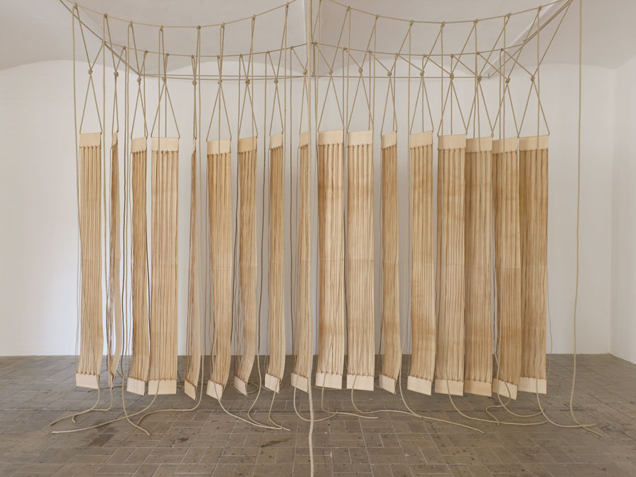
In Antunes’s studio, the sunlight catches the lengths of slim brass tubing that have been laid out on the table behind us. These will be strung together to create fine, gilded, net-like sculptures, like those that streamed from the high wooden ceilings of the Arsenale as part of this year’s Venice Biennale. Antunes explains to me that the gridded patterns of the eight hanging works in Venice (… then we raised the terrain so that I could see out, 2017) correspond, variously, to certain features in an early private home created by Albini in Milan as well as to elements from Carlo Scarpa’s designs for the Museo di Castelvecchio in Verona. In certain senses, the architecture of Scarpa – who was born and spent most of his life in Venice – holds up a mirror to Albini’s own: the use of materials and ‘liberated’ modes of display at Castelvecchio share much with Albini’s earlier palazzi. (In life, as in art, the trajectories of the two men followed one another: they were born and died within a year of each other.) But the mute geometries of the hanging pieces also veil another name – that of Franca Helg, who joined Albini’s studio in 1951 and helmed it after his death in 1977. The two worked so closely together – for instance, on the renovations of the Palazzo Rosso, begun in 1952 – that it makes little sense to speak of designs ‘by Albini’ or ‘by Helg’. Except, of course, that history has tended to attribute them to Albini. When I get back to London to research further, the British Library catalogue directs me to numerous titles on Albini; it holds none on Helg.

Antunes’s methodology is a kind of tracing, a transfering of specific geometries from one space into another. She does this by way of line drawings made from brass, leather, bamboo and rubber, amongst other materials. These drawings in three dimensions might hang from the ceiling or stand or lie on the floor; they are frequently grouped together to create a certain impression of volume, of occupying a space. The geometrical patterns they create (or re-create) are often taken from what might be called the designed environment: for example, the folding screen that partitioned the living space of E-1027, the villa overlooking Monaco that Eileen Gray built for her lover, Jean Badovici, in the early 1920s; or the tiled courtyard of Museo Experimental el Eco in Mexico City, designed by Mathias Goeritz, Luis Barragán’s German-born co-conspirator in ‘emotional architecture’. Antunes’s references are almost all modernist; often they cite figures that are, or were, lesser known – Lina Bo Bardi, Victor Bourgeois, Gray, Helg, Clara Porset; frequently, these are women. Her upcoming exhibition at London’s Whitechapel Gallery will draw on the work of Mary Martin and Lucia Nogueira. Martin was a British constructivist best known for her work with her husband, Kenneth. Nogueira moved to London from Brazil in the mid-1970s and made idiosyncratic minimalist assemblages until her death in 1998.
In Antunes’s miraculously concise articulations, architecture is distilled down to a set of formal questions about the intersection of horizontal and vertical lines, and the related act of translating between three dimensions and two. Like drawings on graph paper, Antunes’s sculptures are schemata, of sorts. Except that, rather than pointing to objects elsewhere, they are simultaneously the thing and its representation: they are diagrams of themselves. When installed, these diagram-things become newly voluminous, since the space around, above and beneath each piece is so indivisibly part of the work.
There is a recursive map-and-territory logic at play here, which has something to do with the labyrinths of Jorge Luis Borges – the repetition of spaces taken to its most audacious extreme. It also makes me think of Georges Perec’s spatial Oulipism: in particular La Vie mode d’emploi (Life a User’s Manual, 1978) – the title of which Antunes nodded to in her 2011 exhibition at Porto’s Serralves Museum,‘Villa, How to Use’. La Vie’s protagonist, Bartlebooth – an Englishman driven to wild feats of eccentricity by his fantastic wealth – has made it his life’s mission to travel the world painting watercolours of ports. He then turns these into jigsaw puzzles, which he reassembles and covers in a special solution that causes the image to disappear after a period of 20 years. One lesson I take from this: let the inevitable inadequacy of representation be a spur for artistic production. (It is, perhaps, with this in mind that Antunes titles so many of her pieces ‘Discrepancies with …’; most recently, ‘Discrepancies with G.G.’, her installation at Tensta Konsthall referencing the work of Greta Magnusson-Grossman, the Swedish architect of southern Californian villas and the first woman to win the award for furniture design from the Swedish Society of Industrial Design.)
As you can fold up a piece of graph paper and carry it in your pocket, I imagine Antunes’s works pack up very small. (Per Marcel Duchamp, who said about his boîte-en-valise 1936–41: ‘Everything that I have done can be put into a little suitcase.’) They seem impossibly light even when their materials are solid, meaning – as with the pieces in the Arsenale – that their geometries are distorted by the unpredictable sag of their weight under gravity.

For Antunes’s 2015 exhibition ‘The Pliable Plane’ at CAPC Bordeaux, a long, brass, netted piece was draped in folds, like billowing fabric, across the gallery’s nave-like space. The geometric pattern follows a weaving by Anni Albers. The exhibition’s title was also borrowed from a 1957 essay by Albers, in which the artist – who, famously, arrived at the loom reluctantly, only because the Bauhaus encouraged women away from painting – reflects on the textile origins of architecture (or vice-versa). The interlaced genealogy of weaves and walls are familiar from Gottfried Semper’s Four Elements of Architecture (1851) and Adolf Loos’s Principle of Cladding (1898); Albers’s update is to make the case for fabric’s contemporary structural relevance. (Interestingly, in the context of Antunes’s work on Albini and Helg, Albers uses the example of museum display: ‘A museum […] could set up textile panels instead of rigid ones […] Such fabric walls could have varying degrees of transparency […] and would bring an intensified note of airiness to a place.’) The Pliable Plane, as a notion, articulates one of Antunes’s fundamental concerns, namely: how can a flat surface create an architectonic volume? How (where, and by what means) is space contained?
Tracing the originary thread of architecture back to myth, the architectural historian Beatriz Colomina has argued that it was Ariadne, rather than Daedalus, as Greek tradition supposed, who was the first architect.1 Though Daedalus built the Minotaur’s labyrinth, it was Ariadne’s thread that allowed Theseus to navigate the space – in a certain sense, to ‘see’ it. Colomina’s broader argument, also pertinent to Antunes’s sculptures, has to do with the importance of representations, specifically photographic, to architectural modernism. Linearity lends itself to photography’s mode of flattening. More important here, though, is the feel of Ariadne’s thread. Much as Albers’s weavings brought texture and gesture to the grid – something entirely autonomous, an expression of pure form or of what Rosalind Krauss famously called ‘modern art’s will-to-silence’2 – Theseus understood architecture through touch.
Generally, you can’t touch Antunes’s work, although I have frequently wanted to. But you can walk around it,stand next to it, look through it. The space her sculptures occupy is not abstract, but experiential. Antunes has talked of her creations as ‘events’ but they are also gorgeously material things, often referencing particular handcraft traditions: the knotting techniques used to make fishing nets on the Portuguese coast, for example, or traditional forms of bridlework. Many of these laborious manual methods are on the verge of dying out. Antunes tells of buying a particularly beautiful, braided-leather bridle in Mexico. Made without stitches, it hangs together with knots. When she showed it to the craftsman with whom she works in Lisbon, he could not replicate the technique: it belongs to an old, specifically Mexican tradition; he didn’t know how. Antunes’s invocation of such forms contributes to a certain otherworldliness that her sculptures have – a sense of being outside of time and place, haunted by elsewheres.

The materials and techniques employed in Antunes’s work mean that even grids are irregular and unrepeatable. Antunes is suspicious of standardization. A series of five suspended chains of brass triangles (collectively, ‘Dunkirk to Barcelona’, 2010) reference the story of the metre, birthed by the lunatic decimal fervour of post-Revolutionary France. Meant to equate to one tenmillionth of the distance between the North Pole and the equator, the length was deduced by triangulating the distance between Dunkirk and Barcelona, two cities with the same latitude as Paris. The calculation took two astronomers nearly seven years and innumerable trips up church belfries, towers and other points of elevation, as well as into and out of jail. (Perec would have approved.) A platinum bar was cast to this length and interred in the vaults of the National Archives in the French capital, and 16 model metres were installed across the city to allow citizens to come and ‘take’ their own measurement. You can still see one of these ‘original’ standard metres on a wall next to the Palais de Luxembourg in the genteel 6th arrondisement. It was discovered some years later that the calculations were slightly out and that the metre is two-tenths of a millimetre short. In the real world, there are no perfect forms.
Main image: ‘Discrepancies with G.G.’, 2017, exhibition view at Tensta Konsthall, Stockholm. Courtesy: the artist and Tensta Konsthall, Stockholm; photograph: Jean Baptiste Beranger
1 Beatriz Colomina, ‘Architecture, Production and Reproduction’, in Architectureproduction Revisions 2, ed. Beatriz Colomina and Joan Ockman, New Jersey: Princeton Architectural Press, 1988, pp. 6–232 Rosalind Krauss, ‘Grids’, October, Vol. 9 (Summer, 1979), pp. 50–64


