BIO 25 – The Biennial of Design in Ljubljana
A report from Europe’s longest-running design biennial, this year focusing on what it means to be ‘critical’
A report from Europe’s longest-running design biennial, this year focusing on what it means to be ‘critical’

Over the past decade the word ‘critical’ has permeated design discourse to such an extent that its relevance is often taken for granted. According to designers Anthony Dunne and Fiona Raby, who first popularized the term ‘critical design’ in the late 1990s, what makes critical design critical is that it questions its own context, challenging the ‘status quo’ of the ‘role products play in everyday life.’ So what happens when criticality itself has become the status quo? This year’s edition of BIO, the Biennial of Design in Ljubljana, which runs until 29 October, provides some clues.

Founded in 1963 when Slovenia was still part of former Yugoslavia, BIO is the world’s oldest design biennial. For decades the exhibition was a major global showcase for contemporary industrial design; objects were selected nationally and presented according to categories such as Furniture, Lamps and Textiles. As BIO’s director, Matevž Čelik, said in an interview, it was ‘a platform that intended to supply tangible proof that socialist prosperity could compete with and exceed that of capitalism.’
By the time Slovenia became a post-socialist republic in 1990, this premise no longer held, and the biennial (like so many cultural institutions faced with the same transition) meandered through a process of postmodernist reinvention. This was especially complex due to the rapid privatization of the very industries upon which industrial design depended. In 2008 BIO dispensed with national categories and in 2012 fully shed its former skin, gaining a curator and an ensuing thesis for each exhibition: 'Design Relations' and then '3, 2, 1, Test…' – the latter took on politically inflected themes such as affordability and sustainability, and by many accounts put BIO back on the schedule of unmissable international design events.
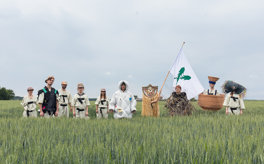
The 2017 edition, titled ‘Faraway, so Close’, was co-curated by Slovenian curator-architect Maja Vardjan and Italian curator-editor Angela Rui, who chose as their focus the current urban/rural divide in Europe. This topic takes on a particular relevance in Slovenia, a largely rural, mountainous country that is 62 percent forested. ‘Urbanity doesn’t exist in Slovenia,’ said Vardjan in her introductory talk.
As their launching point, Vardjan and Rui cited the current ‘good news’ of the exodus of ‘informed and emancipated young people’ from cities to the underpopulated countryside. While they acknowledge that this trend in no way counterbalances the net urbanization of Europe, it does point to a contemporary desire for bucolic escape on the part of certain groups (I can only read ‘informed and emancipated’ as wealthy and educated).
Given this topic, I assumed the critical challenge would be to question whether the breakdown of industrial production that has gutted small towns, forced labour into cities, and paved the way for the pastoral return of the urban elite really is ‘good news.’ But I got the sense that critical in this context did not necessarily mean design critical of its own premises, rather it referred to the much larger category of noncommercial as opposed to commercial design. But, if we’re to stick to Dunne and Raby’s original definition, while critical design is often noncommercial, noncommercial design is not de facto critical.

The curatorial methodology was complex. First, Vardjan and Rui chose six sites around Slovenia beyond the biennial’s main exhibition venue, the Museum of Architecture and Design (MAO) in Ljubljana. Each site – a forest, an underground cave, a former mining town, a sea port, a farming village and a WWI battlefield – was given a theme. The curators then selected teams of seven international designers who they named ‘Translators’, to work at each site. The Translators were paired with ‘Profiles’, or Slovenian cultural practitioners whose job it was to guide the designers in their unfamiliar contexts. As well as this, an open call was held for each of the categories, and the Translators chose yet another group of designers to collaborate on the assigned region/theme. The projects they were to create together would be site-specific, but would also somehow be reflected in an exhibition at MAO.
The laudable goal of choosing off-site spaces was to lure audiences outside the urban centre of Ljubljana. This means that most audiences won’t get the full picture – even with a full ten hours on a bus during the press trip, I only managed to see three of the far-flung locations. Luckily, each off-site project works well as a stand-alone. (If the Slovenian tourist board, who sponsored my trip, wanted to show me that Slovenia has outstanding areas of natural beauty, they achieved their goal.)
Taking the bus trip was also worthwhile because visiting the museum alone gives a woefully fractured impression of the site-specific work. Multidimensional projects born of year-long collaborations with local municipalities, scientific institutes, farming cooperatives, and elementary schools, were too often represented in the museum as science-fair-like documentary displays or puzzling objects without enough context.

For the theme ‘Occupying Woods’, the French product designer Matali Crasset installed a traditional ceramic stove (The Common Stump) in the forest in the region of Kočeve. The stove, which will be permanent and free for anyone to use, was planned in cooperation with a huge range of local groups, from the forest service to regional museum. The stove was as-yet unfinished when I saw it – and looked strangely unpolished for a designer who’s made lamps and sofas for Ikea and Campeggi – but the idea was smart, simple, and potentially useful. On the other hand, the corresponding exhibition in the museum was a jumble of didactic text and cute illustrations about the global history of forestry.
The most impressive in situ intervention I had the chance to see was the sensitive ‘After Utopia’ theme by Greek architect duo Point Supreme. In response to a lack of spaces for public gatherings in the former mining town of Trbovlje, they built a miniature glass pavilion in the city centre which they call the ‘Tiny Museum.’ The aim was for it to be taken over, in perpetuity, by local initiatives for two-week cycles. On the opening day a local puppeteer troupe used it to stage a children’s show, and the next months are already booked for events: an exhibition of kids’ drawings of the leftover mining machinery in their hometown; a reading by a local poet; a show by a group of twenty-somethings who are preparing to send the first Slovenian rocket into space. The project came across as an earnest response to the needs of a unique community as expressed over a year-long conversation.
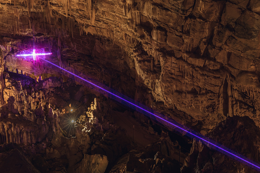
The theme Underground Release brought in requisite references to the Anthropocene. Designer Dan Adlešič was given the dramatic location of a vast underground cave for which he created a light-and-sound show to be played regularly for visitors throughout the summer. The designer-translators who invited him, Studio Formafantasma, made a striking postmodern-looking installation inside the MAO using quarried rocks and minerals. The group worked with a local geological institute to date the materials, asking: ‘what if we included into [calculating] the time of production the time that the raw material takes to form?’ Here was a provocative ‘translation’ of new scientific knowledge to update modernist notions of material transparency.
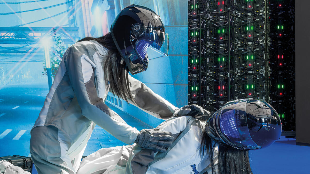
One museum installation illustrated the flip side to what can happen when an expert object-maker is asked to get critical on a topic he is no expert about. Odo Fioravanti, an Italian industrial designer, was assigned the loaded topic of New Heroes, which posited migrants as a type of contemporary heroic figure. In his introduction to the installation, Fioravanti said that ‘design can’t really change anything’ with regards to sociopolitical crises, so he ‘took a symbolic approach’ with his museum display. He designed a series of totemic objects signifying things a migrant needs to survive a harrowing journey, e.g. ‘The Feeder,’ a glass tube that represents ‘what it still means to die of hunger or thirst in 2017.’ He was careful to point out that these objects are in no way useful for survival. In my opinion, especially when compared with Fioravanti’s portfolio of highly covetable design objects, they are also aesthetically uninspired.

In order to be critical of the status quo, design often needs to reach into other fields. In order to borrow knowledge in an effective way, it needs to be fully informed of the critical discourses from those fields. It’s fine to rename a designer a Translator in order to expand the role, but in the end, a designer who does not speak more than one language cannot make a meaningful translation. The projects in the biennial that were the most successful did exactly this: they took advantage of the possibility for dialogue afforded by this ambitious platform, and learned a new language. This was because the chosen designers in those categories already had a career history of social engagement; translating was part of their skillset. For others, the imperative to ‘be critical’ (falsely read as: ‘be noncommercial’) seemed to actually hamper them from aesthetic consideration, which they otherwise excel at.
London-based Slovenian architect Miloš Kosec, part of the design team of the Brand New Coexistence category, referred to his witty biennial project, ‘Interpassive Machine’ (an installation in the museum foyer with printers that randomly shoot out pages of content determined by algorithms), as ‘postcritical.’ As much as the term worries me for its implication that critique is useless – it’s not – as a descriptor for a historical moment in which the term ‘critical’ has become worn through, it’s appropriate. As soon as it’s possible to say ‘criticality is trending’ – as the curators did – you can be sure that, whatever it means, it’s on its way out.
Main image: Luca Fattore with Odo Fioravanti, This is a Poor / Rich State, 2017, in the section 'New Heroes', organized by Marin Medak and Odo Fioravanti, installation view, Piran, Slovenia. Part of ‘Faraway, So Close’, 25th Biennial of Design, Ljubljana; photograph: Delfino Sisto Legnani, Marco Cappelletti


