By Design
How technology has shaped our expectations of desirable design
How technology has shaped our expectations of desirable design

It was a suitcase, though sadly not a well-made one, or so the Consumer Advisory Council discovered after submitting it to seven British Standards Institution tests: it was judged ‘poor’ on five of them. Not only did it leak after routine use, the lining tore, the metal fittings rusted and its handle fell off. Why then, asked the design critic Reyner Banham in the New Statesman, had the Council of Industrial Design [CID] – the government-funded arbiter of design quality – decided to include so defective a product in its list of ‘approved’ design projects?
The answer, Banham suggested, was that the CID based its judgements on aesthetics, without testing more important qualities, such as efficiency and reliability. It was, of course, wrong to do so, not least because, as Banham pointed out, ‘tasteful rubbish is still rubbish’. Wise words, which seem even sager over half a century after Banham wrote them in 1961. Yet, our understanding of what may or may not be deemed tasteful has changed radically, and the same applies to rubbish.
What does this mean for design, and for what we do – and don’t – find desirable about it? Throughout history, our definition of desirable design has consisted of a combination of qualities, but what they are and how they relate to one another has changed constantly. Similar shifts in taste have occurred in other fields, but the pace of change within design has been unusually frenzied and will become more so in future.
One quality that has always been – and still is – essential to desirable design is usefulness. If a design project does not fulfil its function, why would we find it appealing? We wouldn’t, regardless of its other merits. Take a recent example of tasteful rubbish: the double-decker hybrid bus designed by Heatherwick Studio in 2010 for use in London as an energy-efficient reinvention of the beloved 1954 Routemaster. Heatherwick styled the bus – which was nicknamed ‘Boris’ after the city’s then-mayor Boris Johnson – rather cleverly, by adding affectionate references to the original Routemaster without compromising the new vehicle’s modernity. Sadly, the same cannot be said of its engineering, which is why London’s streets are littered with broken-down Boris buses, and others are run on environmentally damaging diesel engines because their batteries have conked out. Like its buffoonish namesake, the Boris bus – or ‘Roastmaster’ as its unfortunate passengers dubbed it after sweltering on the over-heated top deck – has failed to live up to its braggartly promises.
Nor is it desirable for a design exercise to discharge its function effectively, unless it does something we value. Remember Google Glass? Possibly not, even though it was one of the most hyped new products of recent years. Google was so enthralled by what it believed to be the dazzlingly innovative technology of a dodgy pair of spectacles with a smartphone attachment controlled by voice commands that it assumed the rest of us would jump at the chance to buy them. One problem was that Google Glass didn’t enable us to do much more than we could already do on our phones. Another was the quagmire of potential legal issues, such as whether filming other people without their permission constituted a breach of privacy. Sales were so poor that Google ceased production of Google Glass last year, less than two years after its debut. The ominous words ‘The journey doesn’t end here’ are now posted on the Google Glass website. Let’s hope the next phase of the ‘journey’ leads towards something worthwhile.

Another quality recently joined ‘usefulness’ as a non-negotiable ingredient of desirable design: integrity. In other words, if we have any reason to feel uncomfortable about the ethical or ecological implications of any aspect of a design – from development, testing and manufacturing to distribution, sales, marketing and how it will eventually be disposed of – we are unlikely to consider it desirable.
Thanks to Flaminio Bertoni’s inspired styling and André Lefèbvre’s brilliant engineering, a vintage Citroën DS 19 saloon looks as beguiling to us now as it did when Roland Barthes nicknamed it la déesse after its launch in 1955, as the French pronunciation of the letters ‘d’ and ‘s’ sounds like the word for ‘goddess’. But these days, any pleasure we might take from the DS 19 is marred by our knowledge that a car of its age is likely to be a gas-guzzling, environmental time bomb.
The same goes for any new vehicles we suspect of being less fuel efficient than they ought to be (not that any are likely to be as alluring – if only) and to the digital devices, whose manufacturers have been accused of employment abuses or ecological lapses. Once you have read the media exposés of unsafe working conditions and poor pay in the factories of Apple’s Chinese subcontractors, how can you look at an iPhone or iPad with the same optimism and enthusiasm?
Even if you still end up buying one – whether because you suspect Apple’s competitors of being no more or less ethical, or because you baulk at the inconvenience of switching brands – that new gizmo is unlikely to seem as attractive because of your doubts about its integrity. For the same reason, although I still love seeing the soulful glow of the old-fashioned incandescent light bulbs that I stockpiled years ago in preparation for their demise, my pleasure is spoilt by the knowledge that they are less durable and will squander more energy than halogens, compact fluorescents, LEDs and other sustainable alternatives.
Our relationship to the sensual qualities of design projects – which may not be indispensable to desirable design but do so much to enhance it – are becoming more complex, too. Let’s start with what – despite the dogged efforts of design purists – many people still assume to be design’s most important aspect: how it looks.
Firstly, our visual sensibilities are changing, just as they have throughout history, as different shapes and colours have come in and out of fashion. Think of the monochrome geometric forms of the ‘machine age’ in the 1920s, the soothing curves and earthy hues that became popular after the angst of World War II, the fluid ‘blobs’ designers discovered how to make with their new digital tools in the 1990s, and the obsessive simplicity of Apple’s clinically white millennial aesthetic.
All of these archetypes seemed unsettling or incongruous when they first appeared but, gradually, they came to feel apt. The pattern is now being repeated for the surreally intricate 3D forms that evoke the spidery delicacy of digital imagery. Like the blob, these improbably ornate shapes are the outcome of design experiments with new technologies, notably 3D printing, which produces increasingly elaborate and precise forms, such as the Collagene masks devised by the Italian design group MHOX.
Equally complex, otherworldly shapes can be created by simpler means. British designer Max Lamb demonstrated this by using a stone mason’s chisel to carve solid blocks of plaster into the models of his ‘Crockery’ collection of bone china bowls and cups in 2012. Generally considered too heavy and clumsy to carve delicate plaster, the chisel gave Lamb’s products a raw, haphazard air, which would once have looked ungainly but is now intriguing.
The range’s strange, jaggedy silhouette addresses another, increasingly important element of design desirability: singularity. Every ‘Crockery’ object of the same type appears distinctive when seen from different angles and in varying lights, even though it is identical to the others. At a time when 3D printing and other rapidly developing technologies promise to enable us to personalize more and more products, individuality is becoming increasingly seductive – even if, as in the case of ‘Crockery’, it is an illusion, albeit a convincing one.
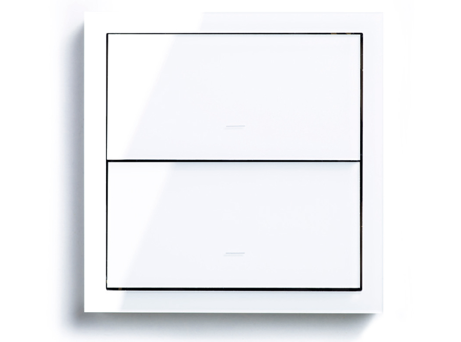
At the same time, the ubiquity of technology is making us crave the intimacy and authenticity of other sensual design qualities, like tactility. And our experience of controlling so many digital products through their touch screens is rendering us more sensitive to the subtleties of texture and the pleasure of touch. The Spanish company Simon recently introduced a light switch composed of a flat rectangular panel, which is operated solely by touch with no visual clues to guide the user. Simon’s research suggests we are now so accustomed to operating our phones through touch that we are ready to do the same for other objects.
Even so, touch is a fledgling field in design. We know instinctively how powerful it can be. Touching something that is too wet, dry, sharp, rough or slippery can be alarming, while pleasurable sensations of touch can feel delightful. Yet, we have a limited vocabulary to describe tactility, reflecting the dearth of scientific research into the subject. Adam Gopnik noted recently in The New Yorker that for every 50 research papers on the science of vision in the last half century, there has been only one on touch. That is changing. The neuroscientist David Linden told Gopnik that more papers have been written about the molecular and cellular basis of touch in the last decade than in the preceding century, which should help designers to use it more adroitly and the rest of us to appreciate its nuances.

That’s just as well because touch will feature more prominently in future design, especially in virtual and augmented-reality software, which will replicate haptic sensations, as well as elaborate visual effects. As a result, touch will become increasingly important in defining our response to design and its desirability. And the same may apply to other, long-neglected sensual qualities, like scent.
Yet, all of these sensory factors face the challenge of the demise of one of the defining principles of 20th-century industrial design (and the mantra of tastemakers such as Banham’s foes in the Council of Industrial Design) that ‘form follows function’, or ‘form ever follows function’ as the US architect Louis Sullivan wrote when he coined the phrase in 1896. The belief that the physical form of an object should be defined by what it does is increasingly irrelevant to more and more areas of design. The catalyst is the relentless surge in computing power as transistors have shrunk in size, enabling digital devices to become smaller and lighter, yet also faster and more efficient.
How could you guess by looking at or touching something as small and as inscrutable as a smartphone that it can execute hundreds, if not thousands, of different tasks? And what is the most important factor in determining whether or not you will enjoy using it: what it looks like or how easy and efficient it is to operate? The latter, of course. However much you admire the styling of a phone or tablet, the pleasure you take in its aesthetic won’t last long if it is infuriatingly difficult to operate. The growing significance of invisible design phenomena, such as the user interface software with which we control digital devices, will not render the physical dimensions of design redundant, but they are likely to become less significant in terms of determining desirability.
Not that this is necessarily a bad thing. Historically, one of design’s biggest problems is that it is so often confused with styling and dismissed as a superficial medium that focuses on the visual aspects of objects or spaces. Equally pernicious is the presumption that design’s stylistic ploys are mostly deployed to commercial ends by tricking us into paying too much for things of dubious value that we will soon discard with the rest of the unrecyclable, toxic junk in bloated dumps.
The growing importance of other design qualities – whether they are haptic, functional or ethical – should challenge these stereotypes and encourage more people to develop an increasingly eclectic and sophisticated understanding of design and its potential to make our lives more desirable in so many respects – not least by consuming less rubbish, tasteful or otherwise.
Lead image: The Citroën DS 19 at the Paris Motor Show in the Grand Plais, Paris, 1955. Courtesy: Getty Images


