Mega Upload
Simon Denny and the exhibition as interface
Simon Denny and the exhibition as interface

In his 2012 essay Navigating Neoliberalism: Political Aesthetics in an Age of Crisis, philosopher Nick Srnicek writes: ‘we’ve now converged on a widespread acceptance of the neoliberal premise that the world is too complex to plan, manipulate, accelerate, modify, or otherwise intervene in. Common sense therefore has it that the market is the best we can hope for. There is no way to manipulate a complex system, so why bother?’
In the late 1990s, the term Big Data was popularized to describe the incomprehensibly large and complex information systems that comprise the global economy. Its understatement makes the phrase all the more intimidating. ‘Big’ data is big like God is big: so great as to surpass the limits of human cognition. Thus, Srnicek writes, ‘an aesthetics of the sublime emerges’ in our daily dealings with it.
Within a structure of such scale and complexity, our point of interpolation is the physical interface through which we can access the tips of the data iceberg. Given this fact, the interface’s aesthetic design takes on both practical and political significance. Inventing interfaces to represent data is as much a job for artists, who have always been engaged in some way with the act of representing the unseeable, as it is for programmers and software designers.
Simon Denny often calls his forté ‘the skill of making exhibitions.’ That is, the ability to filter, synthesize, and organize a large amount of information into an intelligible aesthetic display. Yet unlike the typical interfaces we interact with, Denny’s strategies of organization and representation are non-algorithmic, idiosyncratic. Rather than a computer algorithm, Denny himself is the filter.
As our devices become slimmer, smaller and more invisible – TV tubes shrinking into flatscreens into flat graphics on mobile devices – it’s increasingly easy to forget or overlook the interfaces through which we access the world of Big Data. Denny’s exhibitions-as-interfaces are not necessarily designed to throw a wrench into the back-end algorithms governing access to information, but perform an intervention at the user end – reminding us that we are using an interface in the first place. What is most significant about this kind of exhibition making is not that it manages to convey a huge amount of information (though it does that too), but that its data set has been subjectively chosen and interfaced by a person.

Art Statements, Art 43, Basel
Denny’s 2012 installation, Channel Document (2012), which won the 14th Baloise Art Prize at Art Basel, pinpointed a case in which the technical advancement of a communication medium – counter to general notions of social progress – cut off public access to information. The exhibition chronicled the four-year lifespan of the now defunct TVNZ 7 – New Zealand’s last non-commercial digital television channel. At the time this work was made the country was completing its full switch from analogue to digital broadcasting, and state funding for TVNZ 7 had just been cut. Denny built a timeline of the months leading up to its closure. Arranged were Plexiglas panels featuring newspaper clippings displayed chronologically, stills from TVNZ 7 programmes, ‘Save 7’ T-shirts and Mac calendar icons counting down the days until TVNZ 7 bit the dust. As a tongue-in-cheek comment on the results of full privatization, Denny also included a _Pirates of the Caribbean_-themed television set.
Denny’s subsequent Museum Moderner Kunst Stiftung Ludwig (mumok) show this year – awarded as the result of winning the Baloise Prize – The Personal Effects of Kim Dotcom (2013), likewise emphasized the politics surrounding public access to data. Kim Dotcom is the pseudonym of Kim Schmitz, the German-Finnish media mogul and alleged hacker behind the free file-sharing website Megaupload.com. After more than a decade avoiding jail time in Germany for crimes such as data espionage and insider trading, in 2010 Dotcom was granted residency in New Zealand as part of the ‘investor plus’ category, whereby non-citizens who invest NZ$10 million in the country can gain automatic leave to remain. Millions only go so far when the USA’s information hegemony is threatened, however. By 2012, US intelligence organizations (apparently aided in their spying by the New Zealand Government Communications Security Bureau) had gained enough evidence to mount a case against Dotcom for ‘stealing’ US$500 million from US copyright holders, prompting New Zealand police to confiscate his wealth and possessions.
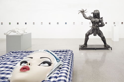
For The Personal Effects of Kim Dotcom, Denny experimented with modes of representing these items. The exhibition is assembled warehouse-style, like a ‘Trash’ folder into which 110 files have been hastily dumped and left unorganized. Given that 65 of the seized items were bank accounts, 18 were web domains and several were denoted in mysterious terms like ‘hooded sculpture’, the presentation of these exhibits necessitated an oblique approach to 1:1 representation (or, as Denny puts it, ‘high definition depiction’). Most URLs and bank accounts become brushed-steel wall plaques emblazoned with logos and domain names – the balance of one bank account, though, was manifested in all its glorious materiality as two stacks of cash. The relationship between signifier and signified was not always easy to decipher in this exhibition, which also included a statue of the Predator from the 1987 Arnold Schwarzenegger movie, sets of license plates – e.g. ‘HACKER’, ‘MAFIA’, ‘STONED’ – a shiny brand-new motorcycle and photo after photo of confiscated Maserati and Mercedes-Benz sport cars. Was this a recreation, museum display or memorial? Denny’s itemizing of Dotcom’s seized possessions within an exhibition space might be read as an attempt to comprehend personhood through objective data. It could also be read as a sharp meta-critique of the societal obligation for an artist to become a Dotcom-like figure, larger-than-life and constructed by the public alternatingly as activist and egoist.
Denny was born in Auckland, New Zealand in 1982; the launch of his career almost perfectly coincided with the rise of Big Data. After graduating from University of Auckland in 2004, he relocated to Germany to attend the Städelschule in Frankfurt, and now lives in Berlin – a growing hub for both new media art and tech start-up companies, which has provided key context and material for his projects. Before shifting his focus to the emerging technology economy, for several years his primary medium and subject of investigation was the analogue television – following its slide into near-obsolescence at the onset of widespread network computing.

Several early exhibitions, such as Aquarium Videos (2008) at Ursula Blickle Stiftung and Seven Drunken Videos (2009) at Lüttgenmeijer, Berlin, explicitly focused on the material depth of the now-outmoded TV tube by likening it to an aquarium. In some shows he emphasized the illusionary nature of this depth – dropping gutted, screenless TV sets into tank-like frames. In others he called attention to the changing relationship between material connectedness and information access – wedging several old bulky TVs screen-first into the tank-frames to expose their naked, disconnected power cords (in Starting From Behind, Brussels Biennale, 2009, and at Michael Lett Gallery the same year). In exhibitions such as these the aquarium is both a cipher for the outmoded television and the container for its archeological display.
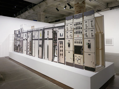
The flattening or compression of both devices and data is a consistent theme. In Denny’s contribution to this year’s 55th Venice Biennale, Analogue Broadcasting Hardware Compression (2013), full-scale images of the UK’s last analogue television transmitters were inkjet printed on canvases. These were arranged back-to-back on a low plinth to form a hollow tunnel, inside of which crushed analogue television sets sat in various states of physical compression. The actual trans-mitters had been displayed in the group show, Remote Control, at the ICA in 2012, so this was effectively a compression of this previous exhibition (for which Denny, in part, had provided exhibition design) – as if, rather than shipping the transmitters to Venice, they had been scanned, zipped and emailed.
In a group of shows focusing on the annual tech conference DLD (Digital-Life-Design) in Munich, Denny tested the capacity of an art exhibition to yield the maximum amount of information. A yearly conference put on by Germany’s Hubert Burda Media corporation, DLD invites the world’s heaviest-hitters in the fields of digital media, science and culture to spend two jam-packed days inspiring each other in a roster of talks, panels and ‘fireside chats’. Denny’s first exhibition on the topic in 2013, All You Need Is Data – The DLD 2012 Conference REDUX, was held at the Munich Kunstverein – a short walk from where the 2013 iteration was taking place at the same time.
Denny sourced the DLD’s extensive database to reactivate the conference in bite-size form. He installed 89 canvases on a metal bar winding through the Kunstverein, each corresponding chronologically to a conference event, including breaks and lunches. The panels presented documentation according to a display logic clearly derived from Apple’s design aesthetic, one of whose distinguishing factors is skeumorphism, or the design of a flat interface to resemble 3D reality (Apple’s notepad app, with its ‘Marker Felt’ scribble on yellow notepaper, is a classic example). It was in this same typeface that quotes from speakers at DLD were rendered on Denny’s canvases, among an overwhelming assortment of taped-up snapshots, banner ads, and dangling participant name tags.
Once again, Denny’s back-end representation algorithm was opaque: it wasn’t clear which quote to attribute to which talking head, or what snippets had been recontextualized to foreground their comedy and contradictions. The sentences ranged from platitudinous exaltation: ‘data is the oil of the 21st century’, to self aggrandizement: ‘If you take a zero off of everything we’ve done, it all looks incredibly normal’, to lamentations of the very technology that most participants were actively thrusting forward: ‘we’re stuck creating algorithms that figure out what all this data actually means.’
Denny again resurrected DLD 2012 at Petzel Gallery in New York this summer, with the addendum rerun at the end of the exhibition title. In the mere months between the exhibition’s first and second iterations, technology had already leapt forward and altered the material’s context: halfway through the show’s run, Apple released its iOS 7, a brand-new interface that all but abandons skeumorphic imagery in favour of flat design – consistent with the predictive timeline of aesthetic flattening that Denny has created in many exhibitions. Suddenly All You Need Is Data … became a historical document not only in terms of content but also aesthetics.
All You Need Is Data … is shown in its third incarnation for the 2013 Nationalgalerie Preis für Junge Kunst (National Gallery Prize for Young Art) exhibition at Hamburger Bahnhof in Berlin. Denny was one of four nominees for the prize, along with Kerstin Brätsch, Mariana Castillo Deball, and Haris Epaminonda. His is the only work in the show that converses directly with contemporary technology, which is probably what prompted curator Joachim Jäger to describe it in a promotional video as ‘absolutely up-to-date’. Yet its absolutely not up-to-dateness, its widening temporal gap from its material, is precisely what emphasizes its point: the speed at which interface aesthetics change, and how these aesthetics determine how we absorb and historicize the information they purport to transmit in new and better ways.

Over recent years, Denny has moved closer to his subject – here, the world of ‘real’ digital design and Berlin’s expanding IT sector – by attending start-up conferences and hackathons. In spring 2013 Denny, with friend Matt Goerzen, attended one hackathon run by Deutsche Telekom and tech company Evernote. Initially attending as spectators, they were eventually invited to present ideas. The app they came up with (a programme that criticizes and bullies the user, but eventually evolves into something more positive), will form the basis for a 2014 show at Galerie Buchholz in Berlin.
In another direct action within an existing framework, Denny and the artist Daniel Keller jointly applied to organize a ‘TEDx’ conference in Lichtenstein. The irony of hosting TED in this micro-nation of economic superlatives (highest GDP, lowest internal debt) is not lost. To memorialize TED’s official endorsement, Denny printed the acceptance letter in icing on a series of fruitcakes and displayed them in a 2013 group exhibition at the Kunstmuseum Liechtenstein. This exhibition was organized as a result of Denny, along with three other artists, being awarded the Ars Viva award for contemporary art. While the cakes explicitly celebrate TED’s recognition, they also implicitly liken the culture of arts awards to any other promotional mechanism such as the TED talks.
If the dividing lines between art and commercial enterprise, or between art and technological development were at all clear today, it might be tempting to term Denny’s forays into the tech sector ‘interventions’. But these spheres are hardly mutually exclusive. Nonetheless, Denny has said repeatedly he comes from an outside user’s perspective without the same skills or agenda as a systems architect. Tellingly, he likens his new IT projects to a 1979 video work by Michael Smith, USA Freestyle Disco Championships, in which the artist entered a disco competition at New York’s Copacabana nightclub, gave it his all despite total lack of dancing ability – and lost.
Whether or not Denny identifies as a user or participant in the world of Big Data, by approaching exhibition-making as interface design the artist becomes a release valve, however small, in the global information economy. By providing a (much funnier) alternative to interfacing data, the arbitrariness of the systems we take for given is brought to light. A fruitcake with skeumorphic icing? Why not?


