Remembering Mr. Gridnik: A Tribute to Wim Crouwel (1928–2019)
Designers Experimental Jetset, Kellenberger–White, Fraser Muggeridge and historian Emily King on the enduring influence of the Dutch design legend
Designers Experimental Jetset, Kellenberger–White, Fraser Muggeridge and historian Emily King on the enduring influence of the Dutch design legend
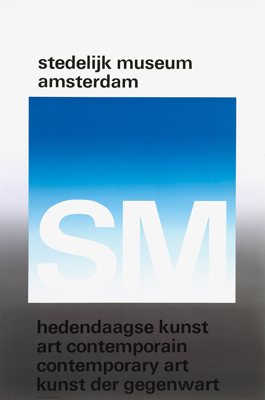
Wim Crouwel, who died on 19 September at the age of 90, was one of the 20th-century’s most prolific and influential designers. With his company Total Design, one of the Netherlands’ first graphics agencies, he created the visual identities of numerous Dutch cultural, commercial and civic entities from the 1960s on. His distinctive typography – sans serif typefaces organized according to carefully structured grids – has appeared everywhere from postal stamps and telephone directories to museum posters and Olivetti typewriters. One of Crouwel’s longest standing and most prolific collaborations was with the museum director Edy de Wilde, with whom he first worked at the Van Abbemuseum in Eindhoven in the mid-1950s. When De Wilde moved to the Stedelijk Museum in Amsterdam in the early 1960s, he took Crouwel with him. Between 1963 and 1985, as sole designer of the Stedelijk’s visual communications, Crouwel combined a minimalist, grid-based approach with innovative, sometimes playful typography to create a distinct visual identity that still looks fresh. His space-age ‘New Alphabet’ font, designed in 1967 (and unexpectedly revived by its appearance, in striking lime green, on the cover of Joy Division’s 1988 album Substance) was acquired by MoMA in 2011, while ‘Gridnik’ graced Dutch postal stamps until 2002. ‘Wim Crouwel: Mr. Gridnik’, an exhibition of his typographic work opens at the Stedelijk later this month. As a tribute to Crouwel and his ongoing influence, contemporary designers and design historians discuss the element of his work that has been most meaningful to them.

Marieke Stolk, Erwin Brinkers and Danny van den Dungen, Experimental Jetset
Edward Kienholz exhibition poster, 1970
We grew up in a graphic environment that was shaped by Wim Crouwel and his peers: the Netherlands of the 1970s and the social-democratic visual landscape in which we spent our childhood years. The schoolbooks, stamps, telephone books – everything around us was designed by Crouwel and his firm, Total Design. As a result, we regard Crouwel’s graphic language as our mother tongue, our folk art. It shaped our way of thinking, of reading, of writing, of living – and for this, we are forever thankful.
However, in contrast to the way in which most critics and admirers (and, most notably, Wim himself) interpret his work, we never saw his designs as functionalist, objective or neutral. In our view, Crouwel is most of all a graphic poet – and his work is filled with deep rhythms, emotional undercurrents and subversive tendencies.
An example of this subversiveness can be found in the catalogue he designed (together with Jolijn van de Wouw, of Total Design) for the 1970 Edward Kienholz retrospective, ‘Tableaux’. The letters SM (Stedelijk Museum) are stamped on top of an American flag – black on black. A gesture that is almost proto-punk in its execution. A gothic image, perfect for the dark, gloomy times ahead of us.

Eva Kellenberger and Sebastian White, Kellenberger–White
Fernand Léger exhibition poster, 1957
About 12 years ago, a little while before we opened our graphic design studio, we went to a lecture by Wim Crouwel at Logan Hall in London. He talked about a silk-screened poster he’d designed back in 1957, when he was not yet 30, to accompany a Fernand Léger exhibition at the Stedelijk. Its soft yellow-green palette was, Crouwel explained, a colour he simply ‘saw’ in Léger’s pipe-filled paintings, while the letters were purely constructed, like Léger’s black outlines, with no optical corrections. These lines created a continuous figure, like a signature.
A typographic intervention that grew out of a personal reading of Léger’s work, given shape by conversations with the museum. This poster is an act at once gestural and rhythmic, intuitive and deeply considered. Which is to say, in spite of Crouwel’s mantras – design like a machine, remove the human factor – it feels human, like a kind of magic. As Crouwel admitted, ‘Why the details come to be the way they are, I cannot say.’ His work continues to make us work harder, be more vigorous and inventive, to vehemently use our grids.
No other designer ever had more fruitful or faithful relationships with museums. Crouwel was the sole designer of the Stedelijk’s visual communications from 1963 to 1985, stopping just two years shy of his silver anniversary. Many of his early poster designs for the institution were typographic expressions that create an image – something we dream of designing, but rarely get to do. Typographic posters are no longer popular; exhibitions require a photograph, it is felt, to pull in the crowds. Those were different times and different places.

Emily King, design historian
‘1928: Beauty and Transparency, Logic and Ingenuity’, 1993, Museum Boijmans Van Beuningen
Wim Crouwel was the Director of the Museum Boijmans Van Beuningen in Rotterdam from 1985 until his compulsory retirement at the age of 65 in 1993. To mark his departure, he was asked to curate an exhibition that reflected his own taste. Immediately, he focused on the years between the two world wars and, researching the design he most admired, he discovered that much of it originated from the very year he was born, 1928. The exhibition included work by Marcel Breuer, Le Corbusier, Mies van der Rohe and Charlotte Perriand, alongside a Bugatti race car. It was titled ‘1928: Beauty and Transparency, Logic and Ingenuity’. The only trace of it I can find online is its poster, designed by the British graphic design team 8vo. I didn’t see this show, but I love the idea of it, particularly because the most influential of Wim’s designs, his ‘New Alphabet’, was designed in 1967, the year of my birth.

Fraser Muggeridge
Stedelijk identity, 1963–85
How should we look at Wim Crouwel’s work? Why is it iconic? What is his contribution to the field? Why does it look like it does and what can we learn from it? One of the answers lies in the means of production and the technology used in the mid 1960s. Supplied photographs of artworks would have been scarce and colour photography was costly to use in both design, pre-press and printing. Collaboration and the sharing of preparatory work with artists and clients would have been impossible.
When tasked with designing exhibition posters for the Stedelijk, Crouwel utilized typography combined with limited spot colours to represent each exhibition. The work is super abstract often with a tenuous link to the subject matter, but Crouwel really worked at the border between self-expression and functionality, one of the major challenges to all graphic designers in their work. I would be curious to know how the public reacted to the material at the time.
The posters, catalogues and leaflets that Crouwel designed for the Stedelijk represent a brand identity enabled by the consistent support of a designer by a client over a number of years and cemented by the legacy of Willem Sandberg, the museum’s previous designer and director.


