Sam Moyer
Rachel Uffner Gallery, New York, USA
Rachel Uffner Gallery, New York, USA

As the stones began to pile on top of Giles Corey in Salem, Massachusetts in 1692, he didn’t cry for help – instead he asked for ‘more weight’. Charged with being a witch in one of the trials made famous by Arthur Miller’s play The Crucible, the farmer had refused to enter a plea of guilty or nor guilty and was punished by being crushed to death. Corey’s call to hasten his own death has come to represent resistance in the face of ignorant Puritanism. Sam Moyer mordantly took this phrase as the title of her third solo show at Rachel Uffner Gallery – a show that at first glance looked anything but defiant. On closer inspection, however, the exhibition revealed itself to be an unpretentiously bold take on au courant formalist painting.
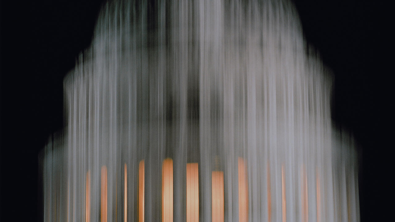
In the gallery’s long and narrow first room, eight 2 x 1-metre paintings (all titled Breakers III, and all made in 2014) asserted a continuation of Moyer’s longstanding interest in light’s effect on painting. Each of these pieces is composed of two sandwiched-together parts: glass that has been painted on its reverse side with horizontal bands, interrupted lines or swirling marks is framed against a layer of ink-dyed fabric or coloured Perspex. These diluted patterns look like washed-away photographic negatives, the light passing through them exposing subtle shifts in colouration and complexity in the surface behind.Although they look slick in their brass frames, the pieces also exude an elegance that is as rough as it is beguiling; their curves, lines, layers, the sheer depth they suggest, create a tension with the overall sense of flatness.
This tension was alleviated, if not levelled, by More Weight (2014), an expansive two-piece installation shown in the gallery’s high-ceilinged second room. The bottom element is a 3 x 7-metre rectangle of white marble that is slightly raised off the floor. Suspended above this is a piece of mildewed-looking dyed fabric that has been stretched over a three-section frame which, at 4 x 8 metres, is marginally larger than the shape that sits beneath. Set closely above this second element is a fluorescent box light that illuminates the faintly brown-and-green cloth beneath. This lighting, diffused by a covering of silk polyester, makes the fabric look as if it were concrete – creating a scene weightier than it really is – and whose soft, filtered glow entices the viewer to step onto the ‘stage’ created by the piece’s marble base. Walking on the stone, exploring its texture and experiencing the room’s softened light mitigates the heaviness that can often characterize works of this size. This is no mean feat for a work that in total weighs around 450 kilos and looks a lot like Richard Serra’s ceiling-and-floor-mounted steel installation, Delineator (1974–75). This piece is an obvious one to reference here, but the nod backwards is part of what gives Moyer’s work its sly rebelliousness: whereas Serra’s work feels weighty, masculine and oppressive, hers feels redemptive and light.

Moyer’s exhibition was all about this space between appearance and reality. Nowhere was the idea more apparent than in the 11 mostly rectangular diptychs that hung in the upstairs space. One-part canvas, one-part marble slab, the works might at first appear gimmicky since some of the canvases, such as Being There (2014) also look as if they were marble. But on closer inspection, volume blows these pieces’ cover: each marble element fits with its canvas partner like a puzzle piece, inviting you to probe the narrow space that is created in the boundary between them.
The show was unpretentious in the sense that Moyer stuck to what she does best: creating expressionist-style paintings that are easy to look at, and honest about what they are. But in a bold engagement with materiality that is untypical of much of today’s historically oriented minimalist art, she has also managed to create depth from flatness – and, for those lucky enough to view the work in person, to return some nuance to the viewing of art that is not easily reproduced by looking at the same thing on a digital screen.


