26th International Biennial of Graphic Design
Various venues, Brno, Czech Republic
Various venues, Brno, Czech Republic

Biennials proliferate. Old ones survive; new ones spring up. Recent biennials like Massimiliano Gioni’s 2013 Venice Biennale, ‘The Encyclopedic Palace’, and Rem Koolhaas’s 2014 Architecture Biennale, ‘Elements of Architecture’, eschewed gathering the new in favour of casting fresh light on the old. Such shows concentrate less on illustrating the current state of play and more on demonstrating curatorial theses. In line with this trend, the 26th International Biennial of Graphic Design Brno, with its subtitle ‘Graphic Design, Education & Schools’, rather than providing a snapshot of contemporary graphic design activity, reflected on the education of graphic designers.
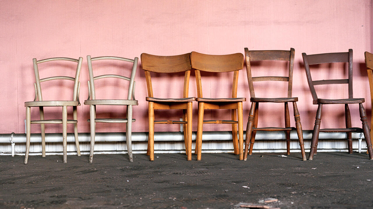
Since its first edition in 1963, the greater part of the Brno Biennial has traditionally comprised work by professional designers chosen through an international competition. The three Czech designers who curated this outing – Tomáš Celizna, Adam Machácek and Radim Peško – were all educated abroad and now work respectively in Amsterdam, Berkeley and London. Instead of judging the work of fellow professionals, the trio took the controversial decision to hold a student competition. The successful entries were displayed on the ground floor of Brno’s Museum of Applied Arts, some of them on furniture that was originally conceived for graphic design schools and had been remade in the museum’s workshops for this exhibition. While the winning works – mostly books and posters, with surprisingly few films and websites – had a sense of highly produced gloss, the furniture, designed by, among others, Max Bill, Karel Martens and Wolfgang Weingart, was strikingly simple. The display created an interesting contrast between the style of the graphic pieces and the stark environments in which they were likely produced.
Pursuing the schools theme, the curators invited designer and teacher Nina Paim to stage an exhibition about the assignments given in graphic design courses. Titled ‘Taking a Line for a Walk’ (after Paul Klee’s famous dictum), this show within a show explored historical and contemporary assignments and displayed a selection of objects used as educational prompts – such as a set of shapes that could be explored in two or three dimensions, or plaster casts of body parts. Graphic design is ostensibly a practical discipline, yet schools offer a chance to work speculatively and educational briefs have to imagine a conduit between the applied and the theoretical.
Other educational elements of the biennial included a reflection on ‘The Study Room’, which comprised publications selected by a group of designers displayed on Enzo Mari’s Autoprogettazione furniture and held vertical by broken-brick book ends. This was shown in tandem with a meditation on St Jerome’s study that was assembled by the curators but referred to a project by Céline Condorelli (Revision, 2009–ongoing). Between them, the two parts of the display prompted analogies between the layout of two- and three-dimensional space, and the structure of thought. Like the art school furniture, it suggested that the shape of things and the shape of ideas are inextricably bound. Picking up on a related theme, a large-scale blackboard illustration by Rudy Guedj, summarizing the evolution of the art school from the Academy through Bauhaus to the contemporary, used a series of simple forms to represent complex educational philosophies.
The two non-educational elements of the biennial were monographic shows of the work of veteran Czech designer Rostistlav Vanek and the esteemed Dutch design team Mevis & Van Deursen. Both were prompted by previous honours – Vanek was given a lifetime contribution award at the 2010 biennial and Mevis & Van Deursen were the winners of the Grand Prix in the professional competition of 2012. While Vane˘k played it straight, showing a career’s worth of well-crafted identities, publications and typefaces, Mevis & Van Deursen fooled with the format by exhibiting only a handful of pieces and overwhelming each of them with outsized, overly detailed captions. The shows were an effective pair, allowing comparisons of not only the designs produced by the respective studios, but also the designers’ sense of their own roles. Vanek posed as a creator of order, Mevis & Van Deursen as generators of disturbance.
The biennial occupied parts of Brno’s Museum of Applied Arts and the Moravian Gallery as well as the ground floor of a third building, the Governor’s Palace, which was given over to an ‘Off Program’ – a revolving selection of workshops, presentations and exhibitions, largely staged by students. The last element of the biennial proper was a statistical study of the genders, nationalities and ages of the winners of the last ten Brno competitions, presented in a book titled Off-White Paper. Although its authors, the Korean designers Sulki & Min Choi, claim an interest in ‘quantities, not qualities’, their title suggests otherwise. The figures reveal a disconcerting consistency in the biennial’s previous few outings, most of the winners being men from Europe. Although it could be argued that the 26th edition didn’t venture into dramatically new geographical territory, it made a significant step simply by breaking the cycle of professional self-congratulation.


