By Design
The pros and cons of new digital interface design
The pros and cons of new digital interface design

If you log on to one of the bigger, busier websites, like The New York Times or the Guardian, you may well spot three horizontal lines of equal length forming a small square at the top of the screen. It is known to techies as the ‘hamburger icon’, even though it is rather a stretch to read the upper and lower lines as the two halves of a bun, and the middle one as the meat, cheese and whatever else is stuffed between them. Oddly named or not, those three lines have appeared on more and more websites in the last year or two, mostly to identify a menu that appears from the side of the screen to reveal a list of the contents.
Like all of the operating symbols on the screens of our laptops, tablets, phones and other digital devices, the hamburger assumed its current function because something had to. In its case, once smart phones had become powerful enough to be used as internet browsers, website designers needed to find ways of removing data from their pages to make them easier to read on smaller screens. Replacing lengthy menus with hidden ones that slid into view at the click of a button was a clever solution. The ‘side navigation panel’, as it is properly known, was devised by the us designer Loren Brichter, who chose to identify it by reviving the hamburger icon, which originally belonged to a pioneering early 1980s digital user interface.
Smart choice. Forget the sketchy resemblance to a burger, those three lines look much more like extreme abstractions of the chapter titles in a book index. It’s an apt allusion, as an index fulfils much the same function as a website menu. The hamburger is visually engaging too, not least because it is ineluctably digital, making it surprisingly rare amid the timid, often nostalgic aesthetics of user interfaces.
Not that interface design is a flop: in many respects, it is a triumph. Enabling those of us without doctorates in advanced programming to operate something as complex as a computer is a Herculean design challenge, which has become ever more daunting as digital devices have shrunk in size while increasing in power. The most important aspect of a user interface, or any other design project, is that it should fulfill its function efficiently, but the experience of using it matters, too. Many of the most pleasurable aspects of operating digital devices involve touch and movement, like the ‘slide to refresh’ manoeuvre (also designed by Brichter) with which we update email inboxes and Instagram feeds by tugging the top of the screen. But the visual dimension of user interfaces has been less beguiling, even though digital operating symbols like the hamburger icon or the email apps on touchscreens are among the most ubiquitous images of our age and our most useful tools. The screenshot pictures made by the Danish artist Anders Clausen reveal how familiar those emblems have become, and how disturbing it can be to see them out of context. So, why are the aesthetics of something so pervasive, the design of which is deeply sophisticated in other respects, often underwhelming?

When the first computers emerged in the 1950s, they were operated by specially trained technicians who typed instructions into typewriter-style keyboards in the form of programming code. Those machines were so big, and generated so much heat and noise, that most were placed in specially designated rooms. They were also so expensive that only large organizations could afford them. Not until the late 1970s did hobbyists – such as Apple co-founders Steve Jobs and Steve Wozniak in the US and Clive Sinclair in the UK – develop computer kits, which were small and cheap enough to be bought by individuals. The designers and programmers of the new personal computers then had to devise ways of enabling people who were unfamiliar with coding to operate them. Much of the early research in digital interfaces – including Muriel Cooper’s work in the Visible Language Workshop at the Massachusetts Institute of Technology – pursued that objective, while seeking to imbue digital imagery with the clarity and sensitivity of the best design in any medium.
The late Bill Moggridge’s 2007 book Designing Interactions describes how the first digital user interfaces were developed by computer scientists and design engineers at research laboratories, like the Xerox Palo Alto Research Center (Xerox PARC) in northern California. Their work was guided by the shared assumption that the closer a computer’s controls appeared to be to familiar things with similar functions, the simpler they would be to use. To this end they modelled the first digital user interface, which was introduced in 1981 with the Xerox 8010, or Star, computer on the flow of paperwork around an office – storing documents in files, folders and cabinets, and discarding trash – by creating pictorial replicas of those objects to represent the relevant controls. The Star’s interface featured several operating symbols devised by a Xerox PARC design engineer, Norm Cox, including an empty rectangle that signified an A4 paper document and the hamburger icon.
Microsoft, Apple and other companies adopted the office template too, while devising their own operating symbols to add to Xerox’s. One Apple designer, Bill Atkinson, told Moggridge that during the development of the Lisa desktop computer in the early 1980s, they decided to warn its users when the trashcan needed to be emptied. Atkinson suggested that flies should buzz around the top, as they might in real life, only to be overruled by his colleagues. Worried that agitated insects would be too unsettling, they insisted on using crumpled sheets of white paper instead.

Graphically, these early interface symbols were crude, not least because the pixels, from which digital images are constructed, were so big at the time. But, as computer graphics became more refined – with ever-tinier pixels and subtler detailing – so did the quality of user-interface imagery. In the last decade, we have become accustomed to seeing increasingly intricate operating symbols on the screens of our computers, phones and tablets, many of them embellished by ornamental effects, like drop shadows and faux textured or polished surfaces.
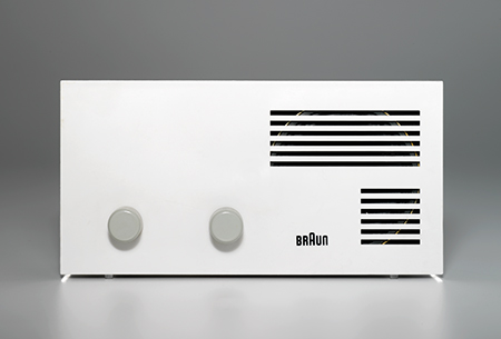
In theory, these advances should have empowered designers to create a singular new aesthetic, the early-21st-century equivalent of the deftly designed controls of Braun electronic products in the 1950s and ’60s. Praising the glacial beauty of Braun’s vintage radios and record players has become a design cliché, yet they remain models of the efficiency and elegance that Cooper sought for digital graphics. Braun’s designers achieved this by minimizing the number of buttons, switches and dials, positioning them in orderly sequences, and guiding the user with visual prompts like colour-coding. ‘Off’ switches were always red and ‘on’ switches green. They even modified the shapes of the button tops to suggest whether they should be pushed down firmly or pressed at particular points: concave for the former, convex for the latter. This formula enabled the products to be operated effortlessly, while creating an innovative design aesthetic that still defines the era.
Instead of striving to produce something equally compelling, digital user interface design has seemed to be steeped in nostalgia. For much of the past decade, it has been dominated by hyper-realistic or skeuomorphic images of the type of analogue objects Xerox PARC used as prompts over 30 years ago. Take the paper envelope with an antique red-wax seal that identified the email application in one Android Samsung phone. (The only digital touch was the @ of an email address stamped into the wax.) Less than three years ago, Apple unveiled the ios 6 operating software for iPhones and iPads, whose graphic symbols included a traditional telephone handset for the phone app, an envelope for email and a clock whose similarity to the Official Swiss Railways Clock provoked a legal row. (Apple conceded defeat.) Even cheesier was the tacky wooden bookcase icon identifying the book store.
Why would any company invest so much cash and intellectual energy in developing digital books only to present them as being rather like printed ones? Why not illustrate them in a way that spelled out their benefits – such as greater choice and instant accessibility – without wasting paper? The analogue symbols that seemed reassuring to tech ingénues in the early days of digital interfaces had become patronizing. They also risked confusing younger users, who may never have owned any of the objects which were being rendered redundant by the very apps they symbolized.
A few weeks before ios 6’s debut, Microsoft introduced the Windows 8 operating system with a very different aesthetic, which it had been developing for several years. Simpler in style and bereft of decorative flurries, it was dominated by solid blocks of colour and spruce typography. ‘Flat design’, as it was called, was also adopted by Google, Twitter, Facebook, Dropbox, Samsung and, eventually, Apple, after Jonathan Ive, its senior vice president of design, took charge of interface design in 2013. Apple has since introduced two operating systems, ios 7 and ios 8, whose styling is cleaner and less fussy than ios 6’s, yet still replete with analogue references. The telephone handset and envelope have survived. Thankfully, the bookcase has disappeared, though so has my favourite skeuo feature, the calculator keypad inspired by the 1977 Braun ET44 pocket calculator, replaced by a dreary piece of flat design. Apple has shed its skeuomorphic excesses, but has neither fully embraced flatness nor succeeded in developing a new aesthetic to match the quality of its hardware design.
Sadly, Apple’s new calculator is not the only dull example of flat design, which although undeniably cleaner and sprucer than skeuomorphism with a pleasingly purposeful spirit, can be as dour as its adjective suggests. Nor is the flat aesthetic free from nostalgia, influenced as it is by the postwar European style of modernism, epitomized by the Swiss Style of typography championed by Max Bill and Adrian Frutiger, and Rams’s work at Braun.
Developing a definitive design aesthetic as Braun once did is fiendishly difficult in any context, but especially so for something as complex as a digital interface with its multifarious functions. Whereas Braun’s designers could depend on the ‘form ever follows function’ principle of modernist industrial design to provide physical clues as to how to operate their products, the designers of digital devices can not do so. How could you guess what to do with a smartphone or tablet by looking at it? You couldn’t. Another obstacle is the need to design operating systems, which, like road signs, can be easily understood by people with dramatically different levels of knowledge and experience, without irritating the experts, or confusing ingénues.
Yet user-interface designers also have great advantages. Their field is relatively new, which is often conducive to a gutsy and experimental approach to design. It also includes huge companies with immense research resources like Apple, Google and Microsoft affording plentiful opportunities to operate independently, free from corporate pressures to compromise. Nor is the visual aspect of user-interface design encumbered by formal constraints. There is no legislative pressure to use specified operating symbols, or an industry-wide agreement to do so, as there is, say, for DVD recorders. In theory, user-interface designers have been free to invent their own aesthetic and have had the inestimable advantage of powerful leaps in technology to help them.
Will they make more of these opportunities in future? There is no reason why they shouldn’t, especially as interface design has already achieved so much, both functionally and sensually. If it becomes equally imposing from a visual perspective, we will all benefit. What would you rather see on your screen? The unexpectedly eloquent hamburger, whose only nod to nostalgia is to the pioneering early age of computing, or a bookcase that’s equally unappealing, whether physical or digital?


