Life in Design: Trix and Robert Haussmann
The renowned Swiss architect and designer duo discuss the influences that have shaped their six-decade careers
The renowned Swiss architect and designer duo discuss the influences that have shaped their six-decade careers

We never wanted to pretend that the previous generations didn’t exist. We have always attempted to find adequate ways of renewing the modernist project after the war, and we were both strongly influenced by the Bauhaus and new objectivity, albeit in different ways.
Robert studied in the Amsterdam academy of the modernist designer and architect Gerrit Rietveld in 1951, then, later, in Zürich, with the Swiss designer Willy Guhl and Bauhaus member Johannes Itten. He also attended private seminars organized by the Swiss historian Sigfried Giedion and his wife Carola Giedion-Welcker, who invited friends from various disciplines. The composer Wladimir Vogel once spoke about 12-tone technique; Hans Kayser talked about harmony. The notion that physical proportions can also be heard, as Kayser taught, was a revelation, and encouraged a certain alertness and attention to the connections and translations between visual design and music. That was a fascinating prospect: making a house or a room audible.

From time to time, Hans Arp joined the seminars. Later, his theory that chance can create beauty would become especially important to us and, in one session, he gave a very practical demonstration of this. He took a box of matches, threw them on the table and said: ‘That’s beautiful.’ He gathered the matches, threw them down once more, and said: ‘And now it’s beautiful again.’ Sometimes, something new comes about without you doing anything. We always say: nature works for us. It can create something beautiful on its own, something unexpected.
The first chairs that Robert made were tributes. His diploma piece, the so-called Schnurstuhl (String Chair), referenced the fascinating Egyptian chairs in the Rietberg Museum, with their animal-like legs. In 1953, after the death of their father, Robert and his brother took over his furniture shop in Zürich’s old town. Robert redesigned the store and released his first product: an homage to Ludwig Mies van der Rohe and Lilly Reich’s Barcelona Chair. At the time, the original was not available in Switzerland, so he redesigned it, but he also analyzed the design and tried to improve it, paying particular attention to dismantlability. Mies van der Rohe’s Weißenhof Chair remains one of our absolute favourites.
For Trix, the influences were different. She, too, was interested in new objectivity, but her ‘father’s milk’, so to speak, came from Rudolf Olgiati, who lived and worked in the Swiss town of Flims. Trix’s parents had a house in Flims and, during the early 1960s, she became friends with Olgiati, helping out in his office every once in a while. Olgiati was strongly oriented towards the ideas of Le Corbusier and new objectivity, but he also had his own theories. For example, he had a strong interest in the old wooden Walser farmhouses that were native to the Swiss Alps. In an attempt to preserve the architectural tradition, he bought up the houses that were set to be demolished, carefully dismantled them and kept them in a barn. Whenever he received a commission, he would retrieve a house, make the necessary adjustments and then rebuild it.

Olgiati taught the exact opposite of constructivism and he explicitly denied any form of classicism. He valued what he called ‘optical reality’: what you see, not how it is made. In Olgiati’s view, everything was going to be whitewashed anyway, so it made no difference whether the underside was a mess. He also encouraged an unprejudiced way of looking. Sometimes, he would flick through lifestyle magazines and cut out images, regardless of whether they were of a palace or of something altogether more modest. In this, Olgiati was extremely undogmatic. He took his cues from beauty and elegance alone, thus implicitly calling into question the strict laws of constructivist modernism. To build a cube that resembles a cube, you have to envision it in perspective, lest it end up too wide and too high. This was Olgiati’s central thesis: optical reality is not the same as constructive reality.
In the early 1970s, we started to engage with mannerism, or late renaissance, which found expression in our 1981 manifesto, ‘Manierismo Critico’ (A Critical Mannerism). In this text, we argue for an architecture that is not afraid of working with illusion, allegory or ambiguity. We had both travelled in Italy, independently of one another, to look at the buildings of the 16th-century architects Andrea Palladio and Giulio Romano (it’s hard to imagine, but at that time this was not a point of reference for architects), and later we returned together to look at the Sacro Bosco gardens in Bomarzo. What fascinates us about this period is how the radical political upheavals of the time manifested in art and architecture; how mannerism called reality and its laws into question. This was thrilling, especially with buildings such as Romano’s Palazzo Te in Mantua. In terms of innovation, Romano was the Andy Warhol of the 16th century. The idea of painting a room to look like its roof is collapsing, as in the Palazzo’s Sala dei Giganti, is striking – even more so considering that single-point perspective and trompe-l’oeil painting were relatively new concepts.
You might say that we are interested in ‘disturbed reality’; the disturbance of form by ornament. We link things that don’t go together and, in order to do this, we rely increasingly on the mirror as a virtual reality: with a mirror, you can destroy the real, enlarge it, change it. But material remains an important device. For Möbel als Architekturzitat (Furniture as Architectural Quotation, 1977), the first of our series of model objects called ‘Lehrstücke’, we painted faux-marbling onto a desk; for ‘Mira-X’ (1980), we applied the same design to curtains, which became a kind of soft wall. In this respect, we have always loved the Studiolo at the Palazzo Ducale in Urbino, with the wooden inlaid work on its cupboard doors, and the Chiesa San Giovanni in Bologna, with the trompe-l’oeil intarsia on the back of its choir stalls.
This interest in ambiguity drew us to certain painters like René Magritte, whose work plays with reality, setting in motion a kind of switching and shifting between fore- and background. The titles of his paintings could be considered a literary genre in their own right: La Reproduction interdite (Not to Be Reproduced, 1937), for example. As with those of Paul Klee, they take things to an entirely different level. We dealt with linguistic concepts in our ‘Log-O-Rithmic Slide Rule’, a thesaurus of 100 manneristic keywords that can be re-arranged to form a total of 10,000 possible combinations. As we wrote in 1981, we thought of the thesaurus as either a ‘critically ironic game of words or a pseudo-encyclopaedic tool in the war of words’.
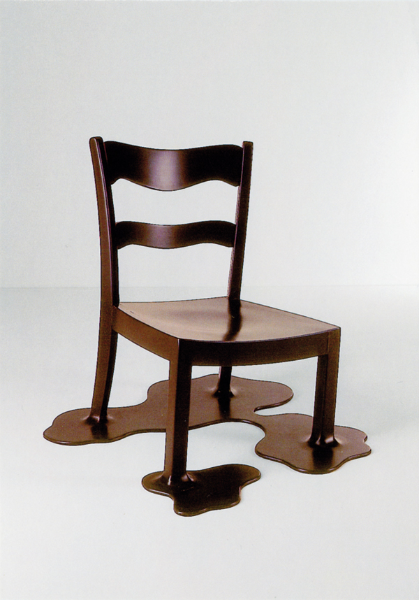
We first collaborated in 1967 for the auction ‘Chair Fun’, which aimed to raise money for the Schweizerische Werkbund in Bern. The initiators, Alfred Hablützel and Nick Morgenthaler, had invited artists and designers to create chair objects that were meant to be sold as a sort of ‘happening’. For our four contributions, we converted existing chairs into absurd readymades, in order to criticize their prevalent functionalism. In general, our work can be seen as very playful, which is not so common in architecture – a field preoccupied with cost and how to produce something that won’t immediately collapse. It’s this playfulness that links the likes of Arp and Magritte with those early practitioners of mannerism. Think, for example, of the monks who used anamorphosis to conceal obscene graphics within larger paintings – the hidden images only visible through reflecting prisms. This is something that we like about art: artists can formulate ideas freely while, as architects, we’re always tied to a brief so, for us, it has to be a conversation. We get something from art that we can’t have ourselves.
As told to Dominikus Müller. Translated by Nicholas Grindell.
This article appears in the print edition of frieze, May 2018, issue 195, with the title Trix and Robert Haussmann.
Main image: Giulio Romano, Fall of the Giants (detail), 1535, Palazzo Te, Mantua. Courtesy and photograph: Wikimedia Commons


