Patrick Caulfield / Gary Hume
Tate Britain, London, UK
Tate Britain, London, UK

Tate Britain’s pairing of solo exhibitions devoted to Patrick Caulfield and Gary Hume was coy. The shows were organized by different curators – Clarrie Wallis and Katherine Stout, respectively – though they occupied adjacent galleries and shared an exhibition guide, which explained that the ‘exhibitions run in parallel, offering visitors the chance to see the work of two complementary British artists from different generations’. Having visited two exhibitions, I nonetheless came away feeling as if I’d seen one.
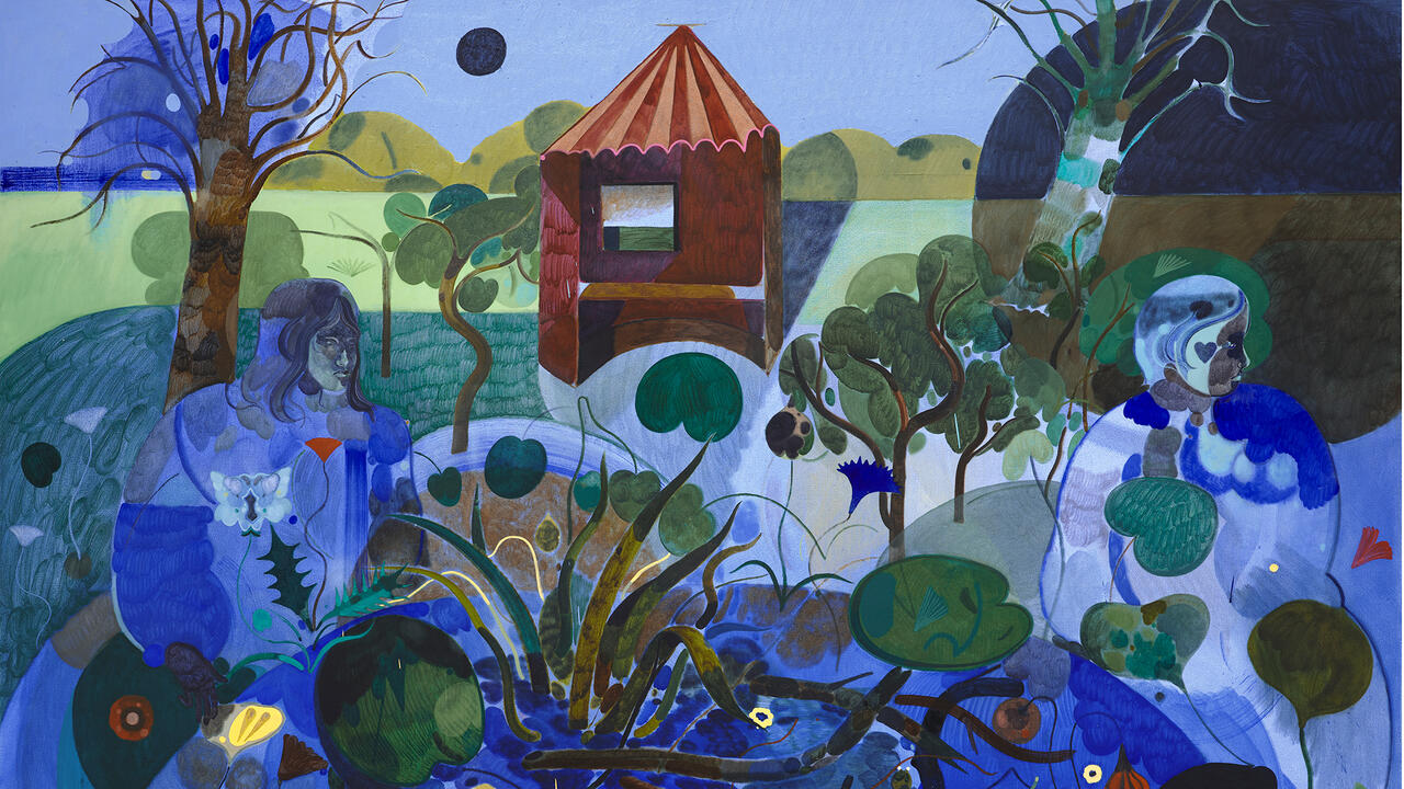
Flatness reigned. There were controlled lines, broad fields of industrial paint applied using sign-painting techniques. There were dalliances with abstraction, pop culture and banal subject matter – painting running away from expressionist gesture in search of ‘the shock of the familiar’, as Caulfield once put it. Productive comparisons were to be made, but occasionally it was a little like witnessing a party at which two guests are introduced to each other because they work in the same profession only to discover they would rather chat to someone else. Caulfield, who died in 2005, disavowed the Pop artist label – Juan Gris, Fernand Léger and formal problems were his bag – whereas Hume, now in his early 50s, has always been comfortable pulling into his work figures from popular culture, such as Kate Moss or Michael Jackson. The older artist’s paintings are architectural, depicting interiors and urban spaces. Hume’s works – even when he is making paintings of doors – rarely seem to care for space at all. Instead, they’re like close-ups of glutinous blooms of coloured wax floating around a lava lamp; little anchors them in figurative painting, but they resist abstraction too. In these works, beauty has thickened, turned into treacle-thick planes of synthetic colour.
Caulfield’s lines are Mod sharp and his interiors are lonely. Restaurants have no diners, plates of food go untouched, bedrooms sit empty. The only portrait in the show, Portrait of Juan Gris (1963), shows the Spanish artist in a blue suit, floating in a bright yellow limbo; he looks landlocked by colour. In After Lunch (1975), a bored waiter hovers in the background: painted the same flat blue as the room, he could pass for part of the décor. Caulfield’s bars and restaurants are spaces of conviviality caught at the wrong moment; a late-afternoon wine-stupor between lunch and dinner, perhaps, or simply off-season. We see modern appliances (Stereophonic Record Player, 1968) and iconic modern furniture (Eero Saarinen ‘tulip’ chairs in Dining Recess, 1972; Arne Jacobsen ‘ant’ chairs in Café Interior, Afternoon, 1973). These images speak of ideal homes waiting for ideal tenants. When originally painted, they would have depicted the latest in forward-thinking taste, a snapshot of that moment when shops such as Habitat had just opened in Britain, showing the urban middle classes how to effortlessly mix and match a Persian rug with an Eames-style chair. Today they speak of similarly educated taste and wealth, only this time shipped in by Monocle magazine and Mad Men: retro-modern as the new antiquarianism.
Taste in painting shifts just like taste in furniture. Caulfield’s exacting draughtsmanship and bright, flat surfaces – flat, but deftly used to suggest overlapping planes, falling light or subtle changes in perspectival depth – changed infrequently and instead were refined over the decades. They played differently as the decades shifted. For all Caulfield’s denials, in the 1960s his work was in step with Pop, even ‘hard-edge’ abstract painting. (They remind me strongly too of Hergé’s ligne claire drawings for the Tintin books.) In the 1970s, with the introduction of trompe l’oeil elements, Caulfield’s work prefigures Postmodern painting – for instance, the multiple stylistic voices an artist such as David Salle would come to use. By the end of the 1980s, Caulfield’s style would seem the antithesis to oh-so-earnest British painters of drab figurative existentialism such as Stephen Conroy, Leon Kossoff, Frank Auerbach and Lucian Freud, or the macho neo-expressionism of Julian Schnabel and Francesco Clemente in the US.
Perhaps this is where Hume comes in. Emerging at the end of the 1980s, his painting, along with that of contemporaries such as Julian Opie, echoed the cool detachment of 1960s British Pop, nodding to Caulfield and Michael Craig-Martin (who taught Hume at Goldsmiths in London). It seems symptomatic of a broader reorientation in the pop-cultural landscape of early ’90s Britain, away from the plaid-shirt nihilism of Generation X, towards a confident levity and engagement with a more localized pop sensibility – a loss of interest in the US as locus of artistic innovation. In Tony Blackburn (1993), a fuzzy blue four-leaf clover wears a thick black halo (or perhaps it’s a wig made from the eponymous British radio DJ’s hair), against a lurid pink and yellow backdrop. The painting is sunny and the title funny if you grew up in the UK in 1970s and ’80s, but even then it’s inscrutable. As with Caulfield, Hume’s painting has varied only subtly over the years: jump a decade from Tony Blackburn to Green Nicola (2003), and there is still the same deadlock at the limits of abstraction and figuration. In this portrait of artist Nicola Tyson, her hair is a chunky arc of yellow surrounding a slender stalk. In The Moon (2009), a field of black surrounds a pom-pom that sits on top of a wiry pink arm, a white sphere jutting from the elbow crook. Tulips (2009) suffocates flowers – another recurring motif in Caulfield’s work – with strands of impasto gloop, as if slathered from an oil spill. As with Caulfield’s paintings, in Hume’s universe there is no movement. The pom-pom arm is motionless. Nicola’s hair is fixed solid. There is something Gothic about these works; they not do not capture the world, so much as embalm it. Indeed, Hume’s frozen paintings would not look out of place on the walls of Caulfield’s lonely interiors.


