


‘Pop Culture Is the Great Educator’: An Interview with Peter Saville
On the 40th anniversary of ‘Unknown Pleasures’, the artist discusses the inspiration behind his iconic designs
On the 40th anniversary of ‘Unknown Pleasures’, the artist discusses the inspiration behind his iconic designs

As Factory Records’ co-founder and art director from 1978–93, Peter Saville produced enigmatic artworks that repurposed images from industrial and cultural history. The chaotic ethos of the label provided him with the freedom to do as he wanted. Nobody knew what they were doing, and nobody told anybody else what to do. In April 1979, Factory’s maverick producer Martin Hannett spent two night-time sessions at Strawberry Studios in Stockport recording an album with a Salford band called Joy Division. On the sleeve, Saville situated an astrological diagram of a dying star amid a jet-black abyss, omitting the title, band name and song credits. This pulsing, wave-like stack of raw data reflected the space-age atmosphere of the record. Now, 40 years later, the album Unknown Pleasures (1979) and Joy Division have ascended to the status of pop-culture mythology.

A new group exhibition at Sprüth Magers, ‘New Order: Art, Product, Image 1976–95’ curated by Michael Bracewell, offers an art-historical perspective on Saville’s design for New Order’s 12” single ‘Blue Monday’ (1983). Sean Burns spoke to him at his London studio about the works and ideas that have influenced his practice.
Sean Burns What happened during punk?
Peter Saville Punk happened in 1976, while I was at art school. It fast-tracked young people who felt the energy of that moment to the possibilities of being able to do something. The expected period of apprenticeship didn’t happen.
SB Do you think that it did away with conventional hierarchies?
PS It did, temporarily. For 12 to 18 months, it was like breaking down the palace gates; then there was a moment of: ‘How do we govern?’ The new wave was the governance of the new youth order.

SB I love the idea that popular music could be intellectual and disseminate a political message.
PS And it did! The extent to which postwar pop culture has been the great educator is undervalued.
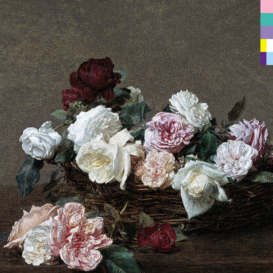
SB I completely agree. In using Henri Fantin-Latour’s A Basket of Roses (1890) on the cover of New Order’s Power, Corruption and Lies (1983), were you implying that the music was in the same register as the painting?
PS Yes – with a certain amount of naivety and idealism; I didn’t think about it strategically, in that sense. In the early 1980s, I was interested in the idea of cultural continuum. I wanted to juxtapose the past with the present because I didn’t see why a wealth of cultural history had to be cast behind us.

SB Is working as an artist something that you thought other people did?
PS I didn’t know anyone who did it. Evidently, there were some people in New York doing it. I would come from Manchester to London for the day and all I would see was the 1960s: a reverberation of the British pop scene, nothing of ‘the now’. I don’t know when Carl Andre’s Equivalent VIII (1966) was first shown at Tate. As a teenager, I wouldn’t have been able to appreciate it. Now, I think it’s an extraordinary work.
SB What artists were you looking at while at art school?
PS I was still airbrushing everything. I was seduced by Philip Castle, Dan Fern, George Hardie and Bush Hollyhead. They were the cool illustrators in London in the early 1970s. They were like hipster stylists with an evolving fashion-linked agenda.

SB Presumably, the UK contemporary art scene of the 1970s was London-centric?
PS It seemed to be. Consequently, images from popular culture, like Brian Duffy and Philip Castle’s cover for David Bowie’s Aladdin Sane (1973), became the icons of the young masses. In the same way that Peter Blake’s cover for The Beatles’ Sgt. Pepper’s Lonely Hearts Club Band (1967) had been in the 1960s.
SB With music as the constant vehicle …
PS Graphic design as a discipline pretty much began in the 20th century. It was a natural consequence of modernism and other movements happening around the same time: De Stijl, constructivism and futurism. There was a changing order in the world, people were coming to terms with the industrialization of society. Prior to that, it was principally book-binding and printing. The graphic arts came alive with mass production.
SB What were you looking at?
PS In Herbert Spencer’s Pioneers of Modern Typography (1969), which included works by Herbert Bayer and Jan Tschichold, I saw an extraordinary wealth of artistic innovation in a form that I could immediately identify with. I would look at a Bauhaus book and look at Manchester and wonder what the fuck had happened. I was angry with the shabby mediocrity of the fabric of life.
SB I can relate to that feeling.
PS One afternoon, I left the library with a pile of books. In one of them, I saw a black thing, Kazimir Malevich’s Black Square (1915). When I saw it, I knew that it was important, but I didn’t know why, and I realized I didn’t know anything. That was the day my education started.

SB What influences you nowadays?
PS What interests me now is the connectivity of things. There’s a very interesting David Joselit article called ‘The Power to Style’ (2012) in which he redeems the word ‘styling’ and points to how integral it is to every significant aspect of our socio-political and cultural lives.
SB You must see your work referenced in that of other artists?
PS Robert Longo was the first professional artist that I met. He was in New York and he said that aspects of my work had been an inspiration to his ‘Men in the Cities’ series (1977–83). When I saw the drawings, I could see the presence of Ian. [Ian Curtis was the singer with Joy Division from 1976, until his tragic suicide in May 1980. Saville’s artwork for Unknown Pleasures eerily prefigured Curtis’s death.]

SB What about more recently, what position are you in now?
PS This past year or so, I feel less frustrated about being me.
SB That’s a good place to be.
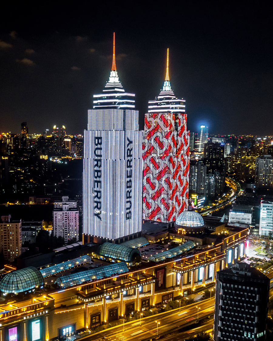
PS I have the freedom to offer my point of view within the parameters of a given context. Last year, I collaborated with Riccardo Tisci to redesign the new Burberry logo and monogram, and it became a form of art.
SB Which contemporary artists do you admire?
PS I never fail to be amazed by Haim Steinbach. Sometimes, when you have an idea for a work, you discover that, of course, someone has been there before you. The process of finding self and of being able to cope with that, and be less self-concerned, can be fundamental.
‘New Order: Art, Product, Image 1976–95’ runs at Sprüth Magers, London, UK, until 14 September.
Peter Saville is an artist and designer who lives and works in London, UK.
Main image: Peter Saville and Joy Division, Unknown Pleasures, 1979. Courtesy: the artist and Factory Records