


Vanessa Maltese & Nathalie du Pasquier
Cooper Cole, Toronto, Canada
Cooper Cole, Toronto, Canada

Before cofounding the Memphis group in 1981, Nathalie Du Pasquier lived and travelled in francophone Africa. There, the Bordeaux-born artist and designer learned the creative force of pattern, combining it with her interests in modern design and its precursors, such as the arts and crafts movement and the Wiener Werkstätte. Known for its kitschy colours and wacky geometries, Memphis also drew on art deco, pop and the Bauhaus aesthetic in its furniture, textiles, plastic laminates and other designs. Yet, none of this appears in the smaller room of Cooper Cole in Toronto, where greyscale and earthy tones pervade the six paintings on paper dated between 1998 and 2006. Those who remember Du Pasquier’s many-hued stripes, grids, zigzags, squiggles and other dynamic motifs will find them, instead, in the gallery’s second exhibition: Vanessa Maltese’s ‘Birds flew down to peck at the painted grapes’. Born in 1988, a year after Memphis disbanded and Du Pasquier adopted painting as her main pursuit, the Toronto-based Maltese mines this retro aesthetic in four, round oil panels rife with pictorial games and references to the medium’s history.
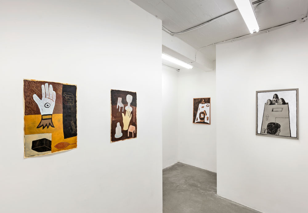
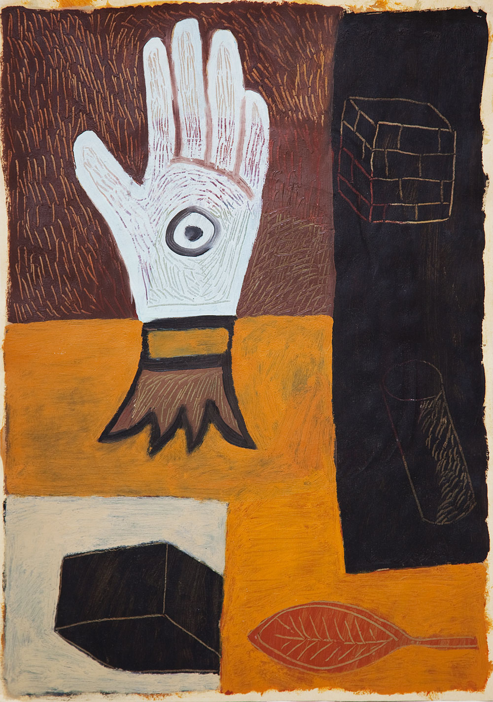
Du Pasquier likewise explores the tension between the flat picture plane and perspectival illusion. In Untitled (1999), a curve cuts across the top of the painting, demarcating either a table’s edge or the far wall of a room. Several objects seem to hover against a dark background, their indeterminate scale, light colours and lack of cast shadows all enhancing their flatness. The disembodied hand floating in the centre may figure viewers’ futile attempts to orient themselves within the unusually configured composition. Lower down, Du Pasquier has scored a bark-like pattern into the roughly applied oil paint, revealing both the white-grey paper beneath and some dark underpainting, recalling the energy of her signature patterns. It is no surprise to see Maltese painting similar lines to simulate woodgrain and other textures in her larger, smoother panels on view.
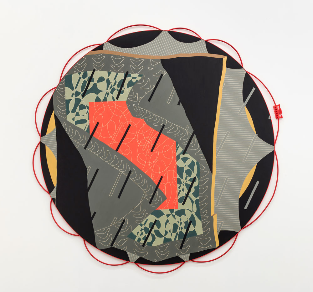
Full of warring planes, Maltese’s circular paintings invite the beholder to peel them apart layer by layer. Pale grey and decorated with thin white lines, part of Capacity for self control (2016), for instance, looks stretched over the panel like rawhide over a drum, as if nailed to its red frame, fashioned from curved steel rods and adorned with a found red
hairclip. The fourth layer is a black quadrilateral whose shaded yellow edges create the illusion of volume, while the fifth evokes a many-patterned carpet or quilt, its bottom-left and top-right corners folded over a coral rectangle. Short black or grey diagonal lines, like stylized raindrops inserted at different planar depths, create further tension with the surrounding elements. When it comes to such excessive ornamentation, Maltese’s titular ‘capacity for self-control’ is never in question: to play with so many pictorial devices at once requires both subjective restraint and a mastery of painting’s rules.
A pair of red shoes, which appears in a single sculptural work (Self portrait [company], 2016), provides one further illusion. In the exhibition text, Aryen Hoekstra links them to the 1948 ballet film The Red Shoes as well as to Kate Bush’s The Line, the Cross and the Curve (1993), a 50-minute music video featuring songs from the eponymous album and a fairy tale by Hans Christian Andersen. Maltese’s red shoes are not a ballerina’s pointe shoes but a pair of Converse sneakers cast in aluminium, painted in hyperrealist oil and seemingly discarded on the gallery floor. Like Du Pasquier, Maltese understands that we want to be tricked by the decorated surface, which both artists consider paramount to a work of art: style and content are inseparable.


