


Out in the World
The intertwining of art and commercial photography is nowhere more evident than in the genre of still life
The intertwining of art and commercial photography is nowhere more evident than in the genre of still life

Photography may have triumphed in art over the last couple of decades, but questions linger as to whether art gets the best out of it. Many artistically minded photographers admit to finding art an interesting place to visit but they wouldn’t want to live there. It can be airless, self-serving and very slow. (Photography permits rapid artistic development for those who want it, but curators and collectors rarely do.) Moreover, given that art photography triumphed by remaking, diverting or otherwise contemplating the medium’s ‘applied’ forms – such as the document, the film still, the advertisement and the archival image – there is always much in common between art photographs and those we see elsewhere.
Nothing demonstrates this better than the promiscuous still life photograph, present everywhere from the gallery wall and the family album to billboards and mail-order catalogues. Picked fruit and cut flowers, artefacts of glass, plastic, wood and metal, objects rare and commonplace, the still life bridges art and commerce. Its rise from the lowest genre to the equal of landscape and portraiture followed the rise of commodity culture. In the 1820s and ’30s, the pioneers of photography could not resist gathering objects before their cameras. Nicéphore Niépce shot a dining table laid for one. Louis Daguerre contrived arrangements of classical sculpture and paintings. William Henry Fox Talbot showed off his china and glassware. Were these images documents, pictures for contemplation or advertising? All three. The still life was ideal for a world of accelerated manufacture and exchange, mobilizing desires and expressing tastes. Even the humble table, the basic support for the still life, was unthinkable without its marketable image. As Karl Marx famously declared in his 1867 passage on commodity fetishism, a table ‘not only stands with its feet on the ground, but in relation to all other commodities, it stands on its head, and evolves out of its wooden brain grotesque ideas, far more wonderfulthan if it were to begin dancing of its own free will.’1 Two years later, Comte de Lautréamont was after the new beauty of ‘the chance encounter, on an operating table, of a sewing machine and an umbrella’.2 Such wild tableaux! In the hallucination of capital the still life is a hybrid of sculpture and montage.

When photographers made their bid for modern artistic significance in the1920s many were key figures in the medium’s applied fields, notably reportage, portraiture and the advertising still life. They included Man Ray, Edward Steichen, Laure Albin-Guillot, Helmar Lerski and Albert Renger-Patzsch. Others made still lifes that could be taken for advertisements (Edward Weston, László Moholy-Nagy, André Kertész, Heinz Hajek-Halke). But as Modernists true to their métier, the aim was to make good photographs and the ‘art’ part could be left to take care of itself. Photographers as different as Man Ray and Walker Evans insisted their medium was not art but it could be an art – a distinction lost on many today. Exhibiting or publishing a book of one’s commissioned work might be enough to shift the emphasis from the things depicted to the depiction, from anonymity to named author, from paid work to Works, from applied to fine art. Context, as any photographer will tell you, is key.

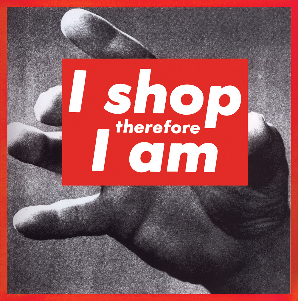
This indirect path to artistic status produced extraordinary images – and they could only have been made that way. A weak claim to art can be a great stimulus for photography, but a strong claim can crush it. This is why so many contemporary photographers feel constrained by the anxious categories and stifling agendas of art world photography and look to the freedom of that older attitude. But this has proved difficult. In the 1950s and ’60s, commercial photography became wary of the unpredictability of art and tried to develop a reliable science of image design (the TV series Mad Men, 2007–ongoing, nails this shift brilliantly). Images would be vetted or even designed in the boardroom. In his 1964 essay ‘Rhetoric of the Image’, Roland Barthes examined a still life advertisement for Panzani, a food company contrived to connote ‘Italianicity’ to the French.³ It was the start of ‘photography theory’. Branded tins and packets intermingle with fresh fruit and vegetables spilling from a rustic net bag against a scarlet backdrop. It was a ruthlessly designed image and, like its makers, Barthes accounted for its every aspect from colour, lighting, composition and text to its committee authorship. He described the ideological sleight of hand that endows manufactured goods with ‘naturalness’. And it is photography that facilitates the slippage most effectively. It is unique in appearing to point at things transparently (‘there it is’) while fashioning appearance artificially (‘this is how it is’). Photographs are taken and made, natural and cultural. Barthes’ semiotic critique also aimed to be a science of popular signs and advertising got the analysis it deserved. This calculated attitude was quite of a piece with Pop art’s approach to commodity images. Andy Warhol’s stacked ‘Brillo Boxes’ (1964) were a strategic fusion of the readymade and the still life, and it made little difference whether you saw them exhibited or in photographic reproduction: the flash of recognition was all. Warhol, the former ad man, grasped Marcel Duchamp’s insight that the industrial/commercial object plucked and placed incongruously (like Lautréamont’s monstrous encounter) will hit the viewer with the deadpan force of a snapshot. But a less remarked legacy of Pop was the polarizing of art’s attitudes to commerce into rictus-grin irony or high-minded disgust. It led to a fraught attitude to money, to the commodity status of art works themselves and, indirectly, to a stand-off between art photography and applied photography. Since the 1960s, the still life photograph in art has passed through the polemic Postmodern image–texts of Barbara Kruger (a former art director at Condé Nast), the post-classical allegories of Olivier Richon and Karen Knorr (whose first joint publication was a cookery book), and the photography-as-sculpture-montage-joke of Fischli/Weiss, Gabriel Orozco and Vik Muniz (a former advertiser). All of which is Art with a capital ‘A’, all of it keen to distance itself from the still life as Commerce (capital ‘C’), even though commerce is often the subject matter.
Consider two examples from either side of Pop, both by figures better known for other things. In 1955, Walker Evans published ‘Beauties of the Common Tool’ in Fortune magazine: five exquisitely restrained still lifes of one-dollar pliers and wrenches. Reproduced larger than life, they were monuments to blue-collar labour. In his accompanying text Evans praised them for holding out against overdesigned and image-led manufacture, while his photos resisted the graphic opulence typical of Fortune. In 1992, the BBC commissioned 20 artists to make public billboards, including the young Damien Hirst, who was the only one keen to do more than simply re-present gallery art. He approached a professional still life photographer to help shoot exquisitely restrained pairs of objects: a hammer with a peach and a cucumber with a pot of Vaseline. They formed two panels of a rotating tri-vision billboard; the third read ‘The Problems with Relationships’. On the street it looked like advertising with nothing to sell but an idea. Evans and Hirst were fashioning still life as a pitch-perfect intervention beyond art. However, whereas Hirst remade his billboard in 1996, exhibited it and sold it, Evans let his magazine work slip into obscurity.
Few photographers find these options appealing, preferring a more open situation. The work of British photographer Jason Evans is exemplary here. For 20 years he has moved between still life, portraiture, fashion and music photography, and between commissions, collaborations, websites and images made for fun. He has exhibited in major museums but refuses any hierarchy between the wall, the magazine page and the computer screen. Everything he makes is driven by curiosity about the medium: its processes, its transformative qualities and its powers of proposition. A request from i-D magazine to shoot a Miu Miu skirt is an opportunity to see clothing as a Modernist still life or sculpture. Christmas present packaging by Gareth Pugh is photographed for Fantastic Man magazine with the precisionist flair of the machine aesthetic. An experiment by the design provocateurs Dunne & Raby to harness energy emitted by live rodents leads to images that update the paranoiac lab science of the 1950s. When Evans exhibits such laconically elegant photographs they carry this astute assimilation of the best applied photography of the past. Little surprise then that Evans’s touchstone is Evidence (1977), the gnomic book of photographs gathered by artists Mike Mandel and Larry Sultan from police, scientific and fire department archives. Strip the most functional photography to its bare essentials and you’re left with enigmas, not facts.

With its use of images and objects from the recent past, there is a twinge of ‘retro’ here, comparable in some respects to the work of photographers – for all their differences – such as Christopher Williams and Roe Ethridge. This is less nostalgia than a sign of how hard it is to develop an artistic relation to the very new. ‘Design just a little dated will interest any artist. Design current is always terrible. Anyone who has tried to find a good contemporary lamp or clock will know what I mean.’4 So declared Walker Evans. How perceptive. He wasn’t writing off the aesthetic of any era, merely noting that not-newness is what often permits artistic access.
Countering the restraint and historical consciousness of his black and white work, Jason Evans’s colour photography is a nower-than-now world of crazed form and crafty process. The hugely popular website thedailynice.com is an outlet for his compulsive photo-notations that have no other home. There’s only ever one image to see, which changes daily, and there is no archive. What you are likely to get is a disarming configuration of colour and shape presented as a considered observation of the made stuff that fills the material world. Fittingly, when the dailynice.com briefly became a gallery exhibition in 2009, visitors could help themselves to prints from a big cardboard box on a table.

Evans’s artwork for musicians such as Wild Beasts and Four Tet reminds you that record covers can still be hotly anticipated and dearly prized. The sleeve for Four Tet’s There is Love in You (2010) started with the scavenging of test prints made each morning by the digital photo labs of central London. Colour spectrums, bright flowers and fine geometric grids will tell technicians if their printers are working correctly. These were pinned on his studio wall and photographed on colour negative film, which was then subjected to a hole-punch. The tiny, rough-edged discs were arranged meticulously on a sheet of glass from which a positive print was made. The digital/analogue blend is a consummate visual expression of the electro-acoustic music. Look closely and see that it could only have been made this way. This is still life as pure process, as profound as the best of the process-driven photography, but it’s less po-faced and lot more joyous.
This fluid, exploratory and less tormented attitude to image-making has much in common with that earlier era of only vague distinctions between art photography and applied photography. If Evans’s refreshing work is now coming to wider attention it’s because it offers so many paths for photography around the Art Obstacle. Besides, in a climate where we are now provided with media-ready art the way supermarkets provide oven-ready chickens,doesn’t most art photography start to seem more applied than fine?
1 Karl Marx, Capital: A Critique of Political Economy, vol 1., translated by Ben Fowkes, Vintage, New York, 1977, p. 163
2 Comte de Lautréamont, Les Chants de Maldoror, Œuvres complètes, Guy Lévis Mano, Paris, 1938, p. 256
3 Roland Barthes, ‘Rhétorique de l’image’ (Rhetoric of the Image), Communications no. 4, Seuil, Paris, 1964, p. 40–51
4 Walker Evans, ‘Collectors Items’, Mademoiselle, May 1963. Evans’s statement accompanied his photographs of thrift store windows, shot as if they were found still-life compositions.