As We Speak
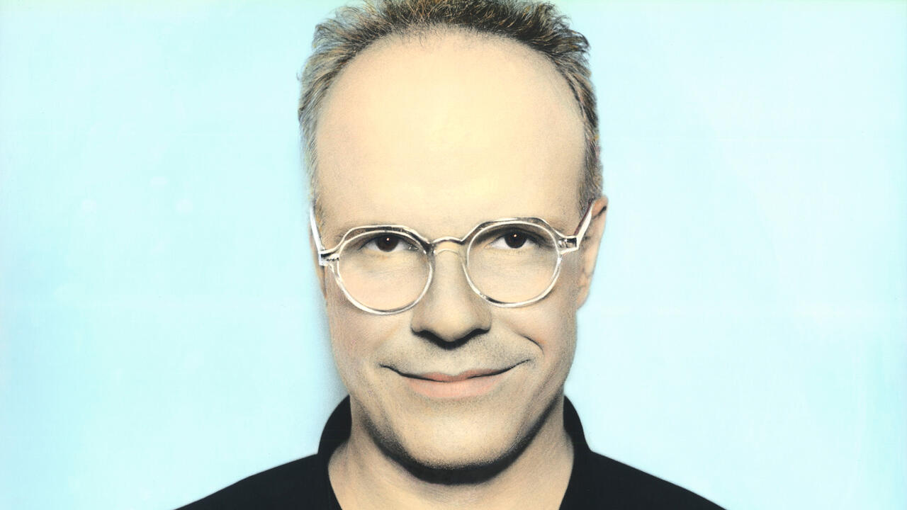
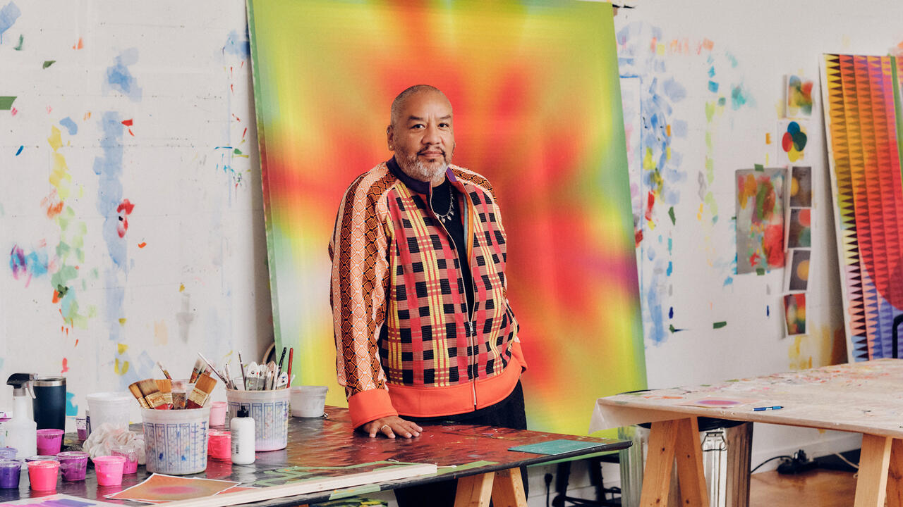
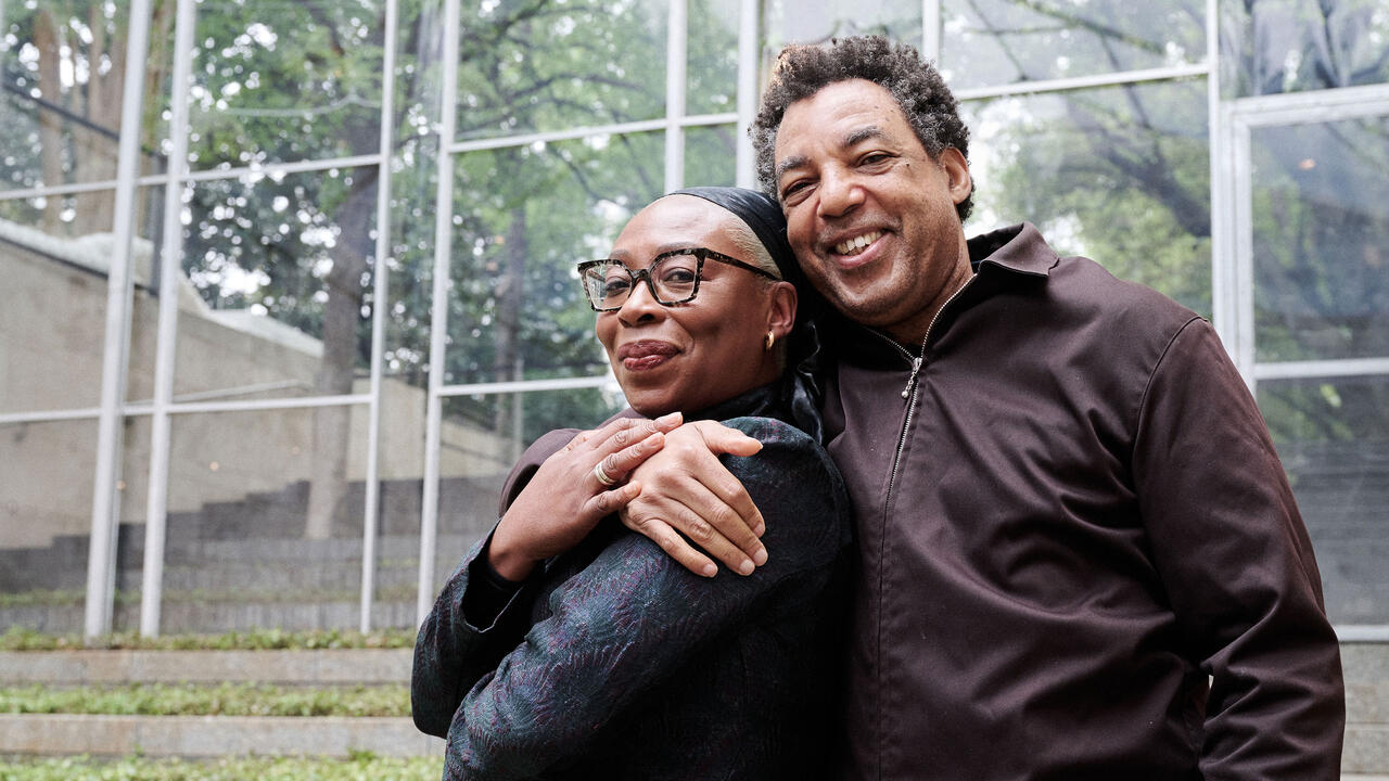
Christopher Williams and Willem de Rooij discuss whether referentiality in art, if once polemical, has become an orthodoxy and if so, is there is a way out?
Christopher Williams and Willem de Rooij discuss whether referentiality in art, if once polemical, has become an orthodoxy and if so, is there is a way out?

Willem de Rooij As a starting-point for this conversation I sent Chris the transcript of a public discussion I had with Jeff Wall in the framework of the conference series ‘Rotterdam Dialogues’ (2008–9) at Witte de With in Rotterdam in April last year (the entire series of transcripts has now been published by Witte de With). Jeff and I spoke mainly about the notion of referencing, both from very different angles and experiences, obviously.
Christopher Williams In this talk two particularly interesting points were raised: one was the idea of using a conversation as a model, and the other was the characterization of the period of art production in the mid-to-late 1970s as ‘the era of polemical referentiality’. He said he felt that after the project of Conceptual art, which involved the de-legitimization of the image, making pictures at that time was a polemical act. What struck me was that during this period Jeff published his first catalogue, which exemplifies that very idea. Each double-page spread had, on the right-hand page, one of Jeff’s transparencies – for example, The Destroyed Room (1978) or Young Workers (1978/83) – and, on the other side, a network of references or source material: a still from a Hitchcock movie, a Delacroix painting, a Chris Burden performance, a photograph by Richard Avedon or an album cover by Public Image Ltd. Since he has not used this tactic in subsequent publications, perhaps he has reconsidered such explications, but for me at that time it was perfect because I could see how complex layers of information could be condensed into a single photograph.
This came at an important time for me, amidst a backdrop of other cultural developments, such as Screen Magazine, T.J. Clark, Jean-Luc Godard’s videos, Fassbinder, post-punk music, and the first English language translations of Situationist texts.

WDR But in that conversation, Jeff also said that right now we’re at a point in time where we might have to revise that take on referentiality, because that way of working has turned into an orthodoxy. At the moment there is such referential proliferation going on in art that some pieces seem to legitimize themselves only through the interestingness of their references.
Jörg Heiser The orthodoxy of referentiality – do you see it more with younger artists?
WDR We all have to deal with it right now, artists of all ages. Whether we find our sources in books or on the Internet – so much of what inspires or triggers us has already been produced, or mediated or processed in another way by someone else, another author.
CW When I started working, using existing cultural material meant you were taking a critical position – and I find a lot of younger artists that I talk to claim it’s just material, and for them there is no reason to take a position.
WDR The actual appropriation is not problematized anymore.
CW Exactly, and I think that describing the kind of work being made in the era of polemical referentiality helps underline the culture that Jeff’s pictures came out of, and mine. I’m thinking, for example, of Argument (1978) by Anthony McCall and Andrew Tyndall. The film is a critical reflection on the economic situation of the artist – the accompanying publication included an essay entitled ‘The Artist as Businessman’ – and of masculinity, using The New York Times Magazine as the object of investigation. Yet the film was not the primary object of the piece; the discussion after screenings of The Argument was seen as an equal element of the overall project.
Another example is Frost and Defrost by Daniel Buren, a project realized at the Otis Art Institute Gallery in Los Angeles in 1979. Over the course of the show, workers removed the ceiling panels, covered them with Buren’s striped wallpaper, put the panels on display, and then put them back up into the ceiling, with the stripes facing up so that at the end of the show you would just have an empty gallery again. The work was a direct response to a work that Michael Asher had done in 1977 at the Van Abbemuseum in Eindhoven, where he had taken out the skylight’s glass panels, and – over the course of the show – cleaned and reinstalled them, the exhibition ending when they were all back in place. For me, as a young artist, these projects were very important because they presented the clearest idea of the art work as a dialogical activity. While it may seem strange now, at that time, when I first started working with photographs, the choice of medium seemed to have political implications.
JH What exactly made adopting photography political?
'In terms of the political implications of what I'm doing, it's about creating the context for a certain kind of looking.'
Christopher Williams
CW Photography at the time was still not considered a primary medium for art work. Also, the first generation of Conceptual artists had de-skilled photography to the point that it wasn’t deemed necessary to develop it as a craft, creating a situation where anyone could feel that they could make art with readily accessible means. The fact that it didn’t have much of a place in museums and the art market made it an attractive place for artists attempting to work outside of mainstream culture. Also, the most interesting female artists at that time – such as Barbara Kruger, Louise Lawler and Sherry Levine – were beginning their work with photography, and so it seemed to me to also have feminist implications.
JH Do you think there is anything ‘polemical’ left in referentiality today?
WDR Rather the opposite. It has become a completely mainstream convention. I’m amazed by the flood of art pieces I’ve seen lately that consist of a photograph of a book that the artist finds interesting. Or a book in a showcase. Or sculptures that consist of a bookshelf on the wall with a number of books on it. Or a photo of a bookshelf. Or a photo of a book in a showcase. These books might be interesting, but the photos and sculptures are usually not. I find it so unfair to art that the form of the work gets ignored in that way.
It was so inspiring to see Rodney Graham’s recent show at the Museum für Gegenwartskunst in Basel. A couple of works brought together the work of Sigmund Freud and Donald Judd. Graham ended up using Judd’s works as bookshelves or pedestals of sorts for Freud’s books – an artistic twist that touches on the problems of referentiality and appropriation, but brings them into a slapstick-like sphere, making it hilarious. None of the bookshelf pieces I’ve seen lately seem aware that these works exist.
I’m not saying that it shouldn’t be possible to work with references. It just doesn’t seem to be happening on a reflective level. In the process of referencing, artists often forget to make the art piece.
JH Maybe for younger generations of conceptual artists, this is about accelerating appropriation to the point of infinite regress. Christopher, you teach at the Kunstakademie Düsseldorf, and Willem, you teach at Städelschule in Frankfurt am Main – how do your students approach the question of appropriation and referentiality?
WDR I don’t think that for our students it’s different from the way it is for us. We’re all living in the same world at the same time and we can all gain inspiration from art history on the one hand, and all other cultural sources on the other, and we all experience the excitement as well as the burden of all that. I think we’re in the same boat.

JH How did you deal with these questions when you and Christopher did your first collaboration, for the joint exhibition at Secession in Vienna, in 2006?
WDR I was working together with Jeroen de Rijke [who passed away in 2006] at the time and the three of us were invited to share the stage. We had been asked to produce two separate exhibitions but we decided to turn it into one collaborative project instead.
CW The conventional way of doing it would have been for one artist to be in the main hall, and one in the basement spaces. We decided to circumvent that hierarchical situation, by merging the two exhibitions. So you could wander through the exhibition and walk towards a De Rijke/De Rooij work and bump into Williams on the way, or vice versa. We had also turned the building’s distinctive mobile wall system – designed by Adolf Krischanitz in the 1980s – into a part of the show by not covering up the modular aspects of the wall. We agreed that the outside of De Rijke and De Rooij’s projection rooms was as important as the inside, so I did not hang my pictures on the outside of their spaces.
WDR But as a counterpoint, we decided to hang one of your pieces inside one of the projection rooms – it was only visible when the projection was running.
CW There was actually a third collaborator on the project, Mathias Poledna, whom we invited to design the two separate catalogues for the exhibition.
WDR The covers of these two catalogues look the same, so they have our three names on the covers. Each volume shared the same authors and the same installation shots – but then the images of individual works are different. The whole design plays with the idea of the doubling. Mathias designed the text into two columns per page, but only one of the two columns is used for print. On the back of that same page, again only one column would be used for print. In this way, he used the fact that paper is always lightly transparent: next to each column of text one can see the text-column that is on the backside of the page shine through. Next to each column of text, you see the absence, as well as the backside, of another column.
CW It was about confusing identities: whose catalogue is this? Who are the collaborators? On the cover it says De Rijke and De Rooij and Williams, so has Williams joined the other two? Is it a group now? Who is responsible for the catalogues? Where is Poledna’s name? We used the catalogues and posters, etc., as an opportunity to open a field of questions as opposed to merely providing information about the exhibition.
WDR Later you were asked to do a show with Mathias Poledna at Kunstverein Bonn, which took place last year, and you decided together to deal with mobile wall systems, and how these systems related to the history of exhibition making in the Rhineland area.
CW Mathias and I took the architectural elements of the Secession exhibition as a starting point. The project was conceived as a literal study of several examples of temporary or mobile wall systems being used by institutions in the region around that time. We borrowed and exhibited the walls without refurbishing or repainting them. We actually were proposing
a typological study of mobile wall systems in use in the Rhineland at that time of the exhibition, not a metaphorical or allegorical structure. It wasn’t about Vietnam.
WDR Christopher and Mathias asked me to respond to their work by organizing an evening in the installation. I screened two films. Mirror of Holland (1950), a short film by Dutch filmmaker Bert Haanstra of Dutch landscapes reflected in water. It’s about national representation and identity, popular topics in the era of postwar reconstruction. The film depicts a set of reflections of clichés of icons of Dutch identity (windmills, cows, sailboats, bicycles). The entity that threatens the Dutch landscape most – water – in this film is the one that makes it visible. It’s a symbiotic interdependency not unlike the way art works relate to museums walls. The second film I showed was The Divine renewal of Ise Shrine by Seijin Koga, from 1973. It’s about a 2,000-year-old Shinto temple complex near the city of Ise in Japan, that every 20 years is ritually deconstructed and moved to another location, on which it is then reconstructed – an ancient form of mobile architecture. The film shows all the steps of how the building is taken apart and reassembled. The entire temple is built for a sacred mirror hidden inside a box that no one is allowed to lay eyes on.
JH In both of your respective oeuvres there is a trajectory coming from Conceptual art, Minimal art and Institutional Critique, of looking at things in a sort of sober, matter-of-fact way. At the same time there are elements that are very playful, almost a bit crazy …
DWR I don’t see what we do as crazy. I think it’s a process of very deliberate decision-making. Maybe we don’t want to get bored along the way.

JH Not crazy literally, but counter-intuitive – like the invitation card for the Bonn show, which showed not mobile wall systems but a photograph of three parrots, or De Rijke/De Rooij’s The Point of Departure (2002), which, after a series of films working with single static shots, suddenly introduced special effects and unhinged camera moves exploring a Persian carpet. Are these decisions arrived at in a playful, intuitive way, or fully consciously, strategically even?
CW When working together, most of the decisions were made in a very fluid way. I don’t know if ‘playful’ is the right word, but we were having fun and we were agreeing on things more often than not. The parrots might be playful, but the photograph of the parrots is not.
WDR ‘Playful’ is such a confusing word. I kept hearing it when I first came to Los Angeles to teach at Art Center College of Design in Pasadena. The students kept using it to describe their work. Of course we have fun when making art, but ‘playful’ sounds like kindergarten to me.
CW And we’re very serious about our fun.
JH Christopher, in the catalogue accompanying your recent show at the Kunsthalle Baden-Baden, there is an introduction by the then-director Karola Krauss but right underneath it in the layout is another double-act: the transcript of the speech she gave at the opening, covering very similar ground.
CW When I first started coming to Germany I was surprised by the length of speeches at opening receptions. For me they were a strange form of theatre and I wanted to play with that idea. For some time I have occasionally orchestrated performances that have intervened in the conventions of these speeches. After doing this kind of thing a few too many times, people were starting to expect that it would happen, so for Baden-Baden I introduced audio feedback into Karola Krauss’ opening speech. I had somebody standing near the speaker with a microphone clipped to the back of his shirt, and when I gave a signal he would lean back and the speakers would feed back. So in the catalogue, the coloured elements in the speech refer to when the feedback was hitting.
JH So what seems like a hypertextual element, a meta-level of
reference, actually comes back to the literal, in this case the indication of interference noise.
CW Yes, and in the exhibition you also had that literalness. There is one room where I exhibited three pictures that foreground the basic elements of a space. One work depicts a mobile wall system from Secession, another is of one of the Buren ceiling tiles which I referred to earlier, and the third is a socked foot pressing onto a floor. So the wall, the ceiling and the floor are referred to with one image each, and in that way it relates to the literalness of work from the 1960s and ’70s, just clearly describing and delimiting the space. But also, each work is referring to another space, and, with the exception of the sock, spaces where art has been exhibited.
JH Willem, in your work with Jeroen de Rijke describing and delimiting spaces seemed central.
WDR Our films were never looped but shown as timed screenings, with intervals that would often take as long as the film itself. This meant that more than 50 percent of the time we would exhibit the empty exhibition-space. I first investigated how to put the exhibition space on display in 1993 in a work named ‘Route along 18 Corners’ – it’s actually on show at the Temporary Stedelijk Museum in Amsterdam at the moment. This work is a series of images of corners in the Stedelijk that are grouped together in a leaflet; visitors can take it along as they walk through the building.
When Jeroen and I made Mandarin Ducks for the Venice Biennale in 2005, counter to earlier works that had been very pared-down, we tried to reach a point of referential exhaustion by referring to as many things as possible in one work. When we were asked to show Mandarin Ducks again in Amsterdam in the Stedelijk Museum later that same year, we were able to frame it by showing some works from the museum’s collection. Some of these had been formative for the script of the film, including for example Gerrit Rietveld’s Elling Buffet (1919), a group of cubist collages from Kurt Schwitters’ Merzmappe (1923) and two works by James Ensor.
JH Is this in line with the idea of explicit referentiality in Jeff Wall’s aforementioned 1970s catalogue page?
WDR Yes, exactly. To use works by other artists in installations under my name – I think of that increasingly as collage. Keren Cytter, Isa Genzken and Vincent Vulsma allowed me to include their works in my installations. Different formats of shared authorship have always been important in my work. The ‘Bouquets’ – actual flower bouquets – I make are always co-produced with a florist. To use found footage or works by other artists as autonomous material is for me also a way to collaborate. In recent years, for invitation cards announcing my shows, I started to use reproductions of paintings by Dutch 17th-century painter Melchior d’Hondecoeter, who painted only birds for more than 40 years. These images became emblems of sorts for those installations, which often contained works by other artists. These images of very different kinds of birds fighting for space in the same pictorial frame – for me they echo the idea of different heterogeneous elements coming together, in a pictorial way as well as in a conceptual way.
In the same period I discovered ceremonial feather-covered objects from 18th-century Hawaii at the Museum of Ethnography in Berlin-Dahlem – helmets, capes and larger-than-life heads depicting gods, worn by chiefs and carried around in processions. Trying to find out whether these fascinations had anything to do with each other, I started to combine images of the paintings and objects on paper. But I soon realized that what I really wanted was to simply see the actual objects combined. So I decided to bring together a number of those paintings and objects, without the usual layers of mediation, not trying to claim ownership other than putting them into a different context. I’ve been basically working on making that happen for four years now: these pieces come from collections all over the world. As no substantial catalogue on either D’Hondecoeter’s work or the Hawaiian objects was ever made, it became quite important to produce knowledge. The work that I’ve now made at the Neue Nationalgalerie in Berlin is an installation on the one hand, and a threefold catalogue on the other. We produced the first book on D’Hondecoeter’s work, as well as a catalogue raisonnée on all Hawaiian feathered objects known.
CW And how have you installed the work?
WDR I designed one purely functional freestanding wall inside Ludwig Mies van der Rohe’s glass cube, which serves only to display both the bird paintings and the feather-covered objects. I wanted it to look like the paper collages I made as sketches when I started to think of these two groups of objects in combination. So it looks quite flat. Another important element is a set of window treatments that serve to bring the light down but leave some of the building’s key characteristic, its transparency, in tact. It was not harder to deal with Mies’ space than with other spaces. Making an installation fit in a space is always the same challenge, no matter how connotated the space is or what size it has. ‘Intolerance’ does not refer to Mies, but it does deal with notions of nation and national representation.
'Whether we find our sources in books or on the Internet, so much of what inspires or triggers us has already been produced, or mediated or processed in another way by someone else.'
Willem de Rooij
JH What exactly is it that interests you in this combination?
WDR In pre-Christian Hawaii these feathered objects were meant to create a connection with the divine and scare off the enemy. These capes and helmets were worn by chiefs, so they were indicators of power. D’Hondecoeter’s bird paintings often depict birds that come from four or five different continents. Exotic birds were rare and expensive imports – so these paintings depict status symbols, and at the same time they are status symbols. So for me the idea of representation, political as well as pictorial, is the nexus of this group of objects. They represent establishment.
D’Hondecoeter used certain motifs again and again in his images, with the help of students and assistants. Sometimes these assistants, Adriaen Coorte for example, would later use these motifs in their own works. Just like the feathered objects which were produced by different groups of specialized craftsmen, in D’Hondecoeter’s images authorship is something very ambiguous – I like to look at them as being produced by groups of people rather than by one person. I like the idea that copying, borrowing, referencing and appropriating were at the time completely mainstream and accepted artistic strategies – they had to be due to the high demand.
CW Do the works have allegorical titles?
WDR Some of them do. For example, the one of the raven robbed of the feathers that he had stolen from other birds in order to look better himself (The Raven robbed of his false Feathers, undated). It’s based on a fable that was often used by painters and writers at the time. The picture shows a gang mob scene basically, with the raven being brutally attacked by a large group of other birds.
CW On the frozen canal in Amsterdam last winter, my partner and I suddenly heard the most insane sounds, and what we witnessed was a group of white birds that had encountered a single black bird in their neighbourhood, and they were attacking it. It was literally along the lines of black and white.
WDR Holland can be a tense place, and looking at those images of birds fighting I often think about that. It is remarkable that someone spends his life painting conflicts.
CW I was going to ask you if there was a relationship between Mandarin Ducks and these bird paintings, and then I realized the very title implies there is.
JH People behaving like birds, the cock, the peacock …
WDR The set of Mandarin Ducks was decorated with representations of the exotic, like a faux-Japanese screen that is very central in the film, on which two Mandarin ducks are depicted. Everything on that set that relates to another culture is fake – the mask from Japanese Noh theatre, the African zebra-hides, the Islamic patterned stained glass windows – all were made in Amsterdam.
CW Bringing two things together, the bird paintings and the feather objects – do you have an idea of how they’re affecting each other, or how one affects the reading of the other?
WDR Well, that of course is what this entire project is about – I want to see what happens.
CW For me, one of the most attractive features of your project is that you are not only referring to something, but, through commissioning scholarly work on the material, you are also producing real knowledge about the subject.
JH For both of you, because of the way you display objects, it seems that the exhibition itself often becomes the art work.
WDR I’m not too comfortable with the word ‘display’ because it makes it sound as if we’re working in a department store.
JH By display I simply mean the way you make something available for being looked at.
WDR Invites, press release, websites – everything is part of the work for me. I started to see the rooms in which my films were shown as part of the work for a very practical reason: it was a way to escape from curatorial terror. I would continuously receive requests for my films to be shown next to or under or behind someone else’s work. It never worked, and that’s why I started to understand that the work should come with a room.
CW But the Hawaiian feather objects never knew they were going to be next to the Dutch bird paintings …
WDR No, that’s true, and their makers did not leave us any instructions for how to show them either…
CW I saw a performance in Paris some years ago where dancers used very specific African head-dresses. The headpieces were almost six-feet tall – taller than the performers wearing them. To be able to dance and bow with these huge things demanded incredible skill. A few years later I attended on of Jean Rouch’s weekly film seminars at the Musée de l’Homme, and I then saw the context that these headdresses had originally been made for. It was for a village where the houses were about eight-feet high, with very narrow streets between them. The bodies of the dancers remained invisible behind them, and you just saw these wooden shapes going by – like a puppet show. At the performance, there was no reference to the reason why these things were so high in the first place. It’s a really simple kind of critique, but within ethnography there’s always a discussion about whether you present enough context or not. What I find interesting about your exhibition project is that you are actually amplifying the alienation of these objects from their original source.
WDR That process of alienation for me is one of the main subjects of ‘Intolerance’. I’m not an ethnographer – I’m looking at how the process of becoming exotic changed these objects and what that changed status means for me now as a producer and consumer of images.
CW The different specialists you got involved to contribute to the catalogue – do you know what they make of the project?
WDR They all seem to be very excited and curious about it – but we have encountered problems in terms of loaning the Hawaiian objects. Especially American institutions are sensitive to the fact that these objects are still sacred to some people in Hawaii, so they don’t want them to travel. I went to see two feathered gods in the depot of the Peabody Museum at Harvard University, and they were stored in boxes that were open on the front, but covered with very light linen curtains: in that way the gods would not have to stare into the empty depot!
CW When you chose the title Intolerance, were you thinking of the D.W. Griffith film from 1916?
WDR There had already been some quotations from Griffith’s movie in the script for Mandarin Ducks – so yes, I was thinking about that. For a long time, I had ‘Intolerance’ on a list of possible titles, and this was finally the time that I felt it fitted.
CW Are any of the Hawaiian gods happy ones?
WDR Yes, there are the ones with the corners of the mouth pointing downwards – a sign of disrespect towards the enemy. But there are also the ones that have a happy face – the gods of prosperity. They operate in a constellation that Adrienne Kaeppler (who wrote the featherwork section of the catalogue) refers to as ‘paired opposition’.
JH Will any of that information be provided in the exhibition?

WDR A little bit but not too much because it’s very much about the visual encounter between the objects. I don’t want to explain too much. There is the publication though that excessively illustrates and contextualizes the exhibits.
JH That’s the back-story problem in art making today – what information to include or to withhold, or to put in a separate place?
WDR I’m working in two ways at the moment, it’s kind of schizophrenic. The show in Berlin is a very referential project that needs a lot of text, but the exhibition ‘Slit or Gloved’ that I made at Galerie Daniel Buchholz in Cologne last February was completely devoid of text, and quite abstract. I showed a flower arrangement named Bouquet V and a large tapestry of linen interwoven with silver and gold threads, a slow gradual colour shift from silver to gold (Vertigo’s Doll, 2010). I’m thinking of that piece as a work that refers to nothing – or at least that’s what I was aiming for. So I’m pulling it towards one extreme with one project, and towards the other with another project.
JH Christopher, your last show at Galerie Gisela Capitain in Cologne had a very distinctive press release, which in a good way didn’t match the show; it seemed like a different layer.
CW At a certain point I became frustrated by the necessarily reductive nature of the standard press release, so instead I adopted a collage style, allowing me to lay down facts or information in the hope that it could spark more complex associations. So it’s not about telling people how to read it, but just about providing more information. For example, the knowledge that a certain percentage of the rubber in the Michelin tires of 1968 was produced in Vietnam. The idea of riding around in Paris in ’68 on Vietnamese rubber has a kind of resonance, but it speaks in a very different way than the picture itself, which is more related to industrial photography. I think of the press releases as functioning in an analogous way to Jeff’s idea of creating a model of a representation of a thought process.
WDR Christopher, I’m currently working on a list of rules, kind of like Lars von Trier’s Dogme 95, to facilitate the production of works that refer to nothing: non-referential art. Do you have any tips?
CW I have three rules but I’m not sure that they relate to non-referentiality.
WDR On my first day in art school I was told: you cannot make art about or with shoes, and also not about or with suitcases.
CW And what was that about?
WDR It was probably about Christian Boltanski being fashionable with art students at that moment.
CW On my first day in art school I was taken aside by an older student who said the way to be taken seriously here is to make audio work – those were his words; have the four-track tape recorder ready. And the next older student told me: don’t produce objects – collect them and keep them in a warehouse, but just provide inventories. He collected vacuum cleaners. But I was interested in the idea of montage, in the sense of reframing and layering information, and of bringing as much history about specific issues as possible into a single picture that was apparently pretty straightforward. I wanted it to be really disproportional in that regard.
WDR So that it would have a really heavy representational burden?
CW Yes, that it would be stacked with multiple narratives, multiple historical frameworks, and that it would have a real weight to bear on that level. Nowadays I’m trying to make simpler pictures that have less of a representational burden, that provide another way of speaking.
JH Do you think there is a kind of historical exhaustion of the possibility of invention in art?
WDR It could be great if we’d end up again in a situation like 17th-century Amsterdam, when it was possible for entire groups of artists to all use the same motif, or all use the same iconographical structure for a piece; when it wasn’t a problem to do what has already been done. The idea that art is something that has to constantly renew itself is really an incident in art history. Was it invented in the Romantic era, let’s say 200 years ago? You only have to go back a couple of centuries to a time when this notion was not so central in the production and consumption of art.
JH But aren’t we always on the lookout for things that are interesting, that surprise us?
CW I actually have an interest in the specific opposite of what you are proposing, which is to photograph something in exactly the same way it was photographed before. It’s also why I had the idea to not only appropriate a certain kind of image, but appropriate its very site of production – for example working with professional object photographers and their studios. That means if I want to make a photo of apples I find an object photographer who often makes photos of apples. So the image produced that way is basically like the images they use in the supermarket around the corner. But if you look at the kind of descriptive clarity, and the amount of information implied in my apple picture, it’s something that you won’t find in the advertising. So it’s a simple strategy: that there’s always a lot more to look at. It’s a way of not only using found imagery, but also gaining control over its production. In terms of the political implications of what I’m doing, it would be about creating the context for a certain kind of looking: to use an image associated with advertising, but create the conditions to slow down and look at it in a way that industrial images are almost never looked at. The art context is one of the few places where speculative thought and disinterested observation can still happen.
JH And can polemical referentiality still happen, too?
WDR When I started teaching at Städelschule I used a logo for my class that was an image of Nancy Reagan lobbying against drug-use by kids in the 1980s; it included the slogan ‘just say no’. I used it as a motto for the class because I wanted to talk with the students about saying no to the demands of the art world – saying no, in my understanding, is one of the most important weapons that you have as an artist.


