Vital Statistics
Edward R. Tufte and the art of data presentation
Edward R. Tufte and the art of data presentation
When old age shall this generation waste,/Thou shalt remain, in midst of other woe/Than ours, a friend to man, to whom thou say'st/'Beauty is truth, truth beauty,' - that is all/Ye know on earth and all ye need to know.
John Keats, Ode on a Grecian Urn (1820)
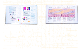
Last Christmas somebody gave me a beautiful book. It had a storm cloud on its cover and, in lieu of a preface, a passage lifted from Emile Durkheim's Les formes élémentaires de la vie religieuse (1912). Thumbing through its creamy pages, I came across a Roy Lichtenstein, an Henri Rousseau and several drawings by Albrecht Dürer. It was only when I read the author's brief biography on the book's back flap that I realized, somewhat to my surprise, that it was the work of a scholar of statistics. It was my first encounter with Edward R. Tufte. Ever since then the world has seemed a slightly different place.
Back in the 19th century the British Prime Minister Benjamin Disraeli declared that 'there are lies, damned lies and statistics'. As adages go, it's pretty perspicacious, but for Tufte it's a slur on the statistician's art. The author of a trilogy of books about data and design - Envisioning Information (1990), Visual Explanations (1997) and The Visual
Display of Quantitative Information (2001) - Tufte sees statistics as a source of both truth and beauty, things that, like Keats' pulchritudinous pot, transcend their temporal trappings. To prove his point he enlists some eccentric examples, ranging from cholera epidemics to Italo Calvino's Invisible Cities (1974), from space shuttle disasters to Salman Rushdie's Haroun and the Sea of Stories (1990). This magpie approach occasionally muddies his argument (what has Arshile Gorky got to do with graphs?), but for all his cross-cultural cutting and pasting Tufte is no Postmodern collagist. Rather, he's an unreconstructed romantic, someone who lives for those moments when - as he writes in Envisioning Information - 'the wonderful becomes familiar and the familiar wonderful'.
Tufte's trilogy tackles pictures of numbers, pictures of nouns and pictures of verbs. The first of his three books, The Visual Display of Quantitative Information, showcases some early examples of data design. They're the kind of images you ignored in school history lessons, but under Tufte's tutelage they're totally transformed. Created in 1861, Charles Joseph Minard's map of the retreat from Moscow - in which he plots the progress of Napoleon's troops along a timeline tied to a plummeting temperature scale - is remarkable, more like a cinema screen than a carte figurative. Writing in 1885, E. J. Marey described it as 'seeming to defy the historian's pen by its brutal elegance'. Sometimes statistics speak louder than words.
The Visual Display of Quantitative Information also sees Tufte detail his theory of data design. It is based on the idea that a little goes a long way; that designers should let the 'data-ink' (the elements of an image that impart essential information) do the talking. Anything that is 'non-data-ink' is pointless puffery. Invoking Mies van der Rohe and Robert Venturi, Tufte sums up his theory thus: 'For non-data-ink, less is more. For data-ink, less is a bore.' I'm not sure if he's building a bridge between Modern and Postmodern aesthetics or if he's just joking, but either way his chutzpah is contagious.
Tufte's Envisioning Information is about articulating 3D data on sheets of paper and screens, about 'escaping flatland'. This is, of course, an impossible dream - 3D is 3D, 2D is 2D, and that, as they say, is that. However, the escape attempts he examines (a toad that's shrugged off its skin, a pop-up pyramid) are so exuberant that it feels like it's only a matter of time before we flee flatland for ever. Like The Visual Display of Quantitative Information, Envisioning Information is concerned with good and bad design. In one chapter Tufte rejigs a bus timetable. In addition to simplifying its structure, he supplements it with an aerial photo of the route. This image is so detailed that, as Tufte puts it, 'the reaction of those who live in the area is to explore the photograph, personalizing the data, seeking to discover their own residence, school or workplace. Same picture, but many stories.' Although Tufte's project is partly about paring things down, it's also about opening people's eyes. In his hands even the driest data (and data doesn't come much drier than a timetable) enriches its users' experience of the world.
Although Visual Explorations discusses data design, it is different from its predecessors. Its index reads like a roll-call of cultural revolutionaries (Charlie Chaplin, René Descartes, Charles Eames, Helen Frankenthaler, E. H. Gombrich ...) and only a couple of conventional charts and graphs grace its pages. In their place Tufte offers some unusual images: an 18th-century 'Automaton Chess Player', operated by a man concealed in a secret compartment; police photos of politicians connected with the Watergate cover-up; a pair of handcuffs that once belonged to Harry Houdini. Individually they illustrate particular points about data design, but they also all touch on the theme of deception. Perhaps Tufte feels OK about flirting with falsehood, but there's something in Visual Explorations that makes me think that's not so. Near the back of the book there's a whole page devoted to the artist Ad Reinhardt. Beneath the cerulean calm of Reinhardt's Abstract Painting 6, Blue (1952) the following words appear: 'Clarity, completeness, quintessence, quiet. No noise, no schmutz, no schmerz, no Fauve schwärmerei. Perfection, passiveness, consonance, consummateness. No palpitations, no gesticulation, no grotesquerie. Spirituality, serenity, absoluteness, coherence. No automatism, no accident, no anxiety, no catharsis, no chance. Detachment, disinterestedness, thoughtfulness, transcendence. No humbugging, no button-holing, no exploitation, no mixing things up.' As a painter's prayer it's powerful, and it sounds just the thing to drive the darkness from a statistician's soul.


